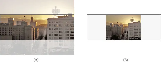
我想创建一个 div ,可以在父元素的高度和宽度变化时保持纵横比例。如上图所示,当改变宽度时,我能够保持 box div 的纵横比,但是当改变父元素的高度时,无法保持纵横比。
我希望灰色框的行为像这样:
.box {
width: 100px;
background-color: #dfdfdf;
max-width: 100%;
}
.box:after {
content: '';
display: block;
width: 100%;
height: 100%;
padding-bottom: 160%;
}
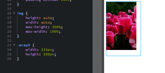
.wrap9 {
width: 125px;
height: 190px;
}<div class="wrap9">
<div class="box"></div>
</div>