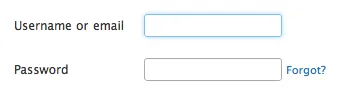
我想为我的表单创建一些不错的输入框,我真的想知道TWITTER如何在它们的输入框周围创建发光的边框。
TWITTER边框的示例/图片:
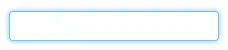
我也不太清楚如何创建圆角。
请看这里:
.glowing-border {
    border: 2px solid #dadada;
    border-radius: 7px;
}

.glowing-border:focus {
    outline: none;
    border-color: #9ecaed;
    box-shadow: 0 0 10px #9ecaed;
}
演示: http://jsfiddle.net/simevidas/CXUpm/1/show/
(若要查看演示代码,请从URL中移除"show/"部分)
label {
    display:block;
    margin:20px;
    width:420px;
    overflow:auto;
    font-family:sans-serif;
    font-size:20px;
    color:#444;
    text-shadow:0 0 2px #ddd;
    padding:20px 10px 10px 0;
}

input {
    float:right;
    width:200px;
    border:2px solid #dadada;
    border-radius:7px;
    font-size:20px;
    padding:5px;
    margin-top:-10px;
}

input:focus {
    outline:none;
    border-color:#9ecaed;
    box-shadow:0 0 10px #9ecaed;
}<label> Aktuelles Passwort: <input type="password"> </label>
<label> Neues Passwort: <input type="password"> </label>transition: box-shadow linear 1s http://jsfiddle.net/simevidas/6LyWe/1/ - Šime Vidas.glowing-input { … }。 - Šime Vidas可以试试这个方案:http://jsfiddle.net/UnsungHero97/Qwpq4/1207/
CSS
input {
    border: 1px solid #4195fc; /* some kind of blue border */

    /* other CSS styles */

    /* round the corners */
    -webkit-border-radius: 4px;
       -moz-border-radius: 4px;
            border-radius: 4px;


    /* make it glow! */
    -webkit-box-shadow: 0px 0px 4px #4195fc;
       -moz-box-shadow: 0px 0px 4px #4195fc;
            box-shadow: 0px 0px 4px #4195fc; /* some variation of blue for the shadow */

}
使用普通的蓝色 border,中等的 border-radius,以及位置为 0 0 的蓝色 box-shadow。
稍微减少了光亮度的修改版。
input {
    /* round the corners */
    //background-color: transparent;
    border: 1px solid;
    height: 20px;
    width: 160px;
    color: #CCC;
    border-radius: 4px;
    -moz-border-radius: 4px;
    -webkit-border-radius: 4px;
}

input:focus {
    outline:none;
    border: 1px solid #4195fc;
    /* create a BIG glow */
    box-shadow: 0px 0px 5px #4195fc;
    -moz-box-shadow: 0px 0px 5px #4195fc;
    -webkit-box-shadow: 0px 0px 5px #4195fc;
}
input {
/* round the corners */
border-radius: 4px;
-moz-border-radius: 4px;
-webkit-border-radius: 4px;
}
input:focus {
outline:none;
border: 1px solid #4195fc;
/* create a BIG glow */
box-shadow: 0px 0px 14px #4195fc;
-moz-box-shadow: 0px 0px 14px #4195fc;
-webkit-box-shadow: 0px 0px 14px #4195fc;
}
input[type="text"]{
   @include transition(all 0.30s ease-in-out);
  outline: none;
  padding: 3px 0px 3px 3px;
  margin: 5px 1px 3px 0px;
  border: 1px solid #DDDDDD;
}
input[type="text"]:focus{
  @include box-shadow(0 0 5px rgba(81, 203, 238, 1));
  -webkit-box-shadow: 0px 0px 5px #007eff;
  -moz-box-shadow: 0px 0px 5px #007eff;
  box-shadow: 0px 0px 5px #007eff;
}
这将创建发光的输入框和文本区域:
textarea,textarea:focus,input,input:focus{
    transition: border-color 0.15s ease-in-out 0s, box-shadow 0.15s ease-in-out 0s;
    border: 1px solid #c4c4c4;
    border-radius: 4px;
    -moz-border-radius: 4px;
    -webkit-border-radius: 4px;
    box-shadow: 0px 0px 8px #d9d9d9;
    -moz-box-shadow: 0px 0px 8px #d9d9d9;
    -webkit-box-shadow: 0px 0px 8px #d9d9d9;
}

input:focus,textarea:focus {
    outline: none;
    border: 1px solid #7bc1f7;
    box-shadow: 0px 0px 8px #7bc1f7;
    -moz-box-shadow: 0px 0px 8px #7bc1f7;
    -webkit-box-shadow: 0px 0px 8px #7bc1f7;
}
// Form control focus state
//
// Generate a customized focus state and for any input with the specified color,
// which defaults to the `@input-focus-border` variable.
//
// We highly encourage you to not customize the default value, but instead use
// this to tweak colors on an as-needed basis. This aesthetic change is based on
// WebKit's default styles, but applicable to a wider range of browsers. Its
// usability and accessibility should be taken into account with any change.
//
// Example usage: change the default blue border and shadow to white for better
// contrast against a dark gray background.

.form-control-focus(@color: @input-border-focus) {
  @color-rgba: rgba(red(@color), green(@color), blue(@color), .6);
  &:focus {
    border-color: @color;
    outline: 0;
    .box-shadow(~"inset 0 1px 1px rgba(0,0,0,.075), 0 0 8px @{color-rgba}");
  }
}
如果您没有使用LESS,则这是编译版本:
.form-control:focus {
    border-color: #66afe9;
    outline: 0;
    -webkit-box-shadow: inset 0 1px 1px rgba(0, 0, 0, 0.075), 0 0 8px rgba(102, 175, 233, 0.6);
    box-shadow: inset 0 1px 1px rgba(0, 0, 0, 0.075), 0 0 8px rgba(102, 175, 233, 0.6);
}
$('.form-fild input,.form-fild textarea').focus(function() {
    $(this).parent().addClass('open');
});

$('.form-fild input,.form-fild textarea').blur(function() {
    $(this).parent().removeClass('open');
});
.open {
color:red;
}
.form-fild {
position: relative;
margin: 30px 0;
}
.form-fild label {
position: absolute;
top: 5px;
left: 10px;
padding:5px;
}
.form-fild.open label {
top: -25px;
left: 10px;
/*background: #ffffff;*/
}
.form-fild input[type="text"] {
padding-left: 80px;
}
.form-fild textarea {
padding-left: 80px;
}
.form-fild.open textarea,
.form-fild.open input[type="text"] {
padding-left: 10px;
}
textarea,
input[type="text"] {
padding: 10px;
width: 100%;
}
textarea,
input,
.form-fild.open label,
.form-fild label {
-webkit-transition: all 0.2s ease-in-out;
-moz-transition: all 0.2s ease-in-out;
-o-transition: all 0.2s ease-in-out;
transition: all 0.2s ease-in-out;
}<script src="https://ajax.googleapis.com/ajax/libs/jquery/2.1.1/jquery.min.js"></script>
<div class="container">
<div class="row">
<form>
<div class="form-fild">
<label>Name :</label>
<input type="text">
</div>
<div class="form-fild">
<label>Email :</label>
<input type="text">
</div>
<div class="form-fild">
<label>Number :</label>
<input type="text">
</div>
<div class="form-fild">
<label>Message :</label>
<textarea cols="10" rows="5"></textarea>
</div>
</form>
</div>
</div>