我希望能够绘制一个(垂直)的彩条,每侧都有不同的刻度标尺(对应于同一数量的两个不同单位),例如一侧是华氏度,另一侧是摄氏度。显然,我需要分别为每一侧指定刻度。
您有什么好的想法吗?
我希望能够绘制一个(垂直)的彩条,每侧都有不同的刻度标尺(对应于同一数量的两个不同单位),例如一侧是华氏度,另一侧是摄氏度。显然,我需要分别为每一侧指定刻度。
您有什么好的想法吗?
那应该能让你开始了:
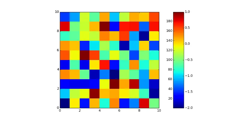
import matplotlib.pyplot as plt
import numpy as np

# generate random data
x = np.random.randint(0,200,(10,10))
plt.pcolormesh(x)

# create the colorbar
# the aspect of the colorbar is set to 'equal', we have to set it to 'auto',
# otherwise twinx() will do weird stuff.
cbar = plt.colorbar()
pos = cbar.ax.get_position()
cbar.ax.set_aspect('auto')

# create a second axes instance and set the limits you need
ax2 = cbar.ax.twinx()
ax2.set_ylim([-2,1])

# resize the colorbar (otherwise it overlays the plot)
pos.x0 +=0.05
cbar.ax.set_position(pos)
ax2.set_position(pos)

plt.show()
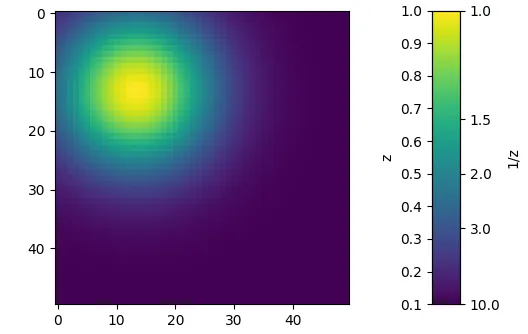
import matplotlib.colors as mcolors
import matplotlib.pyplot as plt
import numpy as np

x = np.linspace(-1,2.7)
X,Y = np.meshgrid(x,x)
Z = np.exp(-X**2-Y**2)*.9+0.1

fig, (ax, cax) = plt.subplots(ncols=2, gridspec_kw={"width_ratios":[15,1]})

im =ax.imshow(Z, vmin=0.1, vmax=1)
cbar = plt.colorbar(im, cax=cax)
cax2 = cax.twinx()

ticks=np.arange(0.1,1.1,0.1)
iticks=1./np.array([10,3,2,1.5,1])
cbar.set_ticks(ticks)
cbar.set_label("z")
cbar.ax.yaxis.set_label_position("left")
cax2.set_ylim(0.1,1)
cax2.set_yticks(iticks)
cax2.set_yticklabels(1./iticks)
cax2.set_ylabel("1/z")

plt.show()
import matplotlib.pyplot as plt
import numpy as np

# generate random data
x = np.random.randint(0,200,(10,10)) #let's assume these are temperatures in Fahrenheit
im = plt.imshow(x)

# create the colorbar
cbar = plt.colorbar(im,pad=0.1) #you may need to adjust this padding for the secondary colorbar label[enter image description here][1]
cbar.set_label('Temperature ($^\circ$F)')

# define functions that relate the two colorbar scales
# e.g., Celcius to Fahrenheit and vice versa
def F_to_C(x):
    return (x-32)*5/9
def C_to_F(x):
    return (x*9/5)+32

# create a second axes
cbar2 = cbar.ax.secondary_yaxis('left',functions=(F_to_C,C_to_F))
cbar2.set_ylabel('Temperatrue ($\circ$C)')

plt.show()
axkws = dict(zorder=2)
cax = inset_axes(
    ax, width="100%", height="100%", bbox_to_anchor=bbox,
    bbox_transform=ax.transAxes, axes_kwargs=axkws
)
cbar = self.fig.colorbar(mpl.cm.ScalarMappable(cmap=cmap), cax=cax)
cbar.ax.yaxis.set_ticks_position('left')

caxx = inset_axes(
    ax, width="100%", height="100%",
    bbox_to_anchor=bbox, bbox_transform=ax.transAxes
)
caxx.yaxis.set_ticks_position('right')
pcolormesh绘制二维数据。我的问题特别关注的是颜色条,而不是坐标轴本身。 - andreas-h