如何使图例颜色条与我的绘图面板高度相同?

19

我在R中生成了一个简单的图表,显示了一组数据的相关系数。目前,这个图表右侧的图例颜色条占整个图表大小的一小部分。

我希望图例颜色条的高度与图表相同。我原本以为可以使用 legend.key.height 来实现,但事实并非如此。我研究了 grid 包中的 unit 函数,并发现其中有一些标准化单位,但当我尝试使用它们(unit(1, "npc"))时,颜色条太高了,超出了页面。

如何使图例的高度与图表本身相同?

以下是一个完整的自包含示例:

library(ggplot2)

corrs <- structure(list(Var1 = structure(c(1L, 2L, 3L, 1L, 2L, 3L, 1L, 2L, 3L), levels = c("Var1", "Var2", "Var3"), class = "factor"), Var2 = structure(c(1L, 1L, 1L, 2L, 2L, 2L, 3L, 3L, 3L), levels = c("Var1", "Var2", "Var3"), class = "factor"), value = c(1, -0.11814395012334, -0.91732952510938, -0.969618394505233, 1, -0.00122085912153125, -0.191116513684392, -0.0373711776919663, 1)), class = "data.frame", row.names = c(NA, -9L))

ggplot(corrs, aes(x = Var1, y = Var2, fill = value)) +
  geom_tile() +
  theme(
    panel.border = element_blank(),
    axis.text.x = element_text(angle = 90, vjust = 0.5, hjust = 1),
    aspect.ratio = 1,
    legend.position = "right",
    legend.key.height = unit(1, "inch")
  )

使用 reprex v2.0.2 工具于2022年12月29日创建。


2
请提供一个最小化的自包含可重现示例。 - baptiste
好的,问题已经编辑为具有完整可运行示例的形式。 - Justace Clutter
相关的 - 但是这种方法似乎实际上并没有获取面板高度。https://dev59.com/OrT3oIgBc1ULPQZFiA_V - tjebo
4个回答

18

编辑 更新到 ggplot v3.0.0

这很混乱,但基于这个答案,并深入研究 ggplot grob,图例可以被精确地定位。

# Load the needed libraries
library(ggplot2)
library(gtable)  # 
library(grid)
library(scales)
library(reshape2)


# Generate a collection of sample data
variables = c("Var1", "Var2", "Var3")
data = matrix(runif(9, -1, 1), 3, 3)
diag(data) = 1
colnames(data) = variables
rownames(data) = variables

# Generate the plot
corrs = data
plot  = ggplot(melt(corrs), aes(x = Var1, y = Var2, fill = value)) + 
   geom_tile() +
   theme_bw() + 
   theme(panel.border = element_blank()) +
   theme(axis.text.x = element_text(angle = 90, vjust = 0.5, hjust = 1)) +
   theme(aspect.ratio = 1) +
   # theme(legend.position = "right", legend.key.height = unit(1, "inch")) +
   labs(x = "", y = "", fill = "", title = "Correlation Coefficients") +
   scale_fill_gradient2(limits = c(-1, 1), breaks = c(-1, -.5, 0, .5, 1), expand = c(0,0), 
      low = muted("red"), mid = "black", high = muted("blue")) +  # Modified line
   geom_text(parse = TRUE, aes(label = sprintf("%.2f", value)), size = 3, color = "white") +
   scale_x_discrete(expand = c(0,0)) +  # New line
   scale_y_discrete(expand = c(0,0))    # New line
plot

# Get the ggplot grob
gt = ggplotGrob(plot)

# Get the legend
leg = gtable_filter(gt, "guide-box")

# Raster height
leg[[1]][[1]][[1]][[1]][[1]][[2]]$height = unit(1, "npc")

# Positions for labels and tick marks - five breaks, therefore, five positions
pos = unit.c(unit(0.01,"npc"), unit(.25, "npc"), unit(.5, "npc"), unit(.75, "npc"), unit(.99, "npc"))

# Positions the labels 
leg[[1]][[1]][[1]][[1]][[1]][[3]]$children[[1]]$y = pos

# Positions the tick marks
leg[[1]][[1]][[1]][[1]][[1]][[5]]$y0 = pos
leg[[1]][[1]][[1]][[1]][[1]][[5]]$y1 = pos

# Legend key height ?
leg[[1]][[1]][[1]][[1]]$heights = unit.c(rep(unit(0, "mm"), 3),
                                         unit(1, "npc"),
                                         unit(0, "mm"))
# Legend height
leg[[1]][[1]]$heights[[3]] = sum(rep(unit(0, "mm"), 3),
                                 unit(1, "npc"),
                                 unit(0, "mm"))

# grid.draw(leg)  # Check on heights and y values

# gtable_show_layout(gt) # Manually locate position of legend in layout
gt.new = gtable_add_grob(gt, leg, t = 7, l = 9)

# Draw it
grid.newpage()
grid.draw(gt.new)

enter image description here


当我尝试按照这个示例操作时,遇到了“无效的'layout.pos.row'”错误。你以前见过这种情况吗? - philiporlando
1
@spacedSparking 在这种情况下,通常是由于“t”和/或“l”超出了gtable给定的可能值而导致错误。然而,这段代码对我来说是有效的 - 我正在使用R v3.5.1,ggplot2 v3.1.0,gtable v0.2.0。我猜你正在使用较旧版本的ggplot2。 - Sandy Muspratt
1
此外,这个答案似乎不能在 ggplot2 3.4.0 中使用。 - tjebo

8

看起来相当棘手,我找到的最接近的是这个:

## panel height is 1null, so we work it out by subtracting the other heights from 1npc
## and 1line for the default plot margins

panel_height <- unit(1,"npc") - sum(ggplotGrob(plot)[["heights"]][-3]) - unit(1,"line")
plot + guides(fill= guide_colorbar(barheight=panel_height))

很不幸,垂直对齐有点偏差。


非常接近了...也许还需要微调,但我已经将其标记为已回答。感谢您的指导。 - Justace Clutter
有什么方法可以防止输出空图?当我运行panel_height代码时,会出现一个空的图。这并不理想,因为它会导致保存一个空的图。 - Matt Dzievit
2
嗨,这真的还是我们能做到的最好吗? - Paul Schmidt
1
使用ggplot2 vs 3.4.0,这种方法似乎不再起作用了。 - tjebo
1
@tjebo 我认为 gtable 的结构已经改变,现在应该是 [["heights"]][-7],但这感觉有点粗糙。 - Allan Cameron

7
以下选项是一种可以添加到ggplot中的功能,使得色条与面板高度相同。
本质上,它使用了Baptiste相同的技术,但对ggplot实现的变化更加健壮,并将图例标题移动到更自然的位置,使对齐更整洁。它还允许更易于识别的ggplot样式语法。
make_fullsize <- function() structure("", class = "fullsizebar")

ggplot_add.fullsizebar <- function(obj, g, name = "fullsizebar") {
  h <- ggplotGrob(g)$heights
  panel <- which(grid::unitType(h) == "null")
  panel_height <- unit(1, "npc") - sum(h[-panel])
  
  g + 
    guides(fill = guide_colorbar(barheight = panel_height,
                                 title.position = "right")) +
    theme(legend.title = element_text(angle = -90, hjust = 0.5))
}

你可以这样做:

ggplot(corrs, aes(x = Var1, y = Var2, fill = value)) + 
  geom_tile() +
  coord_cartesian(expand = FALSE) +
  make_fullsize()

enter image description here

缺点是如果在绘制图后调整绘图窗口大小,则需要重新绘制图形。这有点麻烦,但可以通过一个相当快速简单的修复来解决。它仍然可以与ggsave很好地配合使用。

请注意,颜色条的高度与面板相同,这就是为什么在coord_cartesian中关闭扩展会使其与热图的实际瓷砖匹配,从而看起来更加整洁。

另一个示例是链接重复问题之一:

library(reshape2)

dat <- iris[,1:4]
cor <- melt(cor(dat, use="p"))

ggplot(data=cor, aes(x=Var1, y=Var2, fill=value)) +
  geom_tile() + 
  labs(x = "", y = "") + 
  scale_fill_gradient2(limits=c(-1, 1)) +
  coord_cartesian(expand = FALSE) +
  make_fullsize()

enter image description here


非常好,艾伦。没有尝试过,我认为这可能在使用ggsave时会有些棘手?我猜要保存图形,您需要以“传统方式”保存绘图(即,在控制台中创建设备,然后保存)? - tjebo
@tjebo 不,使用 ggsave 它可以完美地运行,因为 barheight 是存储在指南中的相对高度。只有当绘图作为网格对象最终确定大小时,调整大小才会出现问题。本质上,这与 ggplot 中的任何图例相同-在绘制后重新缩放绘图时大小是固定的。 - Allan Cameron
@Myriad,你是否安装了最新版本的ggplot? - Allan Cameron
我应该补充一点,调整系统缩放也是可行的,例如如果您的系统缩放为125%,那么在函数中使用 unit(1.25, "npc") 将给出正确的结果。理想情况下,您希望采用一种方法来考虑系统范围内的缩放,因为这将是使用高分辨率显示器或视力障碍人群的常见问题。有没有什么想法,这是否可能? - Ritchie Sacramento
@RitchieSacramento 我猜如果系统的缩放可以被 R 询问到,那应该很容易。虽然我以前没有遇到过这种情况,所以不确定 R 会在哪里寻找它。 - Allan Cameron
显示剩余9条评论

2
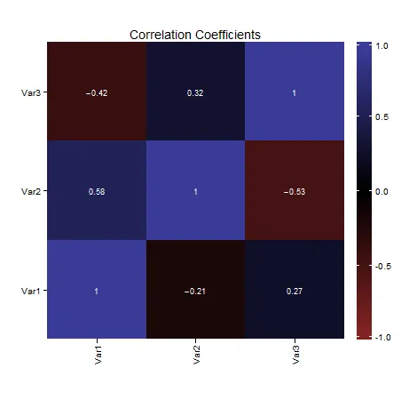
问题在于绘图面板在绘制之前没有定义尺寸("NULL unit"),但你的图例指南却有。请参见 ggplot2中geom_point的npc坐标为ggsave(显示geom_dotplot计数的最终绘图的给定尺寸)找到面板尺寸。我认为以与面板完全相同的大小绘制图例指南将非常棘手。
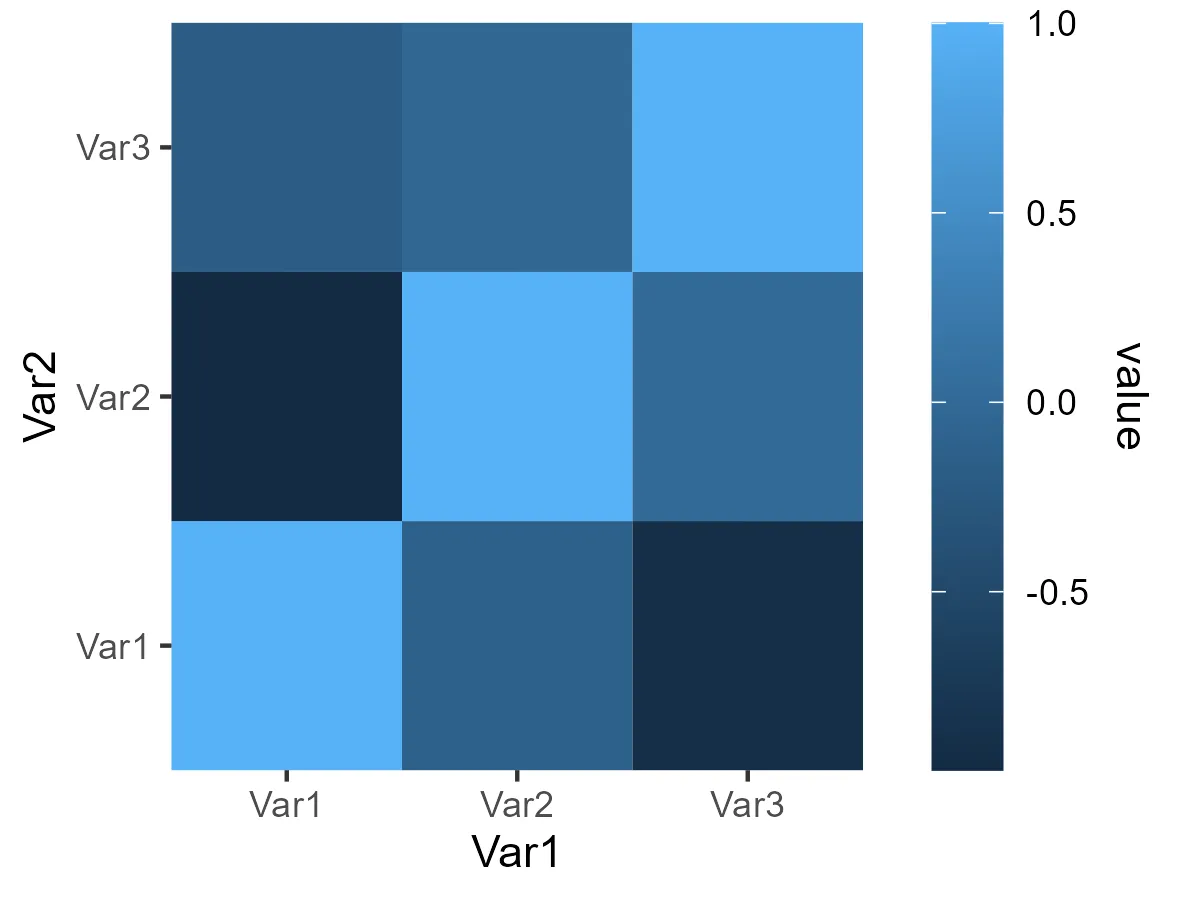
然而,当处理复杂的图例格式时,您可以利用一个技巧:创建一个虚假的图例。挑战在于调整填充比例尺以完美匹配您的图形范围(通常不会完全匹配您的数据值范围)。其余部分只是一些R语法。代码中有一些重要的注释。
library(ggplot2)

corrs <- structure(list(Var1 = structure(c(1L, 2L, 3L, 1L, 2L, 3L, 1L, 2L, 3L), levels = c("Var1", "Var2", "Var3"), class = "factor"), Var2 = structure(c(1L, 1L, 1L, 2L, 2L, 2L, 3L, 3L, 3L), levels = c("Var1", "Var2", "Var3"), class = "factor"), value = c(1, -0.11814395012334, -0.91732952510938, -0.969618394505233, 1, -0.00122085912153125, -0.191116513684392, -0.0373711776919663, 1)), class = "data.frame", row.names = c(NA, -9L))
## to set the scale properly, you will need to set limits and breaks, 
## I am doing this semi-automatically
range_fill <- range(corrs$value)
lim_fill <- c(floor(range_fill[1]), ceiling(range_fill[2]))
## len = 5 and round to 2 is hard coded, depending on the scale breaks that you want
breaks_fill <- round(seq(lim_fill[1], lim_fill[2], len = 5), 2)
## need to rescale the fill to the range of you y values,
## so that your fill scale correctly corresponds to the range of your y 
## however, the actual range of your plot depends if you're in a discrete or continuous range.
## here in a discrete range
lim_y <- range(as.integer(corrs$Var2))
lim_x <- range(as.integer(corrs$Var1))
lim_vals <- lim_y + c(-.5, .5)
## actual rescaling happens here
new_y <- scales::rescale(breaks_fill, lim_vals)
## the position and width of the color bar are defined with
scl_x <- lim_x[2] + .7 # the constant is hard coded
scl_xend <- scl_x + .2 # also hard coded
##  make a data frame for the segments to be created
## using approx so that we have many little segments
approx_fill <- approx(new_y, breaks_fill, n = 1000)
df_seg <- data.frame(y = approx_fill$x, color = approx_fill$y)
## data frame for labels, xend position being hard coded
df_lab <- data.frame(y = new_y, x = scl_xend + .1, label = breaks_fill)
## data frame for separators
sep_len <- .05
df_sep <- data.frame(
  y = new_y, yend = new_y,
  x = rep(c(scl_x, scl_xend - sep_len), each = 5),
  xend = rep(c(scl_x + sep_len, scl_xend), each = 5)
)

ggplot(corrs) +
  geom_tile(aes(x = Var1, y = Var2, fill = value)) +
  geom_segment(
    data = df_seg,
    aes(x = scl_x, xend = scl_xend, y = y, yend = y, color = color)
  ) +
  ## now the labels, the size being hard coded
  geom_text(data = df_lab, aes(x, y, label = label), size = 9 * 5 / 14) +
  ## now make the white little separators
  geom_segment(
    data = df_sep, aes(x = x, xend = xend, y = y, yend = yend),
    color = "white"
  ) +
  ## set both color and fill scales exactly
  scale_fill_continuous(limits = lim_fill, breaks = breaks_fill) +
  scale_color_continuous(limits = lim_fill, breaks = breaks_fill) +
  ## turn off coordinate clipping and limit panel to data area)
  coord_cartesian(xlim = lim_x, ylim = lim_y, clip = "off") +
  ## last but not least remove the other legends and add a bit of margin
  theme(
    legend.position = "none",
    plot.margin = margin(r = 1, unit = "in")
  )

创建于2022年12月29日,使用reprex v2.0.2

网页内容由stack overflow 提供, 点击上面的
可以查看英文原文,
原文链接