我需要向一些Material-UI组件添加填充或边距,但找不到简单易行的方法。我能否将这些属性添加到所有组件中?类似于以下方式:
<Button color="default" padding={10} margin={5}>
我知道使用纯CSS和类也可以实现这一点,但我想以Material-UI的方式完成。
我需要向一些Material-UI组件添加填充或边距,但找不到简单易行的方法。我能否将这些属性添加到所有组件中?类似于以下方式:
<Button color="default" padding={10} margin={5}>
我知道使用纯CSS和类也可以实现这一点,但我想以Material-UI的方式完成。
您可以通过先导入组件,然后在 BOX 组件中使用“间隔”来实现间距:
import Box from '@material-ui/core/Box';
Box组件作为要"修改"间距的组件的"包装器"。
然后,您可以在组件上使用以下属性:
space实用程序将简写的margin和padding props转换为margin和padding CSS声明。这些props的名称采用{property}{sides}格式命名。
其中property之一是:
m-设置margin的类 p-设置padding的类
sides之一是:
t-设置margin-top或padding-top的类
b-设置margin-bottom或padding-bottom的类
l-设置margin-left或padding-left的类
r-设置margin-right或padding-right的类
x-设置左右的类
y-设置上下的类
空格-在元素的4个边上设置margin或padding的类
例如:
<Box m={2} pt={3}>
  <Button color="default">
    Your Text
  </Button>
</Box>
import { withStyles} from '@material-ui/core/styles';

const styles = theme => ({
  buttonPadding: {
    padding: '30px',
  },
});

function MyButtonComponent(props) {
  const { classes } = props;

  return (
      <Button
        variant="contained"
        color="primary"
        className={classes.buttonPadding}
      >
        My Button
      </Button>
  );
}

export default withStyles(styles)(MyButtonComponent);
你可以使用 withStyle 高阶组件(HOC)将样式注入到你的组件中。这是它的工作原理,而且它非常优化。
编辑:要在所有组件上应用样式,你需要使用 createMuiTheme 并将你的组件包裹在 MuiThemeprovider 中。
const theme = createMuiTheme({
  overrides: {
    MuiButton: {
      root: {
        margin: "10px",
        padding: "10px"
      }
    }
  }
});

 <MuiThemeProvider theme={theme}>
  <Button variant="contained" color="primary">
    Custom CSS
  </Button>

  <Button variant="contained" color="primary">
    MuiThemeProvider
  </Button>

  <Button variant="contained" color="primary">
    Bootstrap
  </Button>
</MuiThemeProvider>
MuiButton 引用是来自 Material-UI 框架的 API。与其使用 Button 的原因是为了避免与其他库或项目中的组件名称冲突。 - oligofren在Material-UI v5中,可以使用sx属性更改按钮样式。您可以在这里查看边距/填充系统属性及其对应的CSS属性。
<Button sx={{ m: 2 }} variant="contained">
  margin
</Button>
<Button sx={{ p: 2 }} variant="contained">
  padding
</Button>
<Button sx={{ pt: 2 }} variant="contained">
  padding top
</Button>
<Button sx={{ px: 2 }} variant="contained">
  padding left, right
</Button>
<Button sx={{ my: 2 }} variant="contained">
  margin top, bottom
</Button>
如果您想快速原型化组件,则可以省略像 m 或 p 这样的属性简写,如果您希望代码更易于阅读,可以使用常规的CSS属性。
下面的代码等效于上述代码,但使用了CSS属性:
<Button sx={{ margin: 2 }} variant="contained">
  margin
</Button>
<Button sx={{ padding: 2 }} variant="contained">
  padding
</Button>
<Button sx={{ paddingTop: 2 }} variant="contained">
  padding top
</Button>
<Button sx={{ paddingLeft: 3, paddingRight: 3 }} variant="contained">
  padding left, right
</Button>
<Button sx={{ marginTop: 2, marginBottom: 2 }} variant="contained">
  margin top, bottom
</Button>

import Box from '@material-ui/core/Box';

<Box m={1} p={2}>
  <Button color="default">
    Your Text
  </Button>
</Box>
customSpacing.js
import { makeStyles } from "@material-ui/core";

const spacingMap = {
  t: "Top", //marginTop
  b: "Bottom",//marginBottom
  l: "Left",//marginLeft
  r: "Right",//marginRight
  a: "", //margin (all around)
};

const Margin = (d, x) => {
  const useStyles = makeStyles(() => ({
    margin: () => {
      // margin in x-axis(left/right both)
      if (d === "x") {
        return {
          marginLeft: `${x}px`,
          marginRight: `${x}px`
        };
      }
      // margin in y-axis(top/bottom both)
      if (d === "y") {
        return {
          marginTop: `${x}px`,
          marginBottom: `${x}px`
        };
      }
      return { [`margin${spacingMap[d]}`]: `${x}px` };
    }
  }));
  const classes = useStyles();
  const { margin } = classes;
  return margin;
};

const Padding = (d, x) => {
  const useStyles = makeStyles(() => ({
    padding: () => {
      if (d === "x") {
        return {
          paddingLeft: `${x}px`,
          paddingRight: `${x}px`
        };
      }
      if (d === "y") {
        return {
          paddingTop: `${x}px`,
          paddingBottom: `${x}px`
        };
      }
      return { [`padding${spacingMap[d]}`]: `${x}px` };
    }
  }));
  const classes = useStyles();
  const { padding } = classes;
  return padding;
};

const customSpacing = () => {
  return {
    m: Margin,
    p: Padding
  };
};

export default customSpacing;
Now import above customSpacing function into your Component and use it like below. App.js
import React from "react";
import "./styles.css";
import customSpacing from "./customSpacing";

const App = () => {
  const { m, p } = customSpacing();
  return (
    <div className="App">
      <h1>Hello CodeSandbox</h1>
      <h2
        style={{ background: "red" }}
        className={`${m("x", 20)} ${p("x", 2)}`}
      >
        Start editing to see some magic happen!
      </h2>
    </div>
  );
};
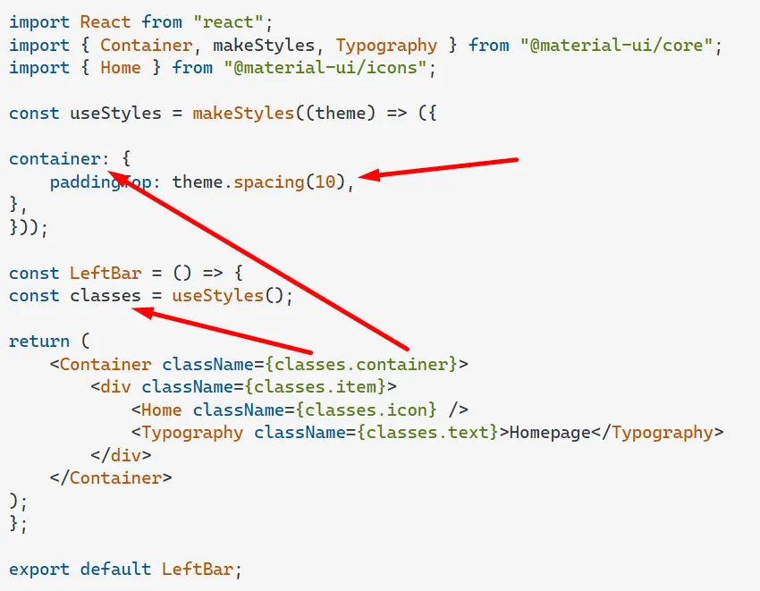
export default App;import React from "react";
import { Container, makeStyles, Typography } from "@material-ui/core";
import { Home } from "@material-ui/icons";
const useStyles = makeStyles((theme) => ({
container: {
paddingTop: theme.spacing(10),
},
}));
const LeftBar = () => {
const classes = useStyles();
return (
<Container className={classes.container}>
<div className={classes.item}>
<Home className={classes.icon} />
<Typography className={classes.text}>Homepage</Typography>
</div>
</Container>
);
};
export default LeftBar;
在版本4.0之前,我们可以在Typography组件上使用makeStyles或styles props来设置边距。
我强烈建议使用material ui的5.0版本,在这个版本中,Typography具有margin props,使生活更加轻松。
首先在主题提供程序中设置初始间距,即包含您应用程序入口的标记。它应该看起来像这样
import { createMuiTheme } from '@material-ui/core/styles';
import purple from '@material-ui/core/colors/purple';
import green from '@material-ui/core/colors/green';

const theme = createMuiTheme({
  palette: {
    primary: {
      main: purple[500],
    },
    secondary: {
      main: green[500],
    },
  },
});
function App() {
  return (
      <ThemeProvider theme={theme}>
        <LandingPage />
      </ThemeProvider>
  );
 }
就是这样。所以将主题部分添加到代码中,并根据需要使用边距/填充。
const theme = {
  spacing: 8,
}

<Box m={-2} /> // margin: -16px;
<Box m={0} /> // margin: 0px;
<Box m={0.5} /> // margin: 4px;
<Box m={2} /> // margin: 16px;
const theme = {
  spacing: value => value ** 2,
}

<Box m={0} /> // margin: 0px;
<Box m={2} /> // margin: 4px;
或者
<Box m="2rem" /> // margin: 2rem;
<Box mx="auto" /> // margin-left: auto; margin-right: auto
Box组件。这样做推荐吗? - oskrggBox(没有任何component修饰)是div的简写。它试图将每个提供的属性映射到其div的相应CSS属性。这通常有助于将此类属性保留在“代码”空间中,而不是强制开发人员查找和更改样式、主题等。我认为这个特定的答案是一个推荐和适当的用法。总的来说,Box并不比添加一个div更糟糕。 - Tom Stambaugh