如何为Material-UI的文本框添加样式

102

我一直在试图弄清楚如何为一个Material-UI TextField组件添加样式。

<TextField
    id="email"
    label="Email"
    className={classes.textField}
    value={this.state.form_email}
    onChange={this.handle_change('form_email')}
    margin="normal"
/>

我的课程创建方式如下:

const styles = theme => ({
    textField: {
        width: '90%',
        marginLeft: 'auto',
        marginRight: 'auto',
        color: 'white',
        paddingBottom: 0,
        marginTop: 0,
        fontWeight: 500
    },
});

我的问题是,我似乎无法将文本字段的颜色更改为白色。我似乎可以对整个文本字段应用样式(因为宽度样式有效等),但我认为问题在于我没有将样式进一步传递到实际输入框中。

我尝试查看其他有关传递inputProps的答案,但没有成功。

已经尽力尝试了一切,但认为我需要问一下是否有人知道我做错了什么。
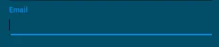
目前的外观

带有蓝色背景和略浅蓝色标签的文本字段

11个回答

91
所有这里的答案都展示了如何使用InputProps或inputProps来进行样式设置,但没有人解释为什么以及它是如何工作的。也没有人解释inputProps和InputProps之间的区别。
<TextField    
    variant="outlined"
    // inputProps are used to pass attributes native to the underlying 
    // HTML input element, e.g. name, id, style.
    inputProps={{
      style: { textAlign: 'center' },
    }

    // InputProps (capital I) passes props to the wrapper Material 
    // component. Can be  one of the following: Input, FilledInput, 
    // OutlinedInput. You can pass here anything that the underlying
    // Material component uses: error, value, onChange, and classes.
    InputProps={{
       // Usually you don't need className, the `classes` object will
       // be sufficient. However, you can also use it and this will
       // add your class to the div of the InputBase.
       className: styles.slider_filter_input, 
       classes: {
          root: classes.root
          focused: classes.focused
          // The list of keys you pass here depend on your variant
          // If for example you used variant="outlined", then you need
          // to check the CSS API of the OutlinedInput.
       }
    }}
/>

这里是一个展示了上述想法的工作中的codesandbox


谢谢,终于有人解释了。如果您能解释为什么样式属性有时会起作用就太好了(例如:<TextField style={{margin: 15, color: 'blue'}} />,边距有效但颜色不起作用...再次感谢。 - Psartek
1
@NielsDominguez,您所描述的问题与Material-Ui无关,而是与CSS的工作方式有关。当您向组件添加样式时,如果该样式未起作用,则意味着某些更具体的样式正在应用于该规则-基于CSS特异性规则。 - ehab
@NielsDominguez 无论如何,请注意您的示例<TextField style={{margin: 15, color: 'blue'}} />将无法正常工作,因为您正在将样式作为属性传递给TextField组件,而该组件不会对该prop进行任何操作。当将style props传递给像div这样的本机dom元素时,它们将被应用为内联样式。当您将它们传递给React组件时,该React组件需要像处理任何其他prop一样处理它。通常,Material UI组件使用inputProps等props将样式传递给底层本机元素。 - ehab
1
虽然这并不重要,但这应该是被接受的答案。 - Raydot

90

您需要将InputProps属性添加到TextField中。

const styles = theme => ({
    textField: {
        width: '90%',
        marginLeft: 'auto',
        marginRight: 'auto',            
        paddingBottom: 0,
        marginTop: 0,
        fontWeight: 500
    },
    input: {
        color: 'white'
    }
});

JSX:

<TextField
    id="email"
    label="Email"
    className={classes.textField}
    value={this.state.form_email}
    onChange={this.handle_change('form_email')}
    margin="normal"
    InputProps={{
        className: classes.input,
    }}
/>

另外,您还可以根据此处的说明样式化标签或使用覆盖。


这两个className有什么不同,换句话说,为什么MUI需要不止一个?(相对于例如从主题中进入textField CSS规则的“白色”颜色) - Dan Dascalescu
2
谢谢,这个很有效。当涉及到让你知道必须使用“InputProps”来样式化文本字段时,“Material-UI”文档并不清楚。 - Nick Kinlen
谢谢,我的朋友。一切都很顺利。 - MOHAMMED NABAWY

24

这是带有内联样式的解决方案:

<TextField
    style={{
        backgroundColor: "blue"
    }}
    InputProps={{
        style: {
            color: "red"
        }
    }}
/>

19

我的建议是保持你的风格在一个主题内。

const theme = createMuiTheme({
  overrides: {
    MuiInputBase: {
      input: {
        background: "#fff",
      },
    },
  },
});

太棒了!如果你使用多个文本字段,这是最好的解决方案。 - Gaurav
HTML代码行是什么样子的? - mattsmith5

6
这真的取决于您要更改的内容。文档中有许多关于自定义 TextFields 的示例,请在此处查看:https://material-ui.com/demos/text-fields/#customized-inputs。关于自定义的更多信息可以在这里找到:https://material-ui.com/customization/overrides/https://material-ui.com/customization/themes/。您是否尝试使用 !important 更改颜色?当我尝试为 outlined TextField 设置默认边框颜色时,我也遇到了同样的问题。请参考此链接:https://stackblitz.com/edit/material-ui-custom-outline-color

4
您可以将样式传递给层次结构中的任何子元素:
TextField > Input > input (HTML 元素)
请注意,InputPropsinputProps 中的大写或小写是不同的。
// pass styles (or props) to the Input component 
<TextField InputProps={{className: classes.input}} />

// pass styles (or props) to the inner input element 
<TextField inputProps={{className: classes.input}} />

3
尝试使用TextField上的inputStyle属性。从文档中了解到...

inputStyle(对象)-用于覆盖TextField输入元素的内联样式。 当multiLine为false时:定义输入元素的样式。 当multiLine为true时:定义文本区域容器的样式。

<TextField inputStyle={{ backgroundColor: 'red' }} />

3
<TextField
          color="whitish"
          label="Enter Your Name"
          type="Text"
          InputLabelProps={{
            style: { color: "white" },
          }}
          sx={{
            ".css-x2l1vy-MuiInputBase-root-MuiOutlinedInput-root": {
              color: "white",
            },
          }}
          InputProps={{
            sx: {
              ".css-1d3z3hw-MuiOutlinedInput-notchedOutline": {
                border: "2px solid white",
              },
              "&:hover": {
                ".css-1d3z3hw-MuiOutlinedInput-notchedOutline": {
                  border: "2px solid white",
                },
              },
            },
          }}
          size="medium"
          variant="outlined"
          fullWidth
          value={name}
          onChange={(e) => {
            setName(e.target.value);
          }}
        />

自定义悬停、颜色和边框的文本输入框


你不会特别针对那些生成的类名进行目标定位。 - SeanMC

3
从 MUI V5 开始,您可以使用 sx 属性更改样式设置。您仍然需要使用 inputProps 将这些属性传递给输入字段。您可以考虑像这样进行操作:
              <TextField
                sx={{ marginTop: 10 }}
                inputProps={{ sx: {color: '#fff'} }}  
              />

MUI V5中的SX属性


0
尝试使用FilledInput组件,而不是TextField 。然后,您可以像这样使用简单的内联样式: style={{color:'white'}} 这也会使占位符文本变浅…太棒了。

网页内容由stack overflow 提供, 点击上面的
可以查看英文原文,
原文链接