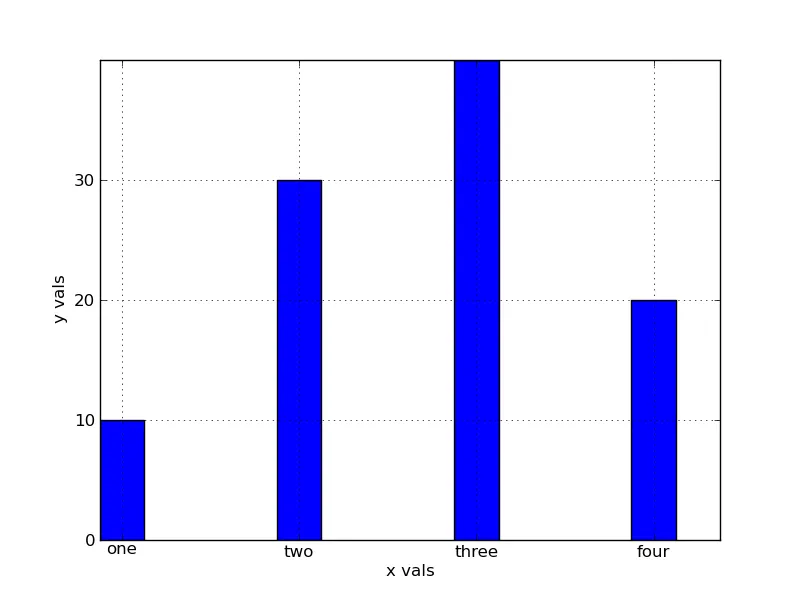
我有一个条形图的代码片段如下...当你运行它时,你会得到4个条形,其中第一个条形紧靠着y轴。是否有可能在y轴和第一个条形之间留出一些间隙?
输出如下:
def plot_graph1():
    xvals = range(4)
    xnames=["one","two","three","four"]
    yvals = [10,30,40,20]
    width = 0.25
    yinterval = 10
    figure = plt.figure()
    plt.grid(True)
    plt.xlabel('x vals')
    plt.ylabel('y vals')
    plt.bar(xvals, yvals, width=width)
    plt.xticks([ x+(width/2) for x in  xvals],[x for x in xnames])
    plt.yticks(range(0,max(yvals),yinterval))
    figure.savefig("barchart.png",format="png")
    plt.show()
if __name__=='__main__':
    plot_graph1()
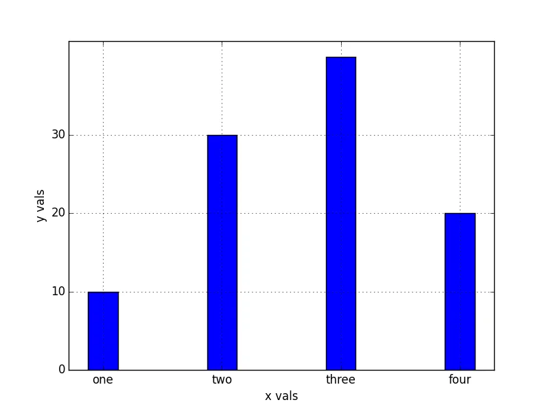
输出如下: