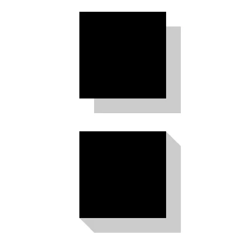
我知道如何使用CSS3实现基本的盒子阴影,您可以在下面的图形顶部看到。
我想要实现的效果是一个三维盒子阴影,如下图底部所示。
有没有关于如何使用CSS3盒子阴影实现这个效果的想法?
我知道如何使用CSS3实现基本的盒子阴影,您可以在下面的图形顶部看到。
我想要实现的效果是一个三维盒子阴影,如下图底部所示。
有没有关于如何使用CSS3盒子阴影实现这个效果的想法?
不幸的是,盒子阴影实际上只是平面层。但是您可以应用多个盒子阴影来创建此效果。
.box-shadow-3d{
    box-shadow: 1px 1px 0px #999,
                2px 2px 0px #999,
                3px 3px 0px #999,
                4px 4px 0px #999,
                5px 5px 0px #999,
                6px 6px 0px #999;
}
你可以使用伪元素作为阴影
div {
  background: black;
  height: 100px;
  width: 100px;
  position: relative;
}
div:after,
div:before {
  content: '';
  background: grey;
  position: absolute;
}
div:after {
  width: 100%;
  height: 20px;
  left: 10px;
  bottom: 0;
  transform: translatey(100%) skewx(45deg);
}
div:before {
  width: 20px;
  height: 100%;
  right: 0;
  transform: translatex(100%) skewy(45deg);
  top: 10px;
}<div></div>这里是用 perspective 和伪元素:before实现的真正的3D阴影。
body {
  background: lightblue;
}
.foo {
  position: relative;
  display: inline-block;
  -webkit-perspective: 1000px;
  -moz-perspective: 1000px;
  persepctive: 1000px;
  margin: 20px;
  margin-top: 50px;
}
.foo .box {
  transform: rotateY(-40deg);
  height: 350px;
  width: 250px;
  background-color: black;
}
.foo:before {
  content: "";
  top: -15px;
  position: absolute;
  width: 50px;
  height: 375px;
  background-color: grey;
  transform: translateX(215px) translateY(2.7px) rotateY(55deg)
}<div class="foo">
<div class="box"></div>
</div>div {
background: black;
height: 100px;
width: 100px;
box-shadow: 0 01px gray,
01px 0 gray,
01px 02px gray,
02px 01px gray,
02px 03px gray,
03px 02px gray,
03px 04px gray,
04px 03px gray,
04px 05px gray,
05px 04px gray,
05px 06px gray,
06px 05px gray;
}
lightgray应用于右侧和darkgray应用于下方。 - Aaron Gillion以下是一段小型的实现,受到 @Vitorino Fernandes 的启发,使用 Stylus 实现...
offset = 10
border = 3
.offsetbox
   margin offset
   padding offset
   text-align center
   box-shadow inset 0 0 0 unit(border,px) black
   background white
   display inline-block
   position relative
   &:after,
   &:before
      content ''
      background black
      position absolute
   &:after
      width 100%
      height offset
      transform translatey(100%) skewx(-45deg)
      right (offset/2)
      bottom 0
   &:before
      height 100%
      width offset
      transform: translatex(-100%) skewy(-45deg)
      left 0
      top (offset/2)
div {
  background: #bbb;
  padding: 1em 1.2em;
  width: 50%;
  margin: 0 auto;
  color: #111;
  font: 150%/1.2 Georgia, Palatino, Times, serif;
  position: relative;
}

div:after {
  content:" ";
  position:absolute;
  top:0;
  left: 0;
  width:100%;
  height:100%;
  padding: 1.42em; /* (square root of gradient position) */
  background: #000; /* Fallback if not supported */
  background: linear-gradient(-135deg, transparent 2em, #000 0) top right,
    linear-gradient(#000, #000) padding-box bottom right,
    linear-gradient(45deg, transparent 2em, #000 0) bottom left;
    /*I have avoided adding -webkit-, -moz and -0 prefixs for linear-gradient.  You may put them in later to be extra safe*/
    background-size: 50% 50%; /* There is no reason to paint the upper left quadrant, so I didn't. */
    background-repeat: no-repeat;
    -webkit-box-sizing: content-box;  -moz-box-sizing: content-box;  box-sizing: content-box;
    /*  Many people use border-box as default these days. Unfortunately, the box cannot be sized using border-box settings with the combination of padding in ems and percentages.  So this is reset to content-box, just in case.   */
z-index: -1; /* To keep the shadow behind the div*/<div>This is a short sentence to demonstrate that our little div is responsive.</div>:root {
--shadow-dimension: 20px;
--blue: #0039a6;
}
.box-container {
position: relative;
}
.box-container>div {
border: 2px solid var(--blue);
}
.box-container>div:after, .box-container>div:before {
content: '';
background-color: var(--blue);
position: absolute;
}
.box-container>div:before {
width: calc(var(--shadow-dimension) + 1px);
height: calc(100% + 100px + 1px);
left: calc(var(--shadow-dimension) * -1);
transform: skewy(-45deg);
top: calc(0.5*var(--shadow-dimension));
clip-path: polygon(0% 0%, 100% 0%, 100% calc(100% - 100px - 2px + var(--shadow-dimension)), 0% calc(100% - 100px - 2px));
}
.box-container>div:after {
width: calc(100% + 100px);
height: calc(var(--shadow-dimension) + 1px);
left: calc(-0.5*var(--shadow-dimension) - 100px);
bottom: 1px;
transform: translateY(100%) skewx(-45deg);
clip-path: polygon(100px 0%, 100% 0%, 100% 100%, calc(100px + 2px) 100%);
}