使用multiplot设置图形间的边距

3
为了展示多个图表,我使用了multiplot (http://www.cookbook-r.com/Graphs/Multiple_graphs_on_one_page_(ggplot2)/)。现在我有两张图表,它们共享相同的x轴范围,并且分别位于上下位置。
multiplot(plot1, plot2)

我使用以下方法去除了x轴标签和标题:

xlab(NULL) + theme(axis.text.x=element_blank(),axis.ticks.x=element_blank())

但是两个图之间仍然存在白色边距。我该如何使这个边距更小或者去掉它?

如果它们具有相同的x轴范围,为什么不使用分面呢? - joran
由于使用的变量位于不同的列中(两种不同类型的计数数据),而不是与 facet wrapping 一起使用的“groups”。 - Shark167
2
但如果这些值在相同的比例尺上,我肯定会通过重新排列我的数据框并堆叠这两个组来处理,以便我可以使用分面。 - joran
在这种情况下,这并不是构建我所追求的图形的最佳方式。 - Shark167
如果问题是数据存储在两列中,我们可以利用reshape轻松地调整数据。搞定了。 - daniel
3个回答

6
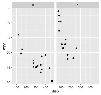
为了减少图形之间的空间,需要删除上面图形的底边距和下面图形的顶边距。以下代码将这些边距设置为0,这仍然会导致微小的白色空间在两个图形之间。您可以将这些边距稍微设置为负值(例如-0.1)以完全消除空间。我们使用gridExtra包中的grid.arrange函数而不是multiplot函数来布置这些图形。
library(grid)
library(gridExtra)

## Create two sample plots with the same x axis using built-in mtcars data frame

# Top plot: Remove bottom margin, x-labels, and x title
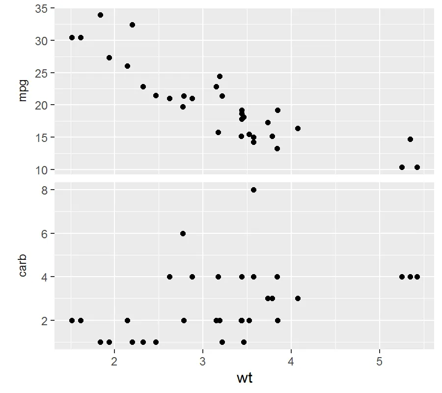
p1 = ggplot(mtcars, aes(wt, mpg)) + geom_point() + 
  xlab(NULL) + 
  theme(axis.text.x=element_blank(),axis.ticks.x=element_blank(),
        plot.margin=unit(c(1,1,0,1), "lines"))

# Bottom plot: Remove top margin
p2 = ggplot(mtcars, aes(wt, carb)) + geom_point() +
  theme(plot.margin=unit(c(0,1,1,1), "lines"))

# Lay out plots in one column
grid.arrange(p1, p2, ncol=1) 

图片描述

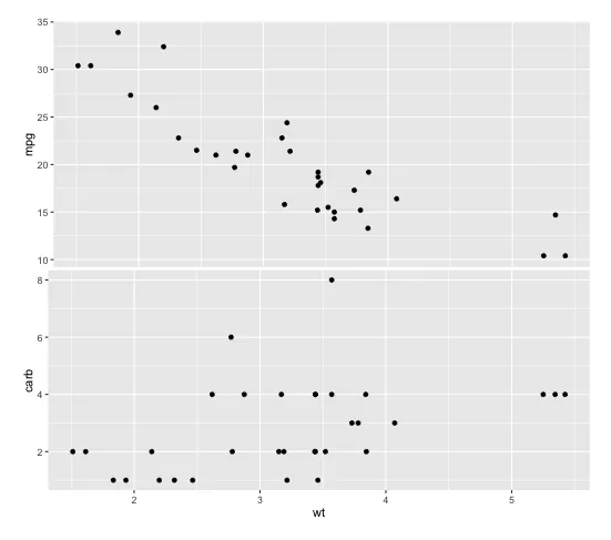
以上布局存在两个问题:(1) y轴未对齐,(2) 下图的绘图区高度小于上图。以下代码解决了这些问题:

# Left justify plots
# Source: https://dev59.com/ImYr5IYBdhLWcg3w6eQ3#13295880
gA <- ggplotGrob(p1)
gB <- ggplotGrob(p2)

maxWidth = grid::unit.pmax(gA$widths[2:5], gB$widths[2:5])
gA$widths[2:5] <- as.list(maxWidth)
gB$widths[2:5] <- as.list(maxWidth)

# Lay out justified plots. Use heights argument to equalize heights of each plot area
grid.arrange(gA, gB, heights=c(0.47,0.53), ncol=1)

在此输入图片描述

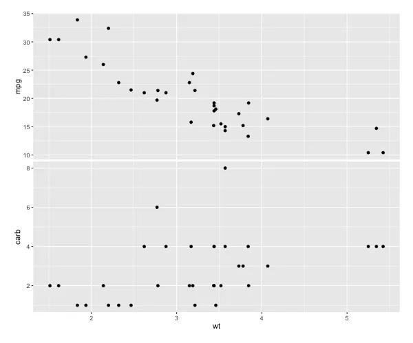
您可以使用与左对齐图形相同的技巧确切地使每个绘图区的高度相等(而不是使用grid.arrangeheights参数通过肉眼调整),但然后绘图边距会被添加回去。我不确定如何处理这个问题,但下面是参考代码:

maxHeight = grid::unit.pmax(gA$heights[2:5], gB$heights[2:5])
gA$heights[2:5] <- as.list(maxHeight)
gB$heights[2:5] <- as.list(maxHeight)

我发现这正是我所寻找的主题(plot.margin=unit(c(0,1,1,1), "lines"))。 - Markm0705

2
< p > 最新的 ggplot2 更新使绘图更加可控。例如:

ggplot(mtcars, aes(disp, mpg)) +
     geom_point() +
     facet_wrap(~vs)

你可以进一步调整标签,行数和比例尺的显示方式,例如:nrow = 2scales = "free"图片描述

2
很容易重新排列数据,以便利用ggplot2中已经存在的良好对齐功能。请参见下面的示例,复制eipi10的答案,但无需使用ggplotGrob。
您需要做的就是选择要绘制的列,以及ID列(在本例中为汽车型号和x轴值列)。然后融化,并使用标准分面程序准备绘图。
请注意,facet_grid调用中的"switch"选项是一个新功能,您可以通过更新到最新的CRAN版本来访问该功能。我使用它替换了常规的y轴标题,该标题使用theme被省略。
这种方法的好处是,图形始终完美对齐。
library("ggplot2")
library("dplyr")
library("reshape2")

df <- mtcars %>% 
  add_rownames(var = "Model") %>%
  select(Model, wt, mpg, carb) %>%
  melt(id.vars = c("Model","wt"))

ggplot(df)+
  aes(x=wt, y=value)+
  geom_point()+
  theme(strip.background=element_blank())+
  facet_grid(variable ~ ., scales="free_y", switch="y")

enter image description here


这对我在另一个问题上非常有帮助,非常感谢! - Shark167

网页内容由stack overflow 提供, 点击上面的
可以查看英文原文,
原文链接