我正在尝试使用pyplot创建一个具有不连续x轴的图表。通常情况下,这是这样绘制的:
(数值)----//----(后面的数值)
//表示你跳过了(数值)和(后面的数值)之间的所有内容。
我没有找到任何关于此的示例,所以我想知道是否可能实现。我知道您可以将数据连接起来,例如金融数据,但我想使轴上的跳跃更加明显。目前,我只是使用子图,但我真的很希望最终能在同一张图表上呈现所有内容。
我正在尝试使用pyplot创建一个具有不连续x轴的图表。通常情况下,这是这样绘制的:
(数值)----//----(后面的数值)
//表示你跳过了(数值)和(后面的数值)之间的所有内容。
我没有找到任何关于此的示例,所以我想知道是否可能实现。我知道您可以将数据连接起来,例如金融数据,但我想使轴上的跳跃更加明显。目前,我只是使用子图,但我真的很希望最终能在同一张图表上呈现所有内容。
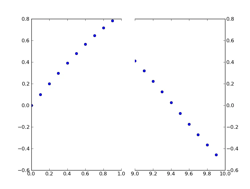
import matplotlib.pylab as plt
import numpy as np

# If you're not familiar with np.r_, don't worry too much about this. It's just
# a series with points from 0 to 1 spaced at 0.1, and 9 to 10 with the same spacing.
x = np.r_[0:1:0.1, 9:10:0.1]
y = np.sin(x)

fig,(ax,ax2) = plt.subplots(1, 2, sharey=True)

# plot the same data on both axes
ax.plot(x, y, 'bo')
ax2.plot(x, y, 'bo')

# zoom-in / limit the view to different portions of the data
ax.set_xlim(0,1) # most of the data
ax2.set_xlim(9,10) # outliers only

# hide the spines between ax and ax2
ax.spines['right'].set_visible(False)
ax2.spines['left'].set_visible(False)
ax.yaxis.tick_left()
ax.tick_params(labeltop='off') # don't put tick labels at the top
ax2.yaxis.tick_right()

# Make the spacing between the two axes a bit smaller
plt.subplots_adjust(wspace=0.15)

plt.show()
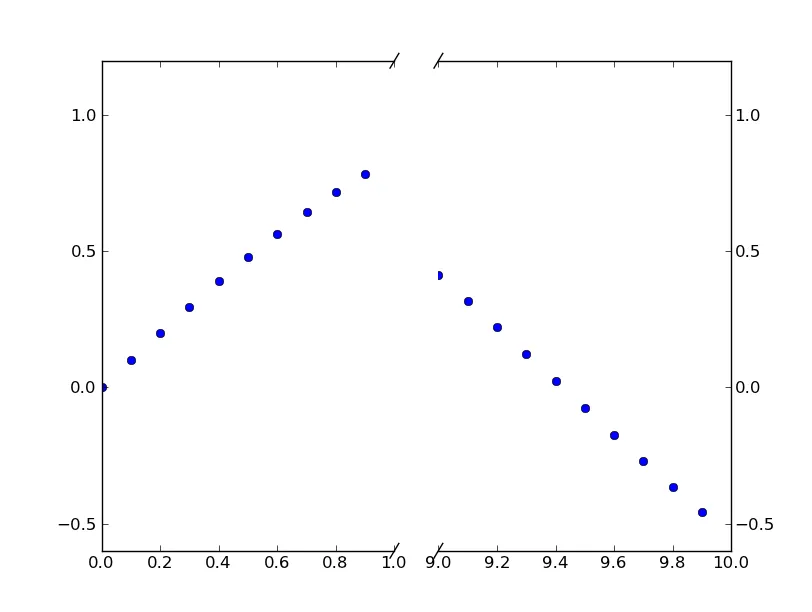
为了添加破折线轴线的效果,我们可以这样做(再次修改自Paul Ivanov的示例):
import matplotlib.pylab as plt
import numpy as np

# If you're not familiar with np.r_, don't worry too much about this. It's just
# a series with points from 0 to 1 spaced at 0.1, and 9 to 10 with the same spacing.
x = np.r_[0:1:0.1, 9:10:0.1]
y = np.sin(x)

fig,(ax,ax2) = plt.subplots(1, 2, sharey=True)

# plot the same data on both axes
ax.plot(x, y, 'bo')
ax2.plot(x, y, 'bo')

# zoom-in / limit the view to different portions of the data
ax.set_xlim(0,1) # most of the data
ax2.set_xlim(9,10) # outliers only

# hide the spines between ax and ax2
ax.spines['right'].set_visible(False)
ax2.spines['left'].set_visible(False)
ax.yaxis.tick_left()
ax.tick_params(labeltop='off') # don't put tick labels at the top
ax2.yaxis.tick_right()

# Make the spacing between the two axes a bit smaller
plt.subplots_adjust(wspace=0.15)

# This looks pretty good, and was fairly painless, but you can get that
# cut-out diagonal lines look with just a bit more work. The important
# thing to know here is that in axes coordinates, which are always
# between 0-1, spine endpoints are at these locations (0,0), (0,1),
# (1,0), and (1,1). Thus, we just need to put the diagonals in the
# appropriate corners of each of our axes, and so long as we use the
# right transform and disable clipping.

d = .015 # how big to make the diagonal lines in axes coordinates
# arguments to pass plot, just so we don't keep repeating them
kwargs = dict(transform=ax.transAxes, color='k', clip_on=False)
ax.plot((1-d,1+d),(-d,+d), **kwargs) # top-left diagonal
ax.plot((1-d,1+d),(1-d,1+d), **kwargs) # bottom-left diagonal

kwargs.update(transform=ax2.transAxes) # switch to the bottom axes
ax2.plot((-d,d),(-d,+d), **kwargs) # top-right diagonal
ax2.plot((-d,d),(1-d,1+d), **kwargs) # bottom-right diagonal

# What's cool about this is that now if we vary the distance between
# ax and ax2 via f.subplots_adjust(hspace=...) or plt.subplot_tool(),
# the diagonal lines will move accordingly, and stay right at the tips
# of the spines they are 'breaking'

plt.show()
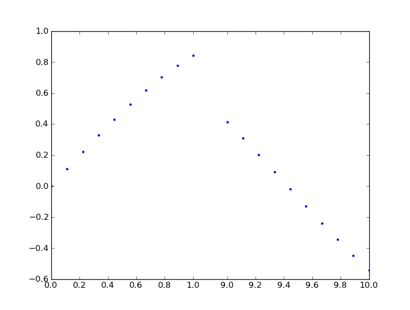
GridSpec(width_ratio=[n,m])吗? - Frederick Nord我看到有很多人对此功能提出了建议,但没有迹象表明它已经被实现。这里是一个可行的解决方案,目前可以使用。它将阶跃函数变换应用于x轴。虽然代码很长,但它相当简单,因为大部分都是样板定制比例尺的内容。我没有添加任何图形来指示断点的位置,因为那是一个风格问题。祝你完成工作顺利。
from matplotlib import pyplot as plt
from matplotlib import scale as mscale
from matplotlib import transforms as mtransforms
import numpy as np

def CustomScaleFactory(l, u):
    class CustomScale(mscale.ScaleBase):
        name = 'custom'

        def __init__(self, axis, **kwargs):
            mscale.ScaleBase.__init__(self)
            self.thresh = None #thresh

        def get_transform(self):
            return self.CustomTransform(self.thresh)

        def set_default_locators_and_formatters(self, axis):
            pass

        class CustomTransform(mtransforms.Transform):
            input_dims = 1
            output_dims = 1
            is_separable = True
            lower = l
            upper = u
            def __init__(self, thresh):
                mtransforms.Transform.__init__(self)
                self.thresh = thresh

            def transform(self, a):
                aa = a.copy()
                aa[a>self.lower] = a[a>self.lower]-(self.upper-self.lower)
                aa[(a>self.lower)&(a<self.upper)] = self.lower
                return aa

            def inverted(self):
                return CustomScale.InvertedCustomTransform(self.thresh)

        class InvertedCustomTransform(mtransforms.Transform):
            input_dims = 1
            output_dims = 1
            is_separable = True
            lower = l
            upper = u

            def __init__(self, thresh):
                mtransforms.Transform.__init__(self)
                self.thresh = thresh

            def transform(self, a):
                aa = a.copy()
                aa[a>self.lower] = a[a>self.lower]+(self.upper-self.lower)
                return aa

            def inverted(self):
                return CustomScale.CustomTransform(self.thresh)

    return CustomScale

mscale.register_scale(CustomScaleFactory(1.12, 8.88))

x = np.concatenate((np.linspace(0,1,10), np.linspace(9,10,10)))
xticks = np.concatenate((np.linspace(0,1,6), np.linspace(9,10,6)))
y = np.sin(x)
plt.plot(x, y, '.')
ax = plt.gca()
ax.set_xscale('custom')
ax.set_xticks(xticks)
plt.show()
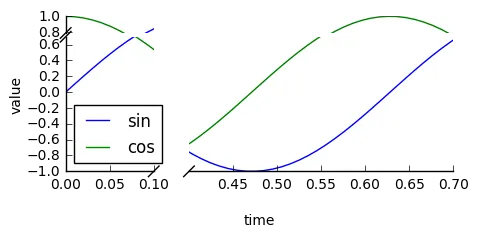
查看brokenaxes包:
import matplotlib.pyplot as plt
from brokenaxes import brokenaxes
import numpy as np

fig = plt.figure(figsize=(5,2))
bax = brokenaxes(
    xlims=((0, .1), (.4, .7)),
    ylims=((-1, .7), (.79, 1)),
    hspace=.05
)
x = np.linspace(0, 1, 100)
bax.plot(x, np.sin(10 * x), label='sin')
bax.plot(x, np.cos(10 * x), label='cos')
bax.legend(loc=3)
bax.set_xlabel('time')
bax.set_ylabel('value')
pip install brokenaxes==0.2 来安装修复后的代码版本。 - ben.dichter# FAKE BROKEN AXES
# plot a white rectangle on the x-axis-spine to "break" it
xpos = 10 # x position of the "break"
ypos = plt.gca().get_ylim()[0] # y position of the "break"
plt.scatter(xpos, ypos, color='white', marker='s', s=80, clip_on=False, zorder=100)
# draw "//" on the same place as text
plt.text(xpos, ymin-0.125, r'//', fontsize=label_size, zorder=101, horizontalalignment='center', verticalalignment='center')
示例绘图:
CutoffScale参数设置合理的默认刻度位置。针对Frederick Nord的问题,如何在使用不等于1:1比率的网格规范时启用对角线“断裂”线的并行方向,可以根据Paul Ivanov和Joe Kingtons的建议进行以下更改。宽度比例可以使用变量n和m进行变化。
import matplotlib.pylab as plt
import numpy as np
import matplotlib.gridspec as gridspec

x = np.r_[0:1:0.1, 9:10:0.1]
y = np.sin(x)

n = 5; m = 1;
gs = gridspec.GridSpec(1,2, width_ratios = [n,m])

plt.figure(figsize=(10,8))

ax = plt.subplot(gs[0,0])
ax2 = plt.subplot(gs[0,1], sharey = ax)
plt.setp(ax2.get_yticklabels(), visible=False)
plt.subplots_adjust(wspace = 0.1)

ax.plot(x, y, 'bo')
ax2.plot(x, y, 'bo')

ax.set_xlim(0,1)
ax2.set_xlim(10,8)

# hide the spines between ax and ax2
ax.spines['right'].set_visible(False)
ax2.spines['left'].set_visible(False)
ax.yaxis.tick_left()
ax.tick_params(labeltop='off') # don't put tick labels at the top
ax2.yaxis.tick_right()

d = .015 # how big to make the diagonal lines in axes coordinates
# arguments to pass plot, just so we don't keep repeating them
kwargs = dict(transform=ax.transAxes, color='k', clip_on=False)

on = (n+m)/n; om = (n+m)/m;
ax.plot((1-d*on,1+d*on),(-d,d), **kwargs) # bottom-left diagonal
ax.plot((1-d*on,1+d*on),(1-d,1+d), **kwargs) # top-left diagonal
kwargs.update(transform=ax2.transAxes) # switch to the bottom axes
ax2.plot((-d*om,d*om),(-d,d), **kwargs) # bottom-right diagonal
ax2.plot((-d*om,d*om),(1-d,1+d), **kwargs) # top-right diagonal

plt.show()
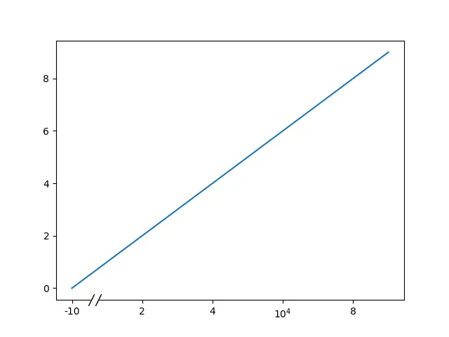
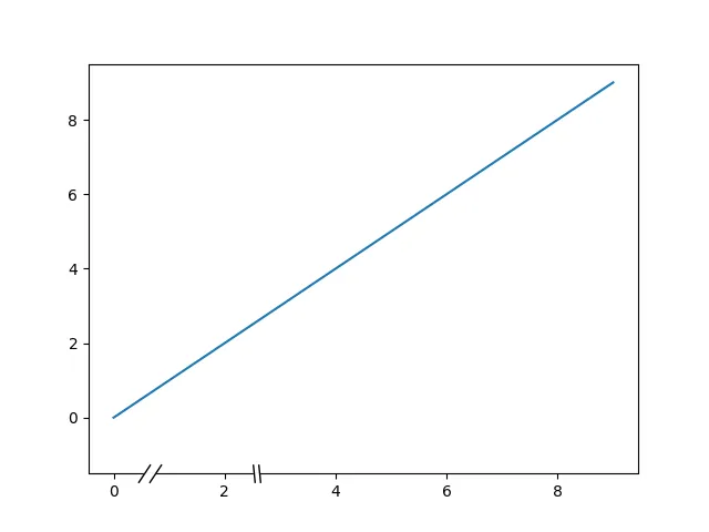
这是一种针对x轴中断的hacky但相当不错的解决方案。
该解决方案基于https://matplotlib.org/stable/gallery/subplots_axes_and_figures/broken_axis.html,它消除了在脊柱上方定位中断的问题,这个问题可以通过如何使用matplotlib绘制点使其出现在脊柱的上方?来解决。
from matplotlib.patches import Rectangle
import matplotlib.pyplot as plt

def axis_break(axis, xpos=[0.1, 0.125], slant=1.5):
    d = slant  # proportion of vertical to horizontal extent of the slanted line
    anchor = (xpos[0], -1)
    w = xpos[1] - xpos[0]
    h = 1

    kwargs = dict(marker=[(-1, -d), (1, d)], markersize=12, zorder=3,
                linestyle="none", color='k', mec='k', mew=1, clip_on=False)
    axis.add_patch(Rectangle(
        anchor, w, h, fill=True, color="white",
        transform=axis.transAxes, clip_on=False, zorder=3)
    )
    axis.plot(xpos, [0, 0], transform=axis.transAxes, **kwargs)

fig, ax = plt.subplots(1,1)
plt.plot(np.arange(10))
axis_break(ax, xpos=[0.1, 0.12], slant=1.5)
axis_break(ax, xpos=[0.3, 0.31], slant=-10)
from matplotlib import ticker

def replace_pos_with_label(fig, pos, label, axis):
    fig.canvas.draw()  # this is needed to set up the x-ticks
    labs = axis.get_xticklabels()
    labels = []
    locs = []
    for text in labs:
        x = text._x
        lab = text._text

        if x == pos:
            lab = label

        labels.append(lab)
        locs.append(x)

    axis.xaxis.set_major_locator(ticker.FixedLocator(locs))
    axis.set_xticklabels(labels)

fig, ax = plt.subplots(1,1)
plt.plot(np.arange(10))
replace_pos_with_label(fig, 0, "-10", axis=ax)
replace_pos_with_label(fig, 6, "$10^{4}$", axis=ax)
axis_break(ax, xpos=[0.1, 0.12], slant=2)