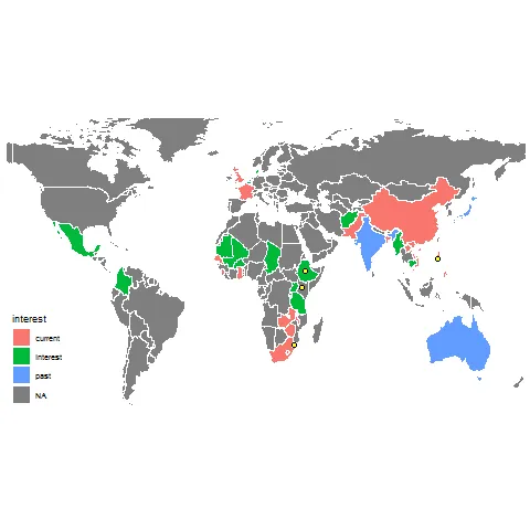
我正在尝试制作一个优雅的地图,显示组织有兴趣合作的国家。我已经制作了下面的地图,但希望通过去掉国界线使其更加精美,除非两个有兴趣的国家共享边界-例如南非和津巴布韦之间。我查阅了许多教程,但找不到相关信息。
最后,我想为城市数据添加一个图例。
以下是代码:
最后,我想为城市数据添加一个图例。
以下是代码:
world <- map_data("world")
countries <- read_excel("country_table.xlsx", sheet = 3) #table of coutries with interest

world3 <- merge(world, countries, all.x = TRUE)
world4 <- arrange(world4, order)

city <- read_excel("country_table.xlsx", sheet = 4) #city data
city$long <- as.numeric(city$long)
city$lat <- as.numeric(city$lat)

ggplot(world4, aes(x = long, y = lat, group = group, fill = interest)) +
  geom_polygon(col = "white") +
  #scale_fill_manual(breaks = c("interest", "past", "current"), values = c("#4dc11d","#26660b","#9def7a")) +
  theme_map() +
  coord_fixed(xlim = c(-130, 160), ylim = c(-50, 75), ratio = 1.3) +
  geom_point(data = city, aes(x= long, y = lat), shape = 21, inherit.aes = F, size = 2, col = "black", fill = "yellow")
生成:
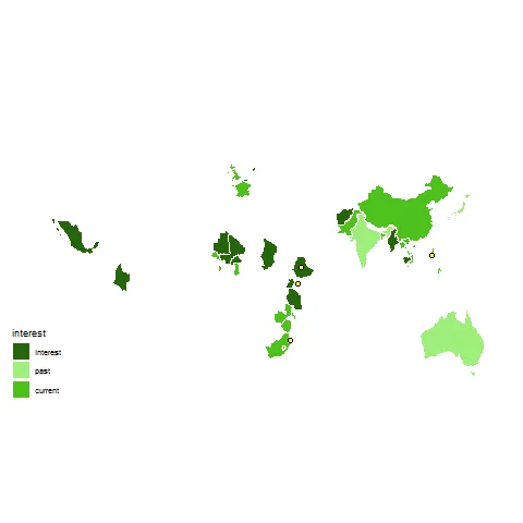
此外,我想使用绿色比例来表示国家,图例的顺序为:“兴趣”,“过去”,“现在”;从浅绿到深绿。目前,当我取消注释行“scale_fill_manual”时,我会失去所有NA数据,产生以下图片。我尝试通过多种方式添加此内容,但无法使其正常工作。为了清楚表达我的意思,这是当我取消该注释时代码所生成的内容:
对于任何一个问题的帮助都将不胜感激。