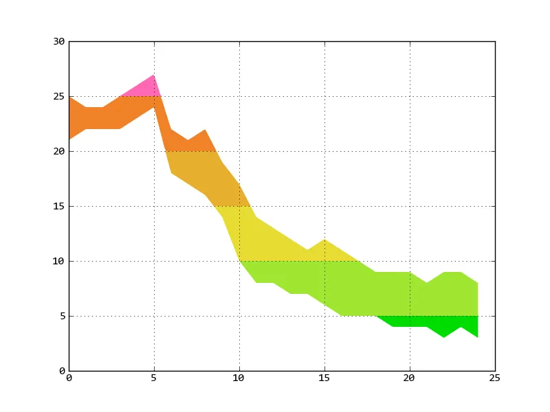
我是一名新的matplotlib用户。我想绘制一个颜色编码的数据线,或者更好的是,一个颜色编码的数据范围。在y轴上对间隔进行颜色编码。以下是一个简单的演示脚本:
import matplotlib.pyplot as plt

# dummy test data
datapoints = 25
maxtemps = [ 25, 24, 24, 25, 26, 27, 22, 21, 22, 19, 17, 14, 13, 12, 11, 12, 11, 10, 9, 9, 9, 8, 9, 9, 8 ]
mintemps = [ 21, 22, 22, 22, 23, 24, 18, 17, 16, 14, 10, 8, 8, 7, 7, 6, 5, 5, 5, 4, 4, 4, 3, 4, 3 ]
times = list(xrange(datapoints))

# cap a filled plot at a given level
def capped(indata, cap):
    outdata  = [0] * datapoints
    lcount = 0

    while lcount < datapoints:
        if indata[lcount] > cap:
            outdata[lcount] = cap
        else:
            outdata[lcount] = indata[lcount]
        lcount += 1
    return outdata

fig = plt.figure()

ax1 = fig.add_subplot(111)
ax1.fill_between(times, 0, maxtemps, color='#FF69B4', zorder=1, linewidth=0.1)
ax1.fill_between(times, 0, capped(maxtemps,25), color='#F08228', zorder=2, linewidth=0.1)
ax1.fill_between(times, 0, capped(maxtemps,20), color='#E6AF2D', zorder=3, linewidth=0.1)
ax1.fill_between(times, 0, capped(maxtemps,15), color='#E6DC32', zorder=4, linewidth=0.1)
ax1.fill_between(times, 0, capped(maxtemps,10), color='#A0E632', zorder=5, linewidth=0.1)
ax1.fill_between(times, 0, capped(maxtemps,5), color='#00DC00', zorder=6, linewidth=0.1)
ax1.fill_between(times, 0, mintemps, color='#FFFFFF', zorder=7, linewidth=0.1)
plt.setp(ax1.get_xticklabels(), visible=False)
ax1.grid(True, zorder=8)
ylim(0)
plt.draw()
plt.show()
完成了大部分工作但有两个问题。
是否有一种更直接、更优雅的方法来使用matplotlib实现相同的效果?即绘制一个1D数组的时间序列数据,或者说明两组这样的数据之间的范围(例如最高,最低温度)?
尽我所能,我无法让网格线绘制在图形的顶部。它们总是似乎位于第一组绘制的数据的顶部,然后被随后绘制的数据所覆盖,留下了绘图的下半部分空白。使用zorder似乎被忽略了。
非常感谢。