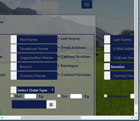
我有一个包含6个列的表格table,希望能够在不同屏幕尺寸(笔记本电脑、iPad、手机等)下固定table的td,只添加不同尺寸的滚动条即可。
<form id="NewCustFrm" style="border:2px solid rgb(16,29,73);">
<table class="table2">
<tr>
<td><label class="arrow-right"> First Name:</label></td>
<td>
<div class="input-group">
<span class="input-group-addon"><i class="fa fa-user"></i></span>
<input name="first_name" placeholder="First Name" class="form-control" type="text">
</div>
</td>
<td><label class="arrow-right"> Last Name:</label></td>
<td>
<div class="input-group">
<span class="input-group-addon"><i class="fa fa-user"></i></span>
<input name="Last_name" placeholder="Last Name" class="form-control" type="text">
</div>
</td>
<td><label class="arrow-right"> Nick Name:</label></td>
<td>
<div class="input-group">
<span class="input-group-addon"><i class="fa fa-user"></i></span>
<input name="Nick_name" placeholder="Nick Name" class="form-control" type="text">
</div>
</td>
</tr>
<tr>
<td><label class="arrow-right"> Facebook name:</label></td>
<td>
<div class="input-group">
<span class="input-group-addon"><i class="fa fa-facebook"></i></span>
<input name="Facebook_name" placeholder="Facebook Name" class="form-control" type="text">
</div>
</td>
<td><label class="arrow-right"> Email Address:</label></td>
<td>
<div class="input-group">
<span class="input-group-addon"><i class="fa fa-at"></i></span>
<input name="email" placeholder="E-Mail Address" class="form-control" type="text">
</div>
</td>
<td><label class="arrow-right"> Birth Date:</label></td>
<td>
<div class='input-group date' class='datetimepicker8'>
<span class="input-group-addon"><i class="fa fa-calendar"></i></span>
<input type='text' class="form-control" class="Frm_Date" />
</div>
</td>
</tr>
<tr>
<td><label class="arrow-right"> Organization Name:</label></td>
<td>
<div class="input-group">
<span class="input-group-addon"><i class="fa fa-building"></i></span>
<input name="Organization_Name" placeholder="Organization Name" class="form-control" type="text">
</div>
</td>
<td><label class="arrow-right"> Celfone Number:</label></td>
<td>
<div class="input-group">
<span class="input-group-addon"><i class="fa fa-phone"></i></span>
<input name="Celfone_Number" placeholder="Celfone Number" class="form-control" type="text">
</div>
</td>
<td><label class="arrow-right"> Landline Number:</label></td>
<td>
<div class="input-group">
<span class="input-group-addon"><i class="fa fa-phone"></i></span>
<input name="Landline_Number" placeholder="Landline Number" class="form-control" type="text">
</div>
</td>
</tr>
<tr>
<td><label class="arrow-right"> Branch:</label></td>
<td>
<div class="input-group">
<span class="input-group-addon"><i class="fa fa-building-o"></i></span>
<input name="Branch" placeholder="Branch" class="form-control" type="text">
</div>
</td>
<td><label class="arrow-right"> Barangay:</label></td>
<td>
<div class="input-group">
<span class="input-group-addon"><i class="fa fa-home"></i></span>
<select class="SelectCust" name="BarangayName" id="BarangayName">
<!--populate value using php-->
<?php
$stmt ="SELECT distinct Barangay_Name FROM Barangay";
foreach ($conn->query($stmt) as $row) {
?>
<option value="<?php echo $row['ID'];?>"><?php echo $row['Barangay_Name'];?></option>
<?php}?>
</select>
</div>
</td>
<td><label class="arrow-right"> Address:</label></td>
<td>
<div class="input-group">
<span class="input-group-addon"><i class="fa fa-home"></i></span>
<input name="Address" placeholder="Address" class="form-control" type="text">
</div>
</td>
</tr>
<tr>
<td><label class="arrow-right"> Other Contact Name:</label></td>
<td>
<div class="input-group">
<span class="input-group-addon"><i class="fa fa-user"></i></span>
<input name="Contact_name" placeholder="Contact Name" class="form-control" type="text">
</div>
</td>
<td><label class="arrow-right"> Contact Number:</label></td>
<td>
<div class="input-group">
<span class="input-group-addon"><i class="fa fa-phone"></i></span>
<input name="Contact_Number" placeholder="Contact Number" class="form-control" type="text">
</div>
</td>
<td><label class="arrow-right"> Other Address:</label></td>
<td>
<div class="input-group">
<span class="input-group-addon"><i class="fa fa-home"></i></span>
<input name="Other_Address" placeholder="Other Address" class="form-control" type="text">
</div>
</td>
</tr>
<tr>
<td><label class="arrow-right"> Photo:</label></td>
<td colspan="5"><!-- <label class="custom-file">
<input type="file" id="file" class="custom-file-input">
<span class="custom-file-control"></span>
</label> -->
</td>
</tr>
<tr>
<td><label class="arrow-right"> Order Type:</label></td>
<td colspan="5">
<div class="input-group">
<span class="input-group-addon"><i class="fa fa-cart-plus"></i></span>
<select class="SelectCust" name="Type" id="Type">
<option value="">Select Order Type</option>
<option value="Cacao Beans">Cacao Beans</option>
<option value="Bananas">Bananas</option>
<option value="Coconuts">Coconuts</option>
</select>
</div>
</td>
</tr>
<tr>
<td><label class="arrow-right"> Order Sub-Type:</label></td>
<td><label><input type="checkbox" value=""> Wet</label><input type="text" id="dist1" style="width:50px;" name="txtbox"> <label>Kg</label></td>
<td><label><input type="checkbox" value=""> Dry</label><input type="text" id="dist2" style="width:50px;" name="txtbox"> <label>Kg</label></td>
<td><label><input type="checkbox" value=""> Fermented</label><input type="text" id="dist3" style="width:50px;" name="txtbox"> <label>Kg</label></td>
<td></td>
<td></td>
</tr>
<tr>
<td><label class="arrow-right"> Order Date:</label></td>
<td>
<div class='input-group date' class='datetimepicker8' style="padding-left:5px;padding-right:5px;">
<input type='text' class="form-control" class="Frm_Date" />
<span class="input-group-addon">
<span class="glyphicon glyphicon-calendar"></span>
</span>
</div>
</td>
<td></td>
<td></td>
<td></td>
<td></td>
</tr>
<tr>
<td colspan="5"><button id="Find" type="button" class="btn btn-success" style="margin-left:55px;">Add Order</button>
</td>
</tr>
</table>
</form>
以及CSS代码
 table.table2
 {
  table-layout: fixed;
  width: 100%;
  white-space: nowrap;
 }
 table.table2 td
 {
  white-space: nowrap;
  overflow: hidden;
  text-overflow: ellipsis;
  word-break:break-all;
 }