我想创建一个组件,左侧或右侧有文本,旁边有一张图片。
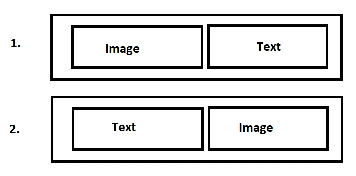
目前我只使用一个布尔参数来检查哪个元素先出现。在较大的屏幕尺寸上一切都很好,但当涉及到较小的屏幕时,每个图像都应该在文本上方。
如果文本在左侧,这种方法不起作用,因为它会将自己放在图像上方。
我创建了一个演示问题的工作示例。
我该如何修复这个行为?也许有一种方法可以摆脱这个if语句?因为唯一不同的是图像和文本容器的顺序。
目前我只使用一个布尔参数来检查哪个元素先出现。在较大的屏幕尺寸上一切都很好,但当涉及到较小的屏幕时,每个图像都应该在文本上方。
如果文本在左侧,这种方法不起作用,因为它会将自己放在图像上方。
我创建了一个演示问题的工作示例。
我该如何修复这个行为?也许有一种方法可以摆脱这个if语句?因为唯一不同的是图像和文本容器的顺序。如果您正在使用CSS网格进行工作,那么您可以通过使用grid-template-areas简单地创建您的区域img和txt:
   .textImageSectionContainer {
      ...
      grid-template-areas:'img' 'txt';

    }
    .imgContainer {
       ....
       grid-area:img;
      }
     .txtContainer {
       padding: 50px;
       grid-area:txt;
      }
您可以仅将上述规则应用于小尺寸屏幕,在此codesandbox示例中,我将上述规则设置为屏幕宽度小于700px。
更新:
您可以使用类绑定以避免if语句和冗余代码:
<template>
  <div
    :class="{ imgleft: imageLeft, imgright: !imageLeft }"
    class="textImageSectionContainer"
  >
    <div class="imgContainer"><img :src="imgUrl" class="img" /></div>
    <div class="txtContainer">
      <div class="headerText">{{ headerText }}</div>
      <div class="mainText">{{ mainText }}</div>
    </div>
  </div>
</template>
应该这样编写CSS规则:
.imgleft {
  display: flex;
}

.imgright {
  display: flex;
  flex-direction: row-reverse;
}