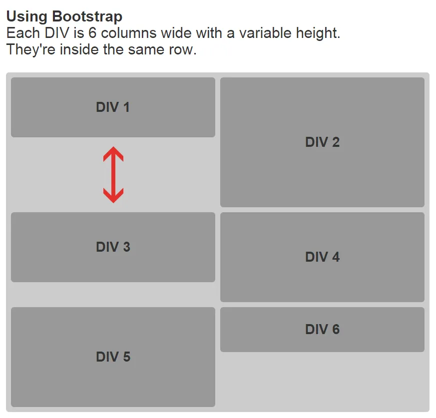
我正在使用Bootstrap网格布局做一个项目,想知道是否可以让列垂直浮动。目前我找不到一种方法能够实现这一点。我正在寻找一种解决方案,可以通过自定义CSS或使用另一个网格来解决这个问题。但是,我更喜欢只使用CSS来设置网格,而不使用JavaScript。
以下是示例的图片和链接:
以下是示例的图片和链接:
<!DOCTYPE html>
<html>
<head>
    <link rel="stylesheet" href="https://maxcdn.bootstrapcdn.com/bootstrap/3.3.5/css/bootstrap.min.css">
    <title>Test</title>
    <style type="text/css">
    body {
        margin-top: 20px;
    }

    .container {
        padding: 0 10px;
    }

    @media (min-width: 768px) {
        .container {
            width: 768px;
        }
    }

    @media (min-width: 992px) {
        .container {
            width: 868px;
        }
    }

    .div1, .div2, .div3, .div4, .div5, .div6 {
        background-color: #999;
        border-radius: 6px;
        width: 100%;
        display: table-cell;
        text-align: center;
        vertical-align: middle;
        font: bold 28px 'Arial';
    }

    .div1 {
        height: 120px;
    }

    .div2 {
        height: 260px;
    }

    .div3 {
        height: 140px;
    }

    .div4 {
        height: 180px;
    }

    .div5 {
        height: 200px;
    }

    .div6 {
        height: 90px;
    }

    .row {
        background-color: #CCC;
        border-radius: 6px;
        padding: 5px;
        margin: 0;
    }

    [class*="col-"] {
        display: table;
        padding: 5px;
    }
    </style>
</head>
<body>

<div class="container">
    <h2><b>Using Bootstrap</b><br>Each DIV is 6 columns wide with a variable height.<br>They're inside the same row.</h2><br>
    <div class="row">
        <div class="col-xs-6">
            <div class="div1">DIV 1</div>
        </div>
        <div class="col-xs-6">
            <div class="div2">DIV 2</div>
        </div>
        <div class="col-xs-6">
            <div class="div3">DIV 3</div>
        </div>
        <div class="col-xs-6">
            <div class="div4">DIV 4</div>
        </div>
        <div class="col-xs-6">
            <div class="div5">DIV 5</div>
        </div>
        <div class="col-xs-6">
            <div class="div6">DIV 6</div>
        </div>
    </div>
</div>

</body>
</html>
flexbox也不行。CSS列是一个选项,但它不会按照您指定的顺序排列。 - Paulie_D