Plotly:如何为地图设置ylim和xlim?

8

目的: 我正在尝试使用plotly(通过ggplotly)创建一个交互式版本的ggplot2地图。

问题: Plotly在图表上方和下方添加了额外的空间,而不是像应该做的那样“拉伸”图表(请参见示例图像)。

示例

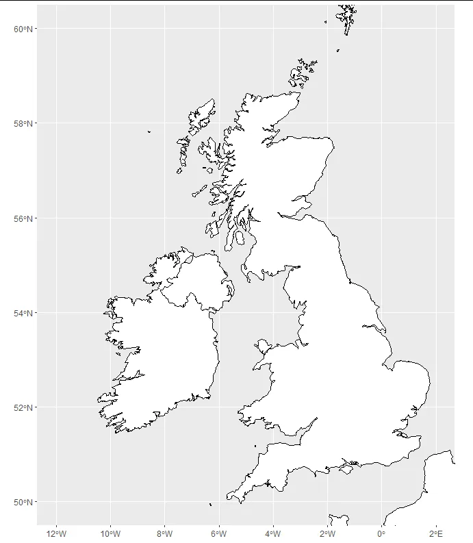
我想要的(在ggplot2中制作的示例):

enter image description here

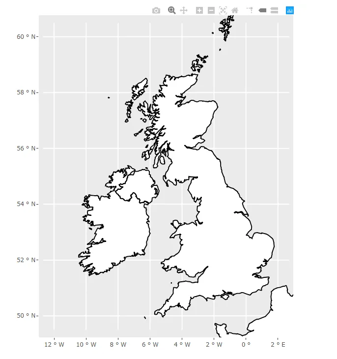
我得到的(在plotly中制作的示例):

enter image description here

我知道ggplotly不支持aspect.ratio,但是否有其他方法可以在保持x轴(-12,2)和y轴(50,60)限制不变的情况下去除上下空间?

代码:

library(maps)
library(ggplot2)
library(plotly)

boundaries <- ggplot2::map_data("world", region=c("UK","Ireland","France","Norway"))

map <- ggplot() +
  geom_polygon(data=boundaries, aes(x=long, y=lat, group=group), color="black", fill="white") +
  coord_sf(xlim=c(-12, 2), ylim=c(50,60)) +
  theme(aspect.ratio = 1.2)

show(map)

visual <- ggplotly(map, height=1.2*400, width=400, tooltip=c("text"), hoverinfo='hide', 
                               dynamicTicks=F) %>%
  layout(xaxis=list(autorange=F, range=c(-12, 2)), yaxis = list(autorange=F, range=c(50,60)))

show(visual)

复制问题:

操作系统:Windows 10
集成开发环境(IDE):RStudio
R语言版本:R 3.6.1


2
我可以复制您的问题。您可以通过将高度和宽度设置为范围比例(10度经度到14度纬度)相匹配来解决此问题。接近您大小的高度为300,宽度为420。这不是很漂亮,也不是正确的长宽比,但它排除了垂直轴上的所有额外区域。 - Ben Norris
1
嗨,本,同意这个半工作:按要求删除了空格,但不幸的是也压缩了地图! - Blithering
2个回答

7
您正在使用coord_sf,它是为特定类别的sf数据框而设计的,而不是与ggplot一起提供的多边形。您可以使用像rnaturalearth这样的包轻松获取此格式的数据。在这里,我选择了高分辨率图像,但如果您无法安装rnaturalearthhires,只需选择“中”作为地图大小即可。
library(ggplot2)
library(plotly)
library(rnaturalearth)
library(sf)

df <- ne_countries(country = c("United Kingdom", "Ireland", "France", "Norway"),
                   returnclass = "sf",
                   scale = "large")

map <- ggplot(df) +
  geom_sf(color = "black", fill = "white") +
  coord_sf(xlim = c(-12, 2), ylim = c(50, 60))

show(map)

enter image description here

然后我们就可以得到这样的Plotly地图:

visual <- ggplotly(map, height = 1.2 * 600, width = 600, tooltip=c("text"), 
                   hoverinfo='hide', dynamicTicks = FALSE) 

show(visual)

enter image description here


5

如果你在Power BI服务中使用R,以下是操作方法:

通过在布局选项中添加scaleratio到xaxis选项,可以获得所需的结果(见下面的代码)。

library(maps)
library(ggplot2)
library(plotly)

boundaries <- ggplot2::map_data("world", region=c("UK","Ireland","France","Norway"))

map <- ggplot() +
  geom_polygon(data=boundaries, aes(x=long, y=lat, group=group), color="black", fill="white") +
  coord_sf(xlim=c(-12, 2), ylim=c(50,60)) 

show(map)

visual <- ggplotly(map, height=1.2*400, width=400, tooltip=c("text"), hoverinfo='hide', 
 dynamicTicks=F) %>%
  layout(xaxis=list(scaleratio=0.6))

show(visual)

*根据接受的答案,Power BI服务不支持rnaturalearth (https://learn.microsoft.com/en-us/power-bi/connect-data/service-r-packages-support)

在这里输入图片描述


1
不错!这是对那些同时使用R、Plotly和PowerBI的人们的有价值的贡献! - vestland

网页内容由stack overflow 提供, 点击上面的
可以查看英文原文,
原文链接