这是我的第一篇帖子,希望我能够遵守网站礼仪。我在网站上找不到答案,之前我在一个ggplot2专门的群组中发布了这个问题,但至今没有解决方案。
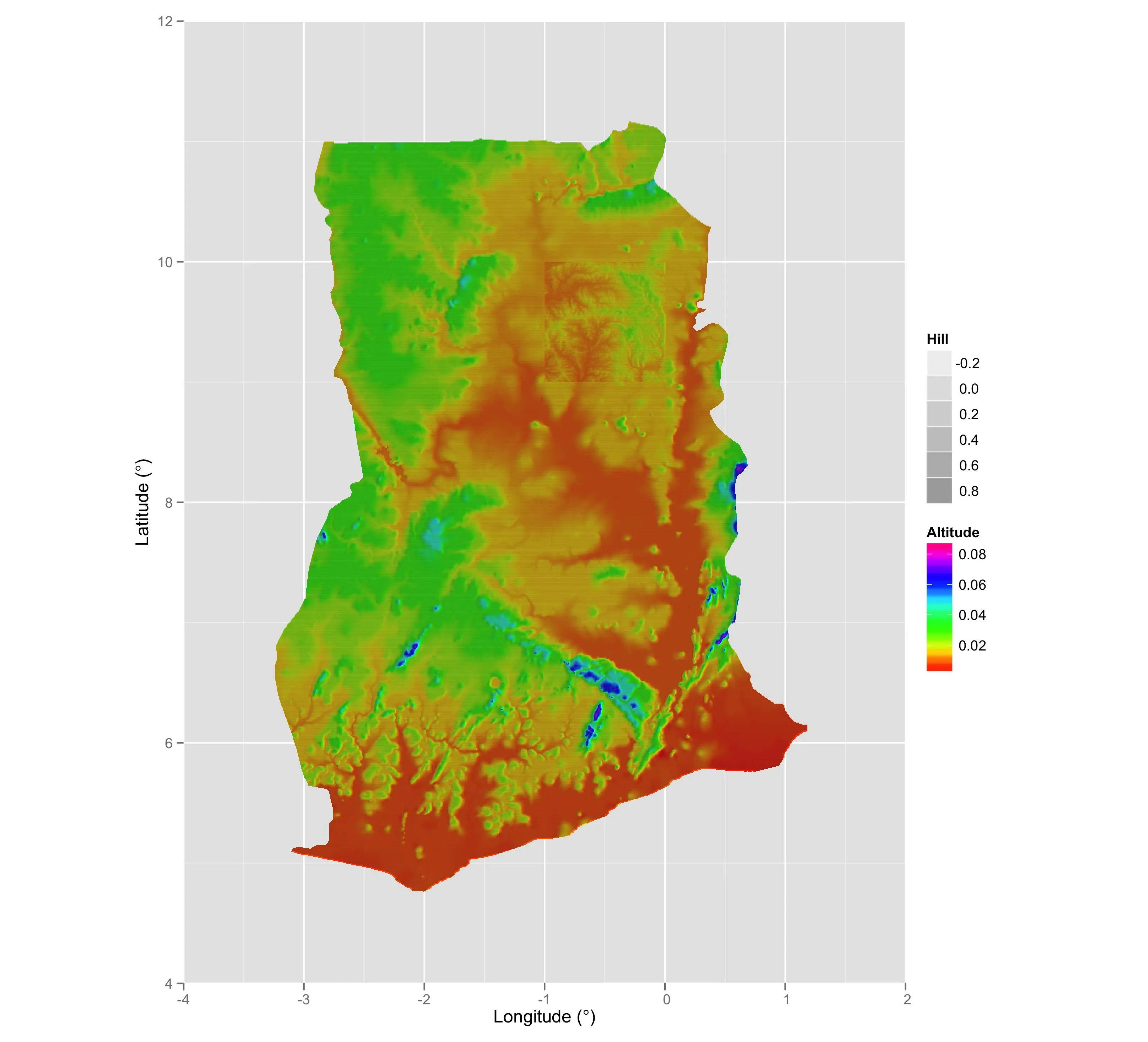
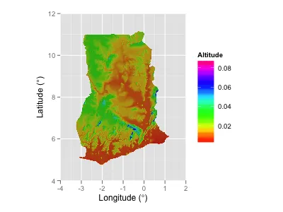
基本上,我正在尝试使用ggplot2叠加两个raster,并要求顶部的raster半透明。我有一个hillShade栅格,它是从高程数据栅格计算出来的,我希望将高程栅格叠加到hillshade栅格上,以便产生的图形不会看起来“平淡无奇”。您可以在下面的可重现的R代码中看到我的意思。
使用基本图形,我可以实现所需的结果,并在下面的代码示例中包含了一个示例,以使其更清晰,但我需要在ggplot2中完成此操作。
我无法在ggplot2中使其正常工作。合并raster会使颜色变得奇怪(我可以单独绘制每个raster)。有人可以帮忙或指点我正确的方向吗?下面包括了自包含的、可重现的代码示例。(很抱歉长度有些长,但我认为最好是清楚明了)。
#   Load relevant libraries
library(ggplot2)
library(raster)


#   Download sample raster data of Ghana from my Dropbox
oldwd <- getwd()
tmp <- tempdir()
setwd(tmp)
url1 <- "http://dl.dropbox.com/s/xp4xsrjn3vb5mn5/GHA_HS.asc"
url2 <- "http://dl.dropbox.com/s/gh7gzou9711n5q7/GHA_DEM.asc"
f1 <- file.path(tmp,"GHA_HS.asc")
f2 <- file.path(tmp,"GHA_DEM.asc")
download.file(url1,f1)  #File is ~ 5,655Kb
download.file(url2,f2)  #File is ~ 2,645Kb


#   Create rasters from downloaded files
hs <-  raster(f1)
dem <- raster(f2)


#   Plot with base graphics to show desired output
plot(hs,col=grey(1:100/100),legend=F)
plot(dem,col=rainbow(100),alpha=0.4,add=T,legend=F)


#   Convert rasters TO dataframes for plotting with ggplot
hdf <- rasterToPoints(hs); hdf <- data.frame(hdf)
colnames(hdf) <- c("X","Y","Hill")
ddf <- rasterToPoints(dem); ddf <- data.frame(ddf)
colnames(ddf) <- c("X","Y","DEM")


#   Create vectors for colour breaks
b.hs <- seq(min(hdf$Hill),max(hdf$Hill),length.out=100)
b.dem <- seq(min(ddf$DEM),max(ddf$DEM),length.out=100)


#   Plot DEM layer with ggplot()
p1 <- ggplot()+
    layer(geom="raster",data=ddf,mapping=aes(X,Y,fill=DEM))+
    scale_fill_gradientn(name="Altitude",colours = rainbow(100),breaks=b.dem)+
    scale_x_continuous(name=expression(paste("Longitude (",degree,")")),limits=c(-4,2),expand=c(0,0))+
    scale_y_continuous(name=expression(paste("Latitude (",degree,")")),limits=c(4,12),expand=c(0,0))+
    coord_equal()
print(p1)


#   Plot hillShade layer with ggplot()
p2 <- ggplot()+
    layer(geom="raster",data=hdf,mapping=aes(X,Y,fill=Hill))+
    scale_fill_gradientn(colours=grey(1:100/100),breaks=b.hs,guide="none")+
    scale_x_continuous(name=expression(paste("Longitude (",degree,")")),limits=c(-4,2),expand=c(0,0))+
    scale_y_continuous(name=expression(paste("Latitude (",degree,")")),limits=c(4,12),expand=c(0,0))+
    coord_equal()
print(p2)


#   Try to plot both together with transparency on the DEM layer
p3 <- ggplot(hdf)+
    geom_raster(aes(X,Y,fill=Hill))+
    scale_fill_gradientn(colours=grey(1:100/100),breaks=b.hs,guide="none")+
    scale_x_continuous(name=expression(paste("Longitude (",degree,")")),limits=c(-4,2),expand=c(0,0))+
    scale_y_continuous(name=expression(paste("Latitude (",degree,")")),limits=c(4,12),expand=c(0,0))+
    geom_raster(data=ddf,aes(X,Y,fill=DEM),alpha=I(0.4))+
    scale_fill_gradientn(name="Altitude",colours = rainbow(100),breaks=b.dem)+
    coord_equal()
 print(p3)


#   Cleanup downloaded files and return to previous wd
unlink(tmp,recursive=T)
setwd(oldwd)
我的问题如下:
Q1: 我该如何让p3的层看起来像上面示例中使用基础图形绘制的那样?
Q2: 我该如何更明智地指定颜色比例尺,以便我不会在右侧得到一个荒谬的图例?
annotation_raster,但是到目前为止我的尝试都没有成功。我认为你的组合图失败的原因是两个对scale_fill_gradientn的调用。 - mnelggplot只能有一个fill美学和一个colour美学。你可以通过将 DEM 层设置为带有colour=DEM的geom_point,然后使用scale_colour_gradientn而不是scale_fill_gradientn来获得某种程度的效果,但它看起来不如基本图形方式好看。 - Matthew Plourde