我想创建一个浮动按钮(用于向列表视图中添加项目),就像谷歌日历一样,同时保持与Android 5.0之前的旧版系统兼容。
我已经创建了以下布局:
活动 main_activity.xml:
<LinearLayout ... >

     <include
         layout="@layout/toolbar"/>

     <RelativeLayout ... >

     <!-- My rest of the layout -->

          <!-- Floating action button -->
          <ImageButton style="@style/AppTheme"
                     android:layout_width="60dp"
                     android:layout_height="60dp"
                     android:text="New Button"
                     android:id="@+id/button"
                     android:src="@drawable/ic_fab"
                     android:background="@drawable/fab"
                     android:layout_alignParentBottom="true"
                     android:layout_alignParentRight="true"
                     android:layout_marginBottom="24dp"
                     android:layout_marginRight="24dp"/>

     </RelativeLayout>

 </LinearLayout>
Drawable fab.xml:
<?xml version="1.0" encoding="utf-8"?>
<shape xmlns:android="http://schemas.android.com/apk/res/android"
       android:shape="oval">
    <solid android:color="#ffa48bc0"/>
</shape>
样式 styles.xml
<resources>
    <style name="AppTheme" parent="Theme.AppCompat.Light.NoActionBar">
        <item name="colorPrimary">#ff1d79b1</item>
        <item name="colorPrimaryDark">#ff084d95</item>
    </style>
</resources>
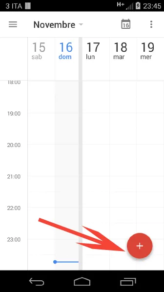
日历浮动操作按钮:
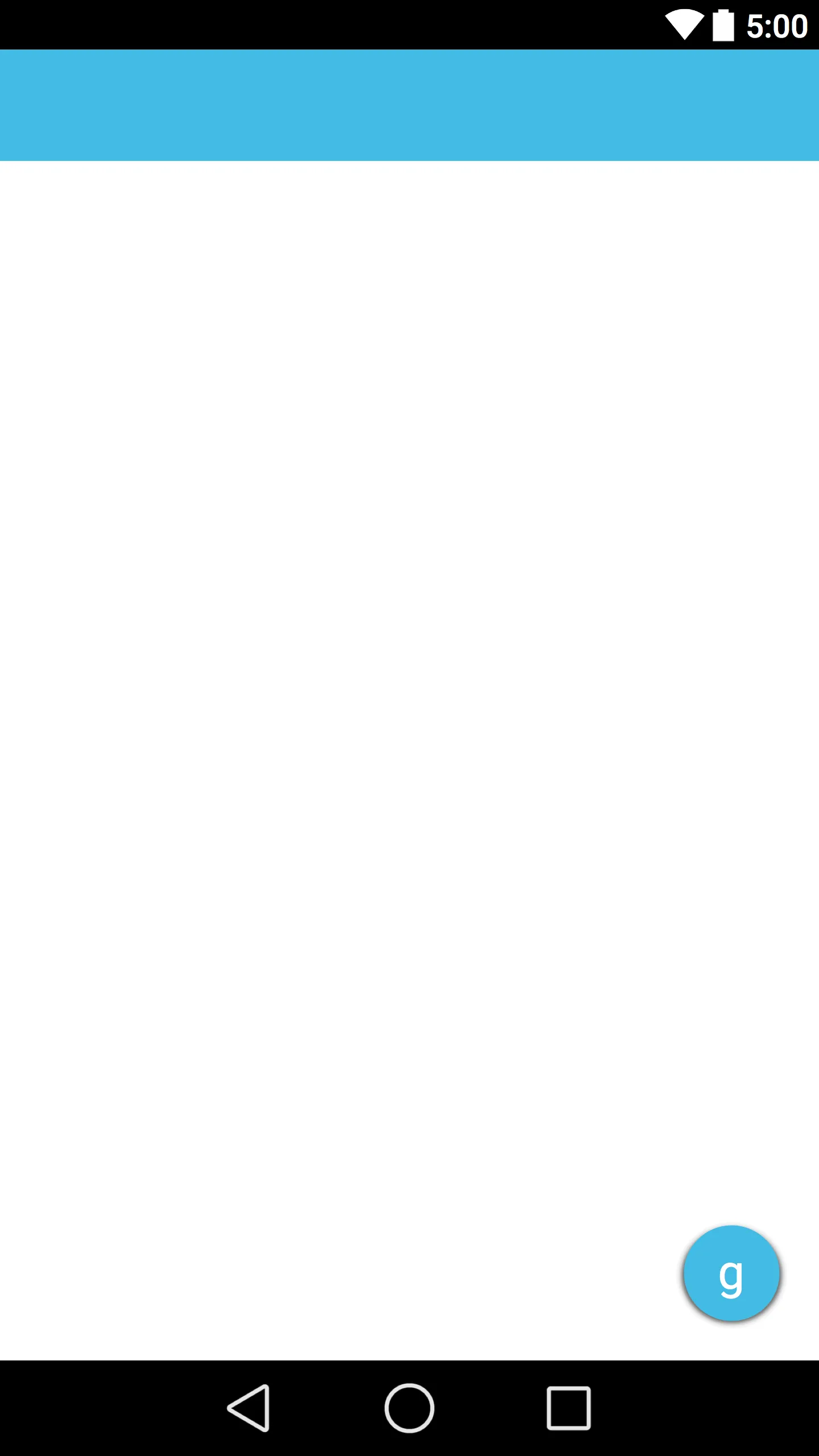
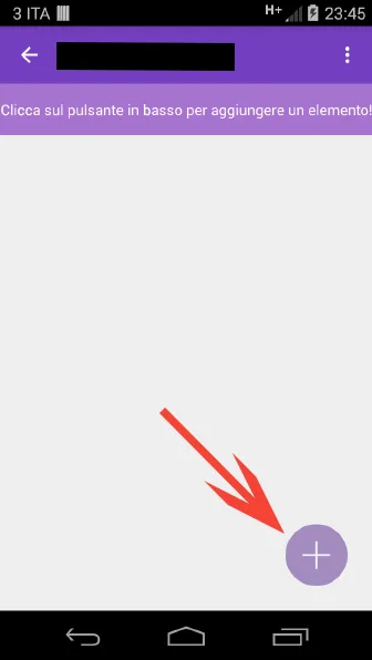
 我的应用程序浮动操作按钮:
 如何给我的按钮添加阴影?
我已经使用了 elevation 属性,但没有效果。