Google图表 - 折线图的全宽显示

4

我使用组合谷歌图表将我的数据和目标显示在如下的图表上:

enter image description here

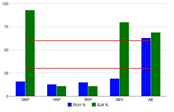
我想要在图表的整个宽度上显示目标线,就像这样: enter image description here

这是我尝试过但没有成功的内容:

<html xmlns="http://www.w3.org/1999/xhtml">
  <head>
    <meta http-equiv="content-type" content="text/html; charset=utf-8"/>
    <title>
      Google Visualization API Sample
    </title>
    <script type="text/javascript" src="//www.google.com/jsapi"></script>
    <script type="text/javascript">
      google.load('visualization', '1', {packages: ['corechart']});
    </script>
    <script type="text/javascript">
      function drawVisualization() {
        // Create and populate the data table.
        var data = google.visualization.arrayToDataTable([
          ['Month', 'RUH %', 'SJA %', 'Goal 30', 'Goal 60'],
          ['GKP',  16,      93,       30,     60],
          ['HKP',  13,      11,       30,     60],
          ['SKP',  15,      11,       30,     60],
          ['AEV',  19,      80,       30,     60],
          ['AE',   63,      69,       30,     60]
        ]);

        // Create and draw the visualization.
        var ac = new google.visualization.ComboChart(document.getElementById('visualization'));

        ac.draw(data, {
          title : 'RUH og SJA måloppnåelse',
          width: 600,
          height: 400,
          chartArea: {'width': '90%', 'height': '80%'},
          colors: ["blue", "green"],
          legend: { position: 'bottom' },
          vAxis: {title: ""},
          hAxis: {title: ""},
          seriesType: "bars",
          series: {2: {type: "line", visibleInLegend: false, color: "red"}, 3:{type: "line", visibleInLegend: false, color: "red"}}
        });
      }


      google.setOnLoadCallback(drawVisualization);
    </script>
  </head>
  <body style="font-family: Arial;border: 0 none;">
    <div id="visualization" style="width: 600px; height: 400px;"></div>
  </body>
</html>

我该如何实现这个?

首先,实际问题是什么?接下来,你尝试了什么?你能提供一个fiddle给我们吗? - Dwza
配置选项中没有任何内容吗? - Dwza
我没有找到有用的东西来解决这个问题 :-( 有什么想法吗? - Oleg
我在寻找,但是找不到任何东西。猜想这是一个尝试和错误的过程^^ - Dwza
1个回答

8
为了将线条延伸到图表的边缘,您需要使用连续型轴,并在现有数据的前后各增加一行。您可以使用DataView将字符串标签转换为格式化数字,然后使用“hAxis.ticks”选项设置轴标签:
function drawVisualization() {
    // Create and populate the data table.
    var data = google.visualization.arrayToDataTable([
        ['Month', 'RUH %', 'SJA %', 'Goal 30', 'Goal 60'],
        ['',   null,    null,       30,     60],
        ['GKP',  16,      93,       30,     60],
        ['HKP',  13,      11,       30,     60],
        ['SKP',  15,      11,       30,     60],
        ['AEV',  19,      80,       30,     60],
        ['AE',   63,      69,       30,     60],
        ['',   null,    null,       30,     60]
    ]);

    var ticks = [];
    // ignore the first and last rows
    for (var i = 1; i < data.getNumberOfRows() - 1; i++) {
        ticks.push({v: i, f: data.getValue(i, 0)});
    }

    var view = new google.visualization.DataView(data);
    view.setColumns([{
        type: 'number',
        label: data.getColumnLabel(0),
        calc: function (dt, row) {
            return {v: row, f: dt.getValue(row, 0)};
        }
    }, 1, 2, 3, 4]);

    var range = view.getColumnRange(0);
    var offset = 0.5; // change this value to adjust the padding to the left and right of the columns in the chart

    // Create and draw the visualization.
    var ac = new google.visualization.ComboChart(document.getElementById('visualization'));

    ac.draw(view, {
        title : 'RUH og SJA måloppnåelse',
        width: 600,
        height: 400,
        chartArea: {
            width: '90%',
            height: '80%'
        },
        colors: ["blue", "green"],
        legend: {
            position: 'bottom'
        },
        vAxis: {
            title: ""
        },
        hAxis: {
            title: "",
            ticks: ticks,
            viewWindow: {
                min: range.min + offset,
                max: range.max - offset
            },
            gridlines: {
                // hide vertical gridlines to match discrete chart display
                color: 'transparent'
            }
        },
        seriesType: "bars",
        series: {
            2: {
                type: "line",
                visibleInLegend: false,
                color: "red"
            },
            3:{
                type: "line",
                visibleInLegend: false,
                color: "red"
            }
        }
    });
}

在此查看工作示例:http://jsfiddle.net/asgallant/J2u3n/


网页内容由stack overflow 提供, 点击上面的
可以查看英文原文,
原文链接