我正在尝试使用以下代码为Seaborn的条形图添加自定义标签:
为什么我会收到这个错误?
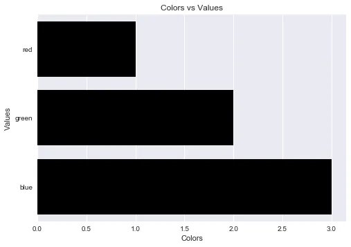
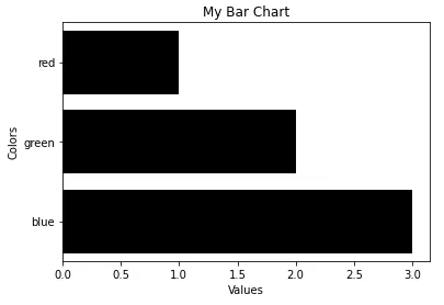
import pandas as pd
import seaborn as sns

fake = pd.DataFrame({'cat': ['red', 'green', 'blue'], 'val': [1, 2, 3]})
fig = sns.barplot(x = 'val', y = 'cat',
                  data = fake,
                  color = 'black')
fig.set_axis_labels('Colors', 'Values')
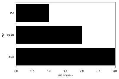
AttributeError: 'AxesSubplot' object has no attribute 'set_axis_labels'
为什么我会收到这个错误?

FacetGrid或任何分面返回一个图形对象,而其他所有内容都返回一个轴对象? - alexpghayes