如何在Jetpack Compose中自定义选项卡

9
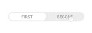
我想要自定义 Jetpack Compose 中选项卡的外观,目前我的选项卡看起来像这样:Current Tab 但是我希望我的选项卡像这样:Expected Tabs 我是这样创建选项卡的:
TabRow(
        selectedTabIndex = pagerState.currentPage,
        backgroundColor = MaterialTheme.colors.primary,
        contentColor = Color.White
    ) {
        filters.forEachIndexed { index, filter ->
            Tab(
                text = {
                    Text(
                        text = filter.name.replaceFirstChar {
                            if (it.isLowerCase()) {
                                it.titlecase(Locale.getDefault())
                            } else {
                                it.toString()
                            }
                        }
                    )
                },
                selected = pagerState.currentPage == index,
                onClick = { scope.launch { pagerState.animateScrollToPage(index) } },
            )
        }
    }

我该如何实现那种效果?我已经搜索了很多但没有找到任何线索,有人能帮忙吗?

3个回答

26
@Composable
fun CustomTabs() {
    var selectedIndex by remember { mutableStateOf(0) }

    val list = listOf("Active", "Completed")

    TabRow(selectedTabIndex = selectedIndex,
        backgroundColor = Color(0xff1E76DA),
        modifier = Modifier
            .padding(vertical = 4.dp, horizontal = 8.dp)
            .clip(RoundedCornerShape(50))
            .padding(1.dp),
        indicator = { tabPositions: List<TabPosition> ->
            Box {}
        }
    ) {
        list.forEachIndexed { index, text ->
            val selected = selectedIndex == index
            Tab(
                modifier = if (selected) Modifier
                    .clip(RoundedCornerShape(50))
                    .background(
                        Color.White
                    )
                else Modifier
                    .clip(RoundedCornerShape(50))
                    .background(
                        Color(
                            0xff1E76DA
                        )
                    ),
                selected = selected,
                onClick = { selectedIndex = index },
                text = { Text(text = text, color = Color(0xff6FAAEE)) }
            )
        }
    }
}

结果如gif所示。

enter image description here

如果您希望拥有带有阴影和颜色混合效果的选项卡,或者像这个gif图中那样具有流动的颜色变化,请选择此选项。

enter image description here

请参考这个答案。

https://stackoverflow.com/a/77333934/5457853


非常好!但将背景设置为Color(0xFFFFEE58)会产生不良影响,为什么? - Yshh
它对性能的影响可以忽略不计,因为它是为演示而添加的,但最好的做法是在 Ui\Color 中定义您的颜色。 - Thracian
谢谢,我的意思是将你的示例代码中的Color(0xff1E76DA)更改为Color(0xFFFFEE58),它效果不好,为什么?我找不到原因。 - Yshh

3

动态选项卡

您想创建像这样的东西吗?

enter image description here

我尝试使用 Material Design 3 库,但它使一切变得更加困难,因此我从头开始创建了 TabRow

您可以使用此代码来节省时间:

@Composable
fun AnimatedTab(
  items: List<String>,
  modifier: Modifier,
  indicatorPadding: Dp = 4.dp,
  selectedItemIndex: Int = 0,
  onSelectedTab: (index: Int) -> Unit
) {

  var tabWidth by remember { mutableStateOf(0.dp) }

  val indicatorOffset: Dp by animateDpAsState(
    if (selectedItemIndex == 0) {
      tabWidth * (selectedItemIndex / items.size.toFloat())
    } else {
      tabWidth * (selectedItemIndex / items.size.toFloat()) - indicatorPadding
    }
  )

  Box(
    modifier = modifier
      .onGloballyPositioned { coordinates ->
        tabWidth = coordinates.size.width.toDp
      }
      .background(color = gray100, shape = Shapes.card4)
  ) {

    MyTabIndicator(
      modifier = Modifier
        .padding(indicatorPadding)
        .fillMaxHeight()
        .width(tabWidth / items.size - indicatorPadding),
      indicatorOffset = indicatorOffset
    )

    Row(
      modifier = Modifier.fillMaxSize(),
      verticalAlignment = Alignment.CenterVertically,
      horizontalArrangement = Arrangement.SpaceEvenly
    ) {
      items.forEachIndexed { index, title ->
        MyTabItem(
          modifier = Modifier
            .fillMaxHeight()
            .width(tabWidth / items.size),
          onClick = {
            onSelectedTab(index)
          },
          title = title
        )
      }
    }

  }
}

@Composable
private fun MyTabIndicator(
  modifier: Modifier,
  indicatorOffset: Dp,
) {
  Box(
    modifier = modifier
      .offset(x = indicatorOffset)
      .clip(Shapes.card4)
      .background(white100)
    )
}


@Composable
private fun MyTabItem(
  modifier: Modifier,
  onClick: () -> Unit,
  title: String
) {
  Box(
    modifier = modifier
      .clip(Shapes.card4)
      .clickable(
        interactionSource = MutableInteractionSource(),
        indication = null
      ) { onClick() },
    contentAlignment = Alignment.Center
  ) {
    Text(text = title)
  }
}

使用方法:

var selectedTab by remember { mutableStateOf(0) }

AnimatedTab(
  modifier = Modifier
    .height(40.dp)
    .fillMaxSize(.9f),
  selectedItemIndex = selectedTab,
  onSelectedTab = { selectedTab = it },
  items = listOf("first", "second")
)

我喜欢你的回答。但是在不同设备上,选项卡没有对齐,并且向左倾斜。请参考以下图片:https://drive.google.com/file/d/1qVrV8hAZ40bHbvaCHWY7xfRtO3_gvLsu/view?usp=sharing - Idhanosi Yerimah

1
除了Thracian的回答之外: 如果您需要在屏幕方向更改后保留选项卡的状态,请使用rememberSaveable而不是remember来选择索引。

2
你的回答可以通过提供更多支持信息来改进。请编辑以添加进一步的细节,例如引用或文档,以便他人可以确认你的答案是正确的。您可以在帮助中心中找到有关如何编写良好答案的更多信息。 - Community

网页内容由stack overflow 提供, 点击上面的
可以查看英文原文,
原文链接