如何制作一个旋转内部视图的3D旋转木马?

4

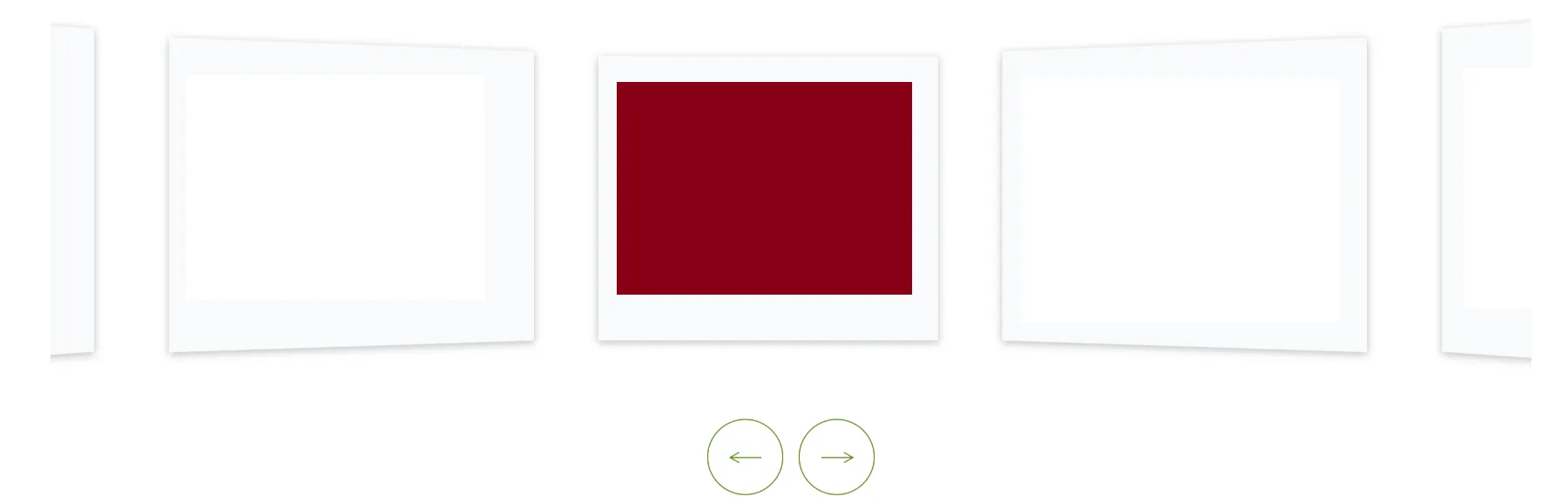
我想制作一个类似于堆叠片段中的3D旋转木马,但需要从内部视角查看,就像下面的图片一样。我该如何实现这个效果?

window.addEventListener('load', () => {
  var carousels = document.querySelectorAll('.carousel');

  for (var i = 0; i < carousels.length; i++) {
    carousel(carousels[i]);
  }
});

function carousel(root) {
  var
    figure = root.querySelector('figure'),
    nav = root.querySelector('nav'),
    images = figure.children,
    n = images.length,
    gap = root.dataset.gap || 0,
    bfc = 'bfc' in root.dataset,
    theta = 2 * Math.PI / n,
    currImage = 0;

  setupCarousel(n, parseFloat(getComputedStyle(images[0]).width));
  
  window.addEventListener('resize', () => {
    setupCarousel(n, parseFloat(getComputedStyle(images[0]).width))
  });

  setupNavigation();

  function setupCarousel(n, s) {
    var apothem = s / (2 * Math.tan(Math.PI / n));

    figure.style.transformOrigin = `50% 50% ${- apothem}px`;

    for (var i = 0; i < n; i++) {
      images[i].style.padding = `${gap}px`;
    }
      
    for (i = 1; i < n; i++) {
      images[i].style.transformOrigin = `50% 50% ${- apothem}px`;
      images[i].style.transform = `rotateY(${i * theta}rad)`;
    }
    
    if (bfc) {
      for (i = 0; i < n; i++) {
        images[i].style.backfaceVisibility = 'hidden';
      }
    }

    rotateCarousel(currImage);
  }

  function setupNavigation() {
    nav.addEventListener('click', onClick, true);

    function onClick(e) {
      e.stopPropagation();

      var t = e.target;
      
      if (t.tagName.toUpperCase() != 'BUTTON') {
        return;
      }

      if (t.classList.contains('next')) {
        currImage++;
      } 
      else {
        currImage--;
      }

      rotateCarousel(currImage);
    }
  }

  function rotateCarousel(imageIndex) {
    figure.style.transform = `rotateY(${imageIndex * -theta}rad)`;
  }
}
body {
  margin: 0;
  font-family: 'Roboto', sans-serif;
  font-size: 16px;
}

h1 {
  text-align: center;
  margin-bottom: 1.5em;
}

h2 {
  text-align: center;
  color: #555;
  margin-bottom: 0;
}

.carousel {
  padding: 20px;
  perspective: 500px;
  overflow: hidden;
  display: flex;
  flex-direction: column;
  align-items: center;
}

.carousel>* {
  flex: 0 0 auto;
}

.carousel figure {
  margin: 0;
  width: 40%;
  transform-style: preserve-3d;
  transition: transform 0.5s;
}

.carousel figure img {
  width: 100%;
  box-sizing: border-box;
  padding: 0 0px;
}

.carousel figure img:not(:first-of-type) {
  position: absolute;
  left: 0;
  top: 0;
}

.carousel nav {
  display: flex;
  justify-content: center;
  margin: 20px 0 0;
}

.carousel nav button {
  flex: 0 0 auto;
  margin: 0 5px;
  cursor: pointer;
  color: #333;
  background: none;
  border: 1px solid;
  letter-spacing: 1px;
  padding: 5px 10px;
}
<h2>Eight images, with 80px gap</h2>

<div class="carousel" data-gap="80">
  <figure>
    <img src="https://source.unsplash.com/VkwRmha1_tI/800x533" alt="">
    <img src="https://source.unsplash.com/EbuaKnSm8Zw/800x533" alt="">
    <img src="https://source.unsplash.com/kG38b7CFzTY/800x533" alt="">
    <img src="https://source.unsplash.com/nvzvOPQW0gc/800x533" alt="">
    <img src="https://source.unsplash.com/mCg0ZgD7BgU/800x533" alt="">
    <img src="https://source.unsplash.com/1FWICvPQdkY/800x533" alt="">
    <img src="https://source.unsplash.com/bjhrzvzZeq4/800x533" alt="">
    <img src="https://source.unsplash.com/7mUXaBBrhoA/800x533" alt="">
  </figure>
  
  <nav>
    <button class="nav prev">Prev</button>
    <button class="nav next">Next</button>
  </nav>
</div>

enter image description here

1个回答

2
旋转木马需要向相反方向旋转和平移,使其成为内部旋转视图。
“transform-origin”设置旋转木马的中心。前两个数字是x和y,只是将旋转木马居中在屏幕上。第三个数字是z,它决定旋转木马是向屏幕移动还是远离屏幕。消除“apothem”上的负号,将其从屏幕中拉出,使中心更接近摄像机,并实现内部旋转木马。“backface-visibility”始终需要设置为隐藏,因为现在可能有图像在相机后面。然后,为了通过下一个按钮修复旋转方向,“* -theta”被更改为正数。

window.addEventListener('load', () => {
  var carousels = document.querySelectorAll('.carousel');

  for (var i = 0; i < carousels.length; i++) {
    carousel(carousels[i]);
  }
});

function carousel(root) {
  var
    figure = root.querySelector('figure'),
    nav = root.querySelector('nav'),
    images = figure.children,
    n = images.length,
    gap = root.dataset.gap || 0,
    theta = 2 * Math.PI / n,
    currImage = 0;

  setupCarousel(n, parseFloat(getComputedStyle(images[0]).width));
  
  window.addEventListener('resize', () => {
    setupCarousel(n, parseFloat(getComputedStyle(images[0]).width))
  });

  setupNavigation();

  function setupCarousel(n, s) {
    var apothem = s / (2 * Math.tan(Math.PI / n));

    figure.style.transformOrigin = `50% 50% ${apothem}px`;

    for (var i = 0; i < n; i++) {
      images[i].style.padding = `${gap}px`;
    }
      
    for (i = 1; i < n; i++) {
      images[i].style.transformOrigin = `50% 50% ${apothem}px`;
      images[i].style.transform = `rotateY(${i * theta}rad)`;
    }

    rotateCarousel(currImage);
  }

  function setupNavigation() {
    nav.addEventListener('click', onClick, true);

    function onClick(e) {
      e.stopPropagation();

      var t = e.target;
      
      if (t.tagName.toUpperCase() != 'BUTTON') {
        return;
      }

      if (t.classList.contains('next')) {
        currImage++;
      } 
      else {
        currImage--;
      }

      rotateCarousel(currImage);
    }
  }

  function rotateCarousel(imageIndex) {
    figure.style.transform = `rotateY(${imageIndex * theta}rad)`;
  }
}
body {
  margin: 0;
  font-family: 'Roboto', sans-serif;
  font-size: 16px;
}

h1 {
  text-align: center;
  margin-bottom: 1.5em;
}

h2 {
  text-align: center;
  color: #555;
  margin-bottom: 0;
}

.carousel {
  padding: 20px;
  perspective: 500px;
  overflow: hidden;
  display: flex;
  flex-direction: column;
  align-items: center;
}

.carousel>* {
  flex: 0 0 auto;
}

.carousel figure {
  margin: 0;
  width: 40%;
  transform-style: preserve-3d;
  transition: transform 0.5s;
}

.carousel figure img {
  width: 100%;
  box-sizing: border-box;
  padding: 0 0px;
  backface-visibility: hidden;
}

.carousel figure img:not(:first-of-type) {
  position: absolute;
  left: 0;
  top: 0;
}

.carousel nav {
  display: flex;
  justify-content: center;
  margin: 20px 0 0;
}

.carousel nav button {
  flex: 0 0 auto;
  margin: 0 5px;
  cursor: pointer;
  color: #333;
  background: none;
  border: 1px solid;
  letter-spacing: 1px;
  padding: 5px 10px;
}
<h2>Eight images, with 80px gap</h2>

<div class="carousel" data-gap="80">
  <figure>
    <img src="https://source.unsplash.com/VkwRmha1_tI/800x533" alt="">
    <img src="https://source.unsplash.com/EbuaKnSm8Zw/800x533" alt="">
    <img src="https://source.unsplash.com/kG38b7CFzTY/800x533" alt="">
    <img src="https://source.unsplash.com/nvzvOPQW0gc/800x533" alt="">
    <img src="https://source.unsplash.com/mCg0ZgD7BgU/800x533" alt="">
    <img src="https://source.unsplash.com/1FWICvPQdkY/800x533" alt="">
    <img src="https://source.unsplash.com/bjhrzvzZeq4/800x533" alt="">
    <img src="https://source.unsplash.com/7mUXaBBrhoA/800x533" alt="">
  </figure>
  
  <nav>
    <button class="nav prev">Prev</button>
    <button class="nav next">Next</button>
  </nav>
</div>


网页内容由stack overflow 提供, 点击上面的
可以查看英文原文,
原文链接