CSS浮动变高度的Divs

87

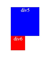
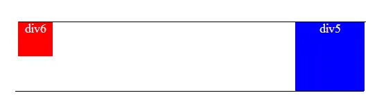
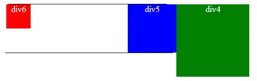
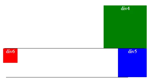
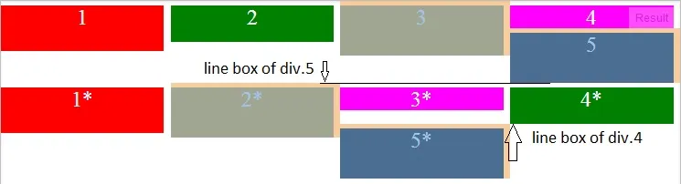
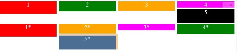
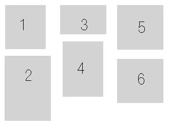
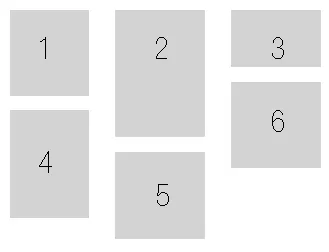
我有无限数量的宽度为100像素的div,可以适应宽度为250像素的父元素。无论高度如何,我需要将div显示在行中,如图所示。 我已经尝试解决这个问题,但是div的高度似乎使情况变得糟糕。

输入图片描述

我会非常感谢您的帮助。 谢谢 :)

        <style>
            #holder{
            width:250px;
            border:1px dotted blue;
            display:inline-block;
        }
        .box{
            width:100px;
            height:150px;
            background-color:#CCC;
            float:left;
            text-align:center;
            font-size:45px;
            display:inline-block;
        }
        .one{
            background-color:#0F0;
            height:200px;
        }

        .two{
            background-color:#0FF;
        }

        .three{
            background-color:#00F;
        }

        .four{
            background-color:#FF0;
        }
    </style>

    <div id="holder">
        <div class="box one">1</div>
        <div class="box two">2</div>
        <div class="box three">3</div>
        <div class="box four">4</div>
    </div>

这是 jsfiddle

我使用JavaScript做了什么以及实现的效果 https://jsfiddle.net/8o0nwft9/


1
列CSS怎么样?内容从一列扩展到下一列http://jsfiddle.net/XFX55/90/ - G-Cyrillus
10个回答

70
据我所知,没有纯CSS的方法可以解决这个问题(适用于所有常见的浏览器):
- 浮动无效。 - display: inline-block无效。 - position: relativeposition: absolute需要手动像素调整。如果您正在使用服务器端语言,并且正在处理图像(或具有可预测高度的内容),则可以使用服务器端代码“自动”处理像素调整。
请使用jQuery Masonry

3
没问题,但你肯定还没有找到对于你提出的问题的解决方案:"我有无限数量的100像素宽度的div,可以放入一个250像素宽度的父容器中。无论高度如何,我都需要以行的形式显示这些div,就像图片中所示。" - thirtydot
1
现在你可以使用CSS列来实现这个功能,例如:http://w3bits.com/css-masonry/ - thirtydot
2
CSS列布局并不能完全解决问题,如果对齐应该像上面编号那样。CSS列会导致布局,其中第1列将包含项目1、2、3,而第2列将包含项目4、5、6。 - Stefan
使用flexbox能否实现相同的效果? - iChido
1
@iChido:我不认为flexbox对这个问题有特别大的帮助,但我也不确定。我很久以前就没有尝试过只使用CSS来解决这个问题了,我总是最终使用JavaScript,因为它可以正常工作。我回答中的Masonry库甚至不再依赖于jQuery。是否仅使用CSS可以完成取决于您的具体要求。 - thirtydot

40

假设您的需求更像是您着色示例代码:

.box:nth-child(odd){
    clear:both;
}

如果需要3行,那么使用nth-child(3n+1)


我不想在任何一个上执行“清除”。 - stevenmc
3
这是最好的只使用CSS的解决方案。 - superluminary
这解决了我的问题,因为我实际上想要一个不同的布局,但这并不是这个SO问题的答案。编辑:PS:nth-child不支持IE8 - Eirik H
我有两列,对我来说,这是最好的解决方案 :) - Ruub
这里有一个示例(3列):http://codepen.io/anon/pen/dPZvbb - veganista

39
我提供这个答案是因为即使有好的解决方案(使用Masonry)仍然不清楚为什么不能使用float来实现。(这很重要 - #1)。

一个浮动元素会尽可能地向左或向右移动,但仍在原来的位置。

因此可以这样表述:
我们有两个div。
<div class="div5">div5</div>
<div class="div6">div6</div>

.div-blue{
    width:100px;
    height:100px;
    background: blue;
}

.div-red{
    width:50px;
    height:50px;
    background: red;
}

没有浮动它们将会一个在另一个下面

enter image description here

如果我们对 div5 进行 float: right,那么 div6 就会被定位在 div5 所在的行上。

/*这些线只是为了说明*/

enter image description here

所以如果我们现在对使用float: left,它将尽可能向左移动,“在此行中”(参见上面的#1),因此如果换行,将跟随它。

现在让我们将其他

添加到方程中

<div class="div4">div4</div>
<div class="div5">div5</div>
<div class="div6">div6</div>

.div-gree{
    width:150px;
    height:150px;
    background: green;

    float:right;
}

我们有这个。

enter image description here

如果我们将div5clear: right设置为,我们强制它在div4下面另起一行。

enter image description here

并且 div6 将会在新的行中向左或向右浮动。

现在让我们以这个问题作为例子 强制 div 从左到右堆叠

以下是测试代码片段:

div{
    width:24%;
    margin-right: 1%;
    float: left;
    margin-top:5px;
    color: #fff;
    font-size: 24px;
    text-align: center;
}

.one{
    background-color:red;
    height: 50px;
}

.two{
    background-color:green;
    height:40px;
}

.three{
    background-color:orange;
    height:55px;
}

.four{
    background-color:magenta;
    height:25px;
}

.five{
    background-color:black;
    height:55px;
}
<div class="one">1</div>
<div class="two">2</div>
<div class="three">3</div>
<div class="four">4</div>
<div class="five">5</div>

<div class="one">1*</div>
<div class="three">2*</div>
<div class="four">3*</div>
<div class="two">4*</div>
<div class="five">5*</div>

enter image description here

在上面的图像中,您可以看到 div.5 如何紧挨着 div.3。这是因为在其行(由 div.4 的行框定义)中,它只能到达那里。div.1*div.2* 等也向左浮动到 div.5 的左侧,但由于它们无法适合该行,它们转到下一行(由 div.5 的行框定义)。
现在请注意,当我们将 div.2* 的高度减小到小于 div.4* 时,它如何让 div.5* 过去:

enter image description here

我希望这可以澄清为什么不能使用浮动来实现此目标。我只使用浮动进行澄清(而不是inline-block),因为标题是“CSS Floating Divs At Variable Heights”,而且现在的答案相当长。

8
正如正确指出的那样,仅仅使用CSS是不可能实现这一点的...幸运的是,我现在在http://isotope.metafizzy.co/中找到了一个解决方案。它似乎完全解决了这个问题。

23
我认为你应该将这个答案回复给 @thirtydot - 他/她建议使用 Masonry,这是实现这一目标的唯一方法。Isotope 是由同一位开发者构建的 Masonry 的(自愿)付费版本。 - iamkeir
它并没有解决任何问题。所有元素的宽度都相同,并且被绝对定位。 - Henry Brewer

4
通过这个评论 (CSS Block float left),我找到了答案。
在我创建的每一行上,我都添加了一个类名 left。在我创建的其他每一行上,我都添加了一个类名 right
然后,我为这些类名中的每一个都浮动了左侧和右侧!
唯一的复杂之处在于“右”行的内容顺序被反转了,但是可以使用PHP解决。
感谢大家的帮助!

#holder{
  width:200px;
  border:1px dotted blue;
  display:inline-block;
}
.box{
  width:100px;
  height:150px;
  background-color:#CCC;
  float:left;
  text-align:center;
  font-size:45px;
}
.one{
  background-color:#0F0;
  height:200px;
}

.two{
  background-color:#0FF;
}

.three{
  background-color:#00F;
  float:right;
}

.four{
  background-color:#FF0;
  float:right;
}
.left{float:left;}
.right{float:right;}
<div id="holder">
  <div class="box one left">1</div>
  <div class="box two left">2</div>
  <div class="box four right">4</div>
  <div class="box three right">3</div>
</div>
</body>


除了你的演示看起来和你的图片完全不一样。而且它不会像你在问题中所要求的那样适用于“无限数量的divs”。例如,尝试使用8个不同高度的.box div来调整你自己答案中的代码。 - thirtydot
另外,对同一元素设置float: leftfloat: rightdisplay: inline-block是毫无意义的。display: inline-block会被float规则转换为display: block(即div的默认属性)。换句话说,display: inline-block没有任何作用。 - thirtydot
好的,你是对的,display:inline-block不对...我已经适当地编辑了我的解决方案。 - stevenmc
1
嗯,好的,你是对的...我还在努力寻找解决方案。完成后我会在这里发布。谢谢 thirtydot。 - stevenmc
第一个 div 的高度是 100px。 - Vishal B
显示剩余2条评论

1
如果有人仍在寻找替代方案,这里有一个。尝试使用(-moz- / -webkit-)column-width属性。它能解决可变div高度的问题。但是column-width会在列末添加新的div。
否则,jQuery Masonry效果最佳。

1
感谢thirtydot的帮助,我意识到之前的答案并没有完全解决问题。这是我的第二次尝试,使用JQuery作为CSS唯一的解决方案似乎是不可能的:
<html>
    <head>
        <script type="text/javascript" src="http://ajax.googleapis.com/ajax/libs/jquery/1.5.1/jquery.min.js"></script>
        <script type="text/javascript" language="javascript">
            $(document).ready(function() {
                var numberOfColumns = 3;
                var numberOfColumnsPlusOne = numberOfColumns+1;
                var marginBottom = 10;  //Top and bottom margins added
                var kids = $('#holder:first-child').children();
                var add;
                $.each(kids, function(key, value) {
                    add = numberOfColumnsPlusOne+key;
                    if (add <= kids.length){
                        $('#holder:first-child :nth-child('+(numberOfColumnsPlusOne+key)+')').offset({ top: $('#holder:first-child :nth-child('+(key+1)+')').offset().top+$('#holder:first-child :nth-child('+(key+1)+')').height()+marginBottom });
                    }
                });
            });             
        </script>
        <style>
            #holder{
                width:270px;
                border:1px dotted blue;
                display:inline-block; /* Enables the holder to hold floated elements (look at dotted blue line with and without */
            }
            .box{
                width:80px;
                height:150px;
                background-color:#CCC;
                margin:5px;
                text-align:center;
                font-size:45px;
            }
            .one{
                height:86px;
            }
            .two{
                height:130px;
            }
            .three{
                height:60px;
            }
            .four{
                clear:both;
                height:107px;
            }
            .five{
                height:89px;
            }
            .six{
                height:89px;
            }
            .left{float:left;}
            .right{float:right;}
        </style>
    </head>
    <body>      
        <div id="holder">
            <div class="box one left">1</div>
            <div class="box two left">2</div>
            <div class="box three left">3</div>
            <div class="box four left">4</div>
            <div class="box five left">5</div>
            <div class="box six left">6</div>
        </div>
    </body>
</body>

我的解决方案仅剩下一个问题,当一个框的宽度是两个盒子宽度而不仅仅是一个时会发生什么。我仍在研究这个解决方案。完成后我会发布。

4
这是我的第二次尝试。什么?为什么你把所有的尝试都发成了不同的回答?你可以简单地[编辑]你的答案并更新你想要的方式。 - T J

0
这可能不是每个人的确切解决方案,但我发现(相当字面意义上)跳出思维定势对许多情况都有帮助:在许多情况下,你可以先填充左列,然后去中间,填充那里的盒子,最后再用盒子填充右列,而不是从左到右显示盒子。你的图像将会是这样的:

order of filling:

如果您正在使用像php这样的脚本语言,您还可以通过添加一个新框并在所有列都填满时输出来从左到右填写列。例如(未经测试的php代码):
$col1 = '<div class="col1"> <div>box1</div>';
$col2 = '<div class="col2"> <div>box2</div>';
$col3 = '<div class="col3"> <div>box3</div>';
$col1 .= '<div>box4</div> </div>'; //last </div> closes the col1 div
$col2 .= '<div>box5</div> </div>';
$col3 .= '<div>box6</div> </div>';
echo $col1.$col2.$col3;

$col1、$col2和$col3可以设置为float:left和width:33%,将div内的框设置为全宽并取消浮动。

显然,如果您正在使用JavaScript / jQuery动态加载框,则最好也按照其他答案中所述的方式进行样式设置。


-1

只需将此CSS放入您的div中,然后您就可以获得所需的布局。 无需任何插件或JS。

 .Your_Outer {
    background-color: #FFF;
    border: 1px solid #aaaaaa;
    float: none;
    display:inline-block;
    vertical-align:top;
    margin-left: 5px;
    margin-bottom: 5px;
    min-width: 152.5px;
    max-width: 152.5px;
}

您可以根据自己的需求编辑代码 :)


-3

在现代浏览器上,你可以简单地这样做:

display: inline-block;
vertical-align: top;

为什么这个被投票否决了? - superluminary
请参阅此链接:https://dev59.com/GW435IYBdhLWcg3wvy6_#5234858 - vinay
好的,它确实有效,你提供的代码片段也有效(至少在Chrome中)。因此,您可能需要给我们一个更好的解释。 - Flavio Tordini
前一个问题链接了以下fiddle,展示了这种方法的效果:http://jsfiddle.net/bCgea/1/ 虽然还不错,但也不是他们想要的。列的流动不连续。 - Eric G

网页内容由stack overflow 提供, 点击上面的
可以查看英文原文,
原文链接