<div class = "container">
<div class = "row">
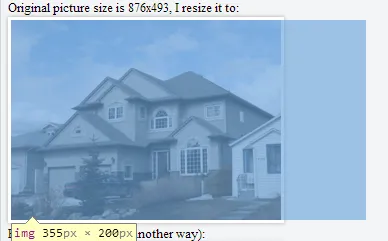
<small>Original picture size is 876x493, I resize it to:</small>
<div class = "property">
<img src = "http://a57.foxnews.com/global.fncstatic.com/static/managed/img/Leisure/2009/876/493/big-house-small-house.png?ve=1&tl=1"/>
</div>
<small>Result I want to get (in another way):</small>
<div class = "property">
<img style = "max-width: 147%" src = "http://a57.foxnews.com/global.fncstatic.com/static/managed/img/Leisure/2009/876/493/big-house-small-house.png?ve=1&tl=1"/>
</div>
</div>
</div>
https://jsfiddle.net/40ay7uco/
我想缩小图片以适应 div。 如何使用 jQuery 或 CSS 实现,而不是像我之前手动编写的那样。
p.s. 我想保持宽高比