注意:这是回答问题“Killercam”在
此处提出的答案。这个问题的答案特别适合他的赏金,所以应他的要求,我在这里发布了它。
在这个答案中,
按钮(Button)控件被用来演示如何使用模板。
第一部分. 控件模板中的绑定
如果你想在
控件模板(ControlTemplate)中使用
数据绑定(Binding),你应该使用以下结构:
<ControlTemplate TargetType="{x:Type SomeControl}">
    <Rectangle Fill="{TemplateBinding Background}" />
引用自MSDN:
TemplateBinding是模板场景下的一种优化形式的绑定,类似于使用{Binding RelativeSource={RelativeSource TemplatedParent}}构建的绑定。
使用TemplateBinding的注意事项
TemplateBinding不能在模板之外或其VisualTree属性之外使用,因此甚至不能在模板的触发器中使用TemplateBinding。此外,对于Freezable(主要是人为原因),例如-VisualBrush,TemplateBinding不起作用。在这种情况下,可以像这样使用绑定:
<FreezableControl Property="{Binding RelativeSource={RelativeSource TemplatedParent},
                                     Path=Background}" />
此外,您始终可以使用替代方案来替代
TemplateBinding:
<Rectangle Fill="{Binding RelativeSource={RelativeSource TemplatedParent},
                          Path=Background}" />
作为另一种可能性,您也可以尝试以下方法:
<Rectangle Fill="{Binding Background,
                          RelativeSource={RelativeSource AncestorType={x:Type SomeControl}},
                          Path=Background}" />
第二部分. 关于您的版本的说明
在您的情况下,这可能会导致ControlTemplate中名称的冲突,因为您已经在使用Binding背景作为Border。因此,请删除此Binding以使用Border,或者使用其他属性,例如Tag或attached依赖属性来绑定背景颜色。
使用示例
不使用ChartingToolkit控件,而是以Button控件为基础,因为这更容易演示这些样式的想法。
解决方案1: 使用Tag
<Window.Resources>
<Style x:Key="TestButtonStyle" TargetType="">
<Setter Property="BorderThickness" Value="0" />
<Setter Property="IsTabStop" Value="False" />
<Setter Property="Template">
<Setter.Value>
<ControlTemplate TargetType="">
<!-- Here we are set Tag for Border Background -->
<Border Background=", Path=Tag}"
BorderThickness="">
<Grid>
<Rectangle Width="24"
Height="24"
Fill=", Path=Background}"
Stroke="" />
<ContentPresenter Content=""
HorizontalAlignment=""
VerticalAlignment="" />
</Grid>
</Border>
</ControlTemplate>
</Setter.Value>
</Setter>
</Style>
</Window.Resources>
<Grid>
<Button Name="TestButton"
Style=""
Content="Test"
HorizontalContentAlignment="Center"
VerticalContentAlignment="Center"
Tag="Green"
Background="Aquamarine"
Width="100"
Height="100" />
</Grid>
输出
在Rectangle中,设置两种颜色:默认为Rectangle,标签为Border。我认为这不是一个好的解决方案,原因如下:
由此可以得出这些缺点,我们应该找到一种替代方案,作为替代方案,我使用了一个带有附加依赖属性的扩展类。
扩展类ButtonExt.cs
public static class ButtonExt
{
    #region RectangleBackground Property

    public static readonly DependencyProperty RectangleBackgroundProperty;

    public static void SetRectangleBackground(DependencyObject DepObject, Brush value)
    {
        DepObject.SetValue(RectangleBackgroundProperty, value);
    }

    public static Brush GetRectangleBackground(DependencyObject DepObject)
    {
        return (Brush)DepObject.GetValue(RectangleBackgroundProperty);
    }

    #endregion

    #region RectangleBorderBrush Property

    public static readonly DependencyProperty RectangleBorderBrushProperty;

    public static void SetRectangleBorderBrush(DependencyObject DepObject, Brush value)
    {
        DepObject.SetValue(RectangleBorderBrushProperty, value);
    }

    public static Brush GetRectangleBorderBrush(DependencyObject DepObject)
    {
        return (Brush)DepObject.GetValue(RectangleBorderBrushProperty);
    }

    #endregion

    #region Button Constructor

    static ButtonExt()
    {
        #region RectangleBackground

        PropertyMetadata BrushPropertyMetadata = new PropertyMetadata(Brushes.Transparent);

        RectangleBackgroundProperty = DependencyProperty.RegisterAttached("RectangleBackground",
                                                            typeof(Brush),
                                                            typeof(ButtonExt),
                                                            BrushPropertyMetadata);

        #endregion

        #region RectangleBorderBrush

        RectangleBorderBrushProperty = DependencyProperty.RegisterAttached("RectangleBorderBrush",
                                                            typeof(Brush),
                                                            typeof(ButtonExt),
                                                            BrushPropertyMetadata);

        #endregion
    }

    #endregion
}
MainWindow.xaml
<Window.Resources>
<Style x:Key="TestButtonExtensionStyle" TargetType="">
<Setter Property="Width" Value="80" />
<Setter Property="Height" Value="80" />
<Setter Property="Background" Value="Green" />
<Setter Property="BorderBrush" Value="Pink" />
<Setter Property="BorderThickness" Value="4" />
<Setter Property="Template">
<Setter.Value>
<ControlTemplate TargetType="">
<Border Background=""
BorderBrush=""
BorderThickness="">
<Grid>
<Rectangle Fill=""
Stroke=""
Width="30"
Height="30" />
<ContentPresenter Content=""
HorizontalAlignment=""
VerticalAlignment="" />
</Grid>
</Border>
</ControlTemplate>
</Setter.Value>
</Setter>
</Style>
</Window.Resources>
<Grid>
<Button Style=""
PropertiesExtension:ButtonExt.RectangleBackground="Aquamarine"
PropertiesExtension:ButtonExt.RectangleBorderBrush="Black"
Content="Test" />
</Grid>
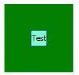
输出

第三部分. 为依赖属性设置值
当您创建并注册您的
附加依赖属性时,您必须声明Set和Get方法来与其配合使用:
public static void SetRectangleBackground(DependencyObject DepObject, Brush value)
{
    DepObject.SetValue(RectangleBackgroundProperty, value);
}

public static Brush GetRectangleBackground(DependencyObject DepObject)
{
    return (Brush)DepObject.GetValue(RectangleBackgroundProperty);
}
那么与它们一起工作的步骤如下:
Set
ButtonExt.SetRectangleBackground(MyButton, Brushes.Red)
Get
Brush MyBrush = ButtonExt.GetRectangleBackground(MyButton)
但在我们的情况下,情况并不简单。当我使用附加的依赖属性时,更新值的问题并不存在。但在我们的情况下,该属性位于模板中,在我的情况下没有更新
Button。我尝试在绑定和属性声明中设置
Mode=TwoWay,
UpdateSourceTrigger=PropertyChanged,以及
GetBindingExpression().UpdateTarget(),但都无效。
请注意,对于属性设置一个新值,并且来自模板的通知没有表明已经更新了该属性。也许我错了,你会成功,或者它是特意这样做的,例如为了避免内存泄漏。
在任何情况下,最好不要直接更新依赖属性,而是将其绑定到
Model 的属性,并在
ViewModel 中设置值。
示例:
<Button Style="{StaticResource TestButtonExtensionStyle}"
        adp:ButtonExt.RectangleBackground="{Binding Path=Model.RectBackground,
                                                    Mode=TwoWay,
                                                    UpdateSourceTrigger=PropertyChanged}"
        adp:ButtonExt.RectangleBorderBrush="{Binding Path=Model.RectBorderBrush,
                                                     Mode=TwoWay,
                                                     UpdateSourceTrigger=PropertyChanged}" />
其中RectBackground和RectBorderBrush实现了INotifyPropertyChanged接口。
作为替代方案,在这种情况下,不要使用依赖属性,而是使用DataTemplate来控制。 DataTemplate非常适合MVVM,非常灵活和动态。
例如,使用DataTemplate工作,您可以查看我的答案:
创建可重用的动态视图
一个ViewModel用于UserControl和Window或单独的ViewModels