我为您准备了一个易于理解的例子,如果有用,请选择我的答案作为正确答案。
import androidx.compose.foundation.background
import androidx.compose.foundation.layout.Box
import androidx.compose.foundation.layout.fillMaxSize
import androidx.compose.foundation.layout.fillMaxWidth
import androidx.compose.foundation.layout.height
import androidx.compose.foundation.layout.size
import androidx.compose.foundation.shape.RoundedCornerShape
import androidx.compose.material.AppBarDefaults
import androidx.compose.material.MaterialTheme
import androidx.compose.material.Surface
import androidx.compose.material.Text
import androidx.compose.runtime.Composable
import androidx.compose.runtime.CompositionLocalProvider
import androidx.compose.ui.Alignment
import androidx.compose.ui.Modifier
import androidx.compose.ui.graphics.Color
import androidx.compose.ui.layout.layoutId
import androidx.compose.ui.platform.LocalLayoutDirection
import androidx.compose.ui.platform.testTag
import androidx.compose.ui.text.font.FontWeight
import androidx.compose.ui.text.style.TextAlign
import androidx.compose.ui.text.style.TextOverflow
import androidx.compose.ui.tooling.preview.Preview
import androidx.compose.ui.unit.LayoutDirection
import androidx.compose.ui.unit.dp
import androidx.constraintlayout.compose.ConstraintLayout
import androidx.constraintlayout.compose.ConstraintSet
import androidx.constraintlayout.compose.Dimension
import stackoverflow.answers.ui.theme.StackOverflowAnswersTheme
@Composable
private fun StandardToolbar(
onProfileButtonClick: () -> Unit,
onFilterButtonClick: () -> Unit,
onBackButtonClick: () -> Unit
) {
val constraintSet = ConstraintSet {
val startReference = createRefFor("startReference")
val endReference = createRefFor("endReference")
val titleReference = createRefFor("titleReference")
constrain(startReference) {
start.linkTo(parent.start, 16.dp)
top.linkTo(parent.top, 16.dp)
bottom.linkTo(parent.bottom, 16.dp)
width = Dimension.value(48.dp)
}
constrain(endReference) {
end.linkTo(parent.end, 16.dp)
top.linkTo(parent.top, 16.dp)
bottom.linkTo(parent.bottom, 16.dp)
width = Dimension.value(48.dp)
}
constrain(titleReference) {
start.linkTo(startReference.end, 8.dp)
end.linkTo(endReference.start, 8.dp)
top.linkTo(parent.top, 16.dp)
bottom.linkTo(parent.bottom, 16.dp)
width = Dimension.fillToConstraints
}
}
Surface(
elevation = AppBarDefaults.TopAppBarElevation,
shape = RoundedCornerShape(
bottomStart = 50f,
bottomEnd = 50f
),
color = Color(0XFF2F364E),
modifier = Modifier
.fillMaxWidth()
.height(72.dp)
) {
ConstraintLayout(
modifier = Modifier.fillMaxSize(),
constraintSet = constraintSet
) {
Box(
modifier = Modifier
.layoutId("startReference")
.size(48.dp)
.background(Color.Blue)
) {
}
Text(
modifier = Modifier
.layoutId("titleReference"),
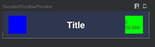
text = "Title",
style = MaterialTheme.typography.h5.copy(fontWeight = FontWeight.Bold),
color = Color.White,
overflow = TextOverflow.Ellipsis,
textAlign = TextAlign.Center,
maxLines = 1
)
Box(
modifier = Modifier
.layoutId("endReference")
.size(48.dp)
.background(Color.Green)
) {
Text(text = "E 20,000", modifier = Modifier.align(Alignment.Center), style = MaterialTheme.typography.caption)
}
}
}
}
@Composable
@Preview
fun StandardToolbarPreview() {
CompositionLocalProvider(
LocalLayoutDirection provides LayoutDirection.Ltr
) {
StackOverflowAnswersTheme {
StandardToolbar(
onProfileButtonClick = { },
onFilterButtonClick = { },
onBackButtonClick = {}
)
}
}
}