我想要对用户的选择做出反应,与这个例子类似: 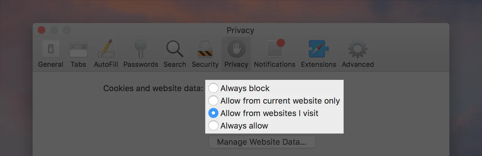
在第二阶段,我想要在每个单选按钮下面展示额外的内容,例如将第二和第三个按钮分开,以便提供一个允许访问网站的列表。
到目前为止,我还没有在SwiftUI中找到如何实现这一点的方法。非常感谢!
我想要对用户的选择做出反应,与这个例子类似:
在第二阶段,我想要在每个单选按钮下面展示额外的内容,例如将第二和第三个按钮分开,以便提供一个允许访问网站的列表。
到目前为止,我还没有在SwiftUI中找到如何实现这一点的方法。非常感谢!
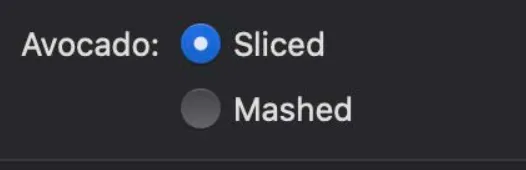
Picker(selection: $order.avocadoStyle, label: Text("Avocado:")) {
    Text("Sliced").tag(AvocadoStyle.sliced)
    Text("Mashed").tag(AvocadoStyle.mashed)
}.pickerStyle(RadioGroupPickerStyle())
这是2019年SwiftUI基础知识主题演讲中的代码(SwiftUI Essentials - WWDC 2019)。在视频的第43分钟左右,他们展示了这个例子。
它将看起来像这样:
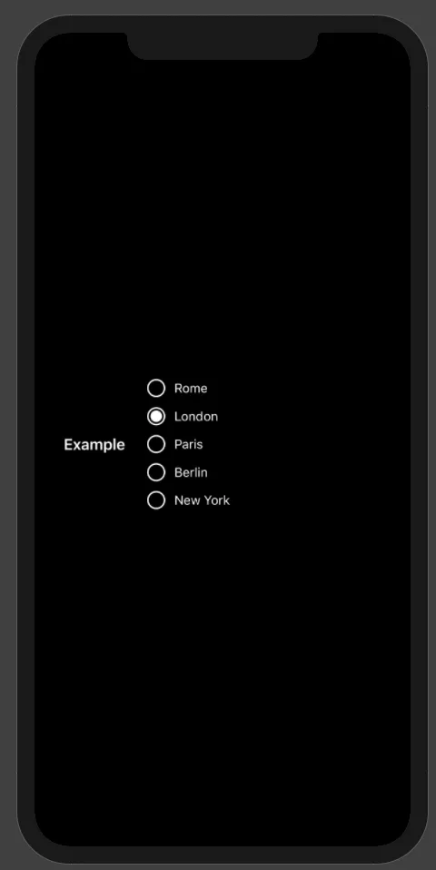
.pickerStyle(RadioGroupPickerStyle()) - user12132829看这里……一个易于使用的iOS SwiftUI RadiobuttonGroup
你可以像这样使用它:
RadioButtonGroup(items: ["Rome", "London", "Paris", "Berlin", "New York"], selectedId: "London") { selected in
                print("Selected is: \(selected)")
            }
这里是代码:
struct ColorInvert: ViewModifier {

    @Environment(\.colorScheme) var colorScheme

    func body(content: Content) -> some View {
        Group {
            if colorScheme == .dark {
                content.colorInvert()
            } else {
                content
            }
        }
    }
}

struct RadioButton: View {

    @Environment(\.colorScheme) var colorScheme

    let id: String
    let callback: (String)->()
    let selectedID : String
    let size: CGFloat
    let color: Color
    let textSize: CGFloat

    init(
        _ id: String,
        callback: @escaping (String)->(),
        selectedID: String,
        size: CGFloat = 20,
        color: Color = Color.primary,
        textSize: CGFloat = 14
        ) {
        self.id = id
        self.size = size
        self.color = color
        self.textSize = textSize
        self.selectedID = selectedID
        self.callback = callback
    }

    var body: some View {
        Button(action:{
            self.callback(self.id)
        }) {
            HStack(alignment: .center, spacing: 10) {
                Image(systemName: self.selectedID == self.id ? "largecircle.fill.circle" : "circle")
                    .renderingMode(.original)
                    .resizable()
                    .aspectRatio(contentMode: .fit)
                    .frame(width: self.size, height: self.size)
                    .modifier(ColorInvert())
                Text(id)
                    .font(Font.system(size: textSize))
                Spacer()
            }.foregroundColor(self.color)
        }
        .foregroundColor(self.color)
    }
}

struct RadioButtonGroup: View {

    let items : [String]

    @State var selectedId: String = ""

    let callback: (String) -> ()

    var body: some View {
        VStack {
            ForEach(0..<items.count) { index in
                RadioButton(self.items[index], callback: self.radioGroupCallback, selectedID: self.selectedId)
            }
        }
    }

    func radioGroupCallback(id: String) {
        selectedId = id
        callback(id)
    }
}

struct ContentView: View {
    var body: some View {
        HStack {
            Text("Example")
                .font(Font.headline)
                .padding()
            RadioButtonGroup(items: ["Rome", "London", "Paris", "Berlin", "New York"], selectedId: "London") { selected in
                print("Selected is: \(selected)")
            }
        }.padding()
    }
}

struct ContentView_Previews: PreviewProvider {
    static var previews: some View {
        ContentView()
    }
}

struct ContentViewDark_Previews: PreviewProvider {
    static var previews: some View {
        ContentView()
        .environment(\.colorScheme, .dark)
        .darkModeFix()
    }
}
我刚刚编辑了@LizJ的答案,将didTapActive和didTapInactive替换为Binding,这样它看起来就像其他SwiftUI元素一样。
import SwiftUI
struct RadioButton: View {
    @Binding var checked: Bool    //the variable that determines if its checked

    var body: some View {
        Group{
            if checked {
                ZStack{
                    Circle()
                        .fill(Color.blue)
                        .frame(width: 20, height: 20)
                    Circle()
                        .fill(Color.white)
                        .frame(width: 8, height: 8)
                }.onTapGesture {self.checked = false}
            } else {
                Circle()
                    .fill(Color.white)
                    .frame(width: 20, height: 20)
                    .overlay(Circle().stroke(Color.gray, lineWidth: 1))
                    .onTapGesture {self.checked = true}
            }
        }
    }
}
我使用的是Swift4、Catalina操作系统和Xcode 11.2,在iOS中无法使用RadioGroupPickerStyle,而.radiogroup根本不能工作(在构建时会冻结),因此我自己制作了一个可重复使用的按钮来处理其他情况的问题。(请注意,它只是一个按钮,您必须自己处理逻辑。)希望这可以帮助到你!
import SwiftUI

struct RadioButton: View {
let ifVariable: Bool    //the variable that determines if its checked
let onTapToActive: ()-> Void//action when taped to activate
let onTapToInactive: ()-> Void //action when taped to inactivate

var body: some View {
    Group{
        if ifVariable {
            ZStack{
                Circle()
                    .fill(Color.blue)
                    .frame(width: 20, height: 20)
                Circle()
                    .fill(Color.white)
                    .frame(width: 8, height: 8)
            }.onTapGesture {self.onTapToInactive()}
        } else {
            Circle()
                .fill(Color.white)
                .frame(width: 20, height: 20)
                .overlay(Circle().stroke(Color.gray, lineWidth: 1))
                .onTapGesture {self.onTapToActive()}
        }
    }
}
}
使用方法:将此代码放入任何文件中,您可以像在项目的其他任何视图中一样使用它。(我们在全局文件夹中保存了一个包含按钮文件的文件夹)
我将使用@LizJ之前的答案,并在单选按钮后添加文本以类似于(Flutter中的RadioListTile)
struct RadioButton: View {
    let ifVariable: Bool    //the variable that determines if its checked
    let radioTitle: String
    var onTapToActive: ()-> Void//action when taped to activate
    let onTapToInactive: ()-> Void //action when taped to inactivate

    var body: some View {
        Group{
            if ifVariable {
                HStack(alignment: .center, spacing: 16) {
                    ZStack{
                    Circle()
                            .fill(AppColors.primaryColor)
                        .frame(width: 20, height: 20)
                    Circle()
                        .fill(Color.white)
                        .frame(width: 8, height: 8)
                }.onTapGesture {self.onTapToInactive()}
                Text(radioTitle)
                .font(.headline)
                }
            } else {
                HStack(alignment: .center, spacing: 16){
                    Circle()
                    .fill(Color.white)
                    .frame(width: 20, height: 20)
                    .overlay(Circle().stroke(Color.gray, lineWidth: 1))
                    .onTapGesture {self.onTapToActive()}

           Text(radioTitle)
           .font(.headline)
                }
            }
        }
    }
我还将为选择逻辑提供一个示例,我们将为单选按钮案例创建一个枚举
enum PaymentMethod: Int {
case undefined = 0
case credit = 1
case cash  = 2
}
然后我们将创建@State变量来携带选择,我不会重新创建另一个SwiftUI视图,而只是解释基本概念,没有任何样板代码
struct YourView: View {

    @State private var paymentMethod: PaymentMethod

    var body: some View {

    RadioButton(ifVariable: paymentMethod == PaymentMethod.credit,radioTitle: "Pay in Credit",  onTapToActive: {
                        paymentMethod = .credit
                    }, onTapToInactive: {})

    RadioButton(ifVariable: paymentMethod == PaymentMethod.cash,radioTitle: "Pay in Cash",  onTapToActive: {
                        paymentMethod = .cash
                    }, onTapToInactive: {})


        }
    }
通过这个之前的代码,你可以在SwiftUI中切换单选按钮,并在每个选择后显示文本以类似于(Flutter中的RadioListTile)。