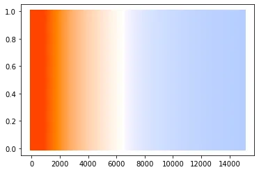
我制作了一个颜色调色板,其中的颜色与温度(以开尔文为单位)相关联。将温度转换为rgb的代码可以在此处找到:https://gist.github.com/petrklus/b1f427accdf7438606a6
- 展示颜色调色板
- 在colorList中捕获[r,g,b]
step_size = 10
colorList=[]
# from 0 K to 15 K, convert K to rgb, plot and capture
for i in range(0, 15000, step_size):
    color = list(map(lambda div: div, convert_K_to_RGB(i)))
    colorList.append(color)
    plt.plot((i, i), (0, 1), linewidth=step_size/2.0, linestyle="-", color=color)
如何在 Plotly 中使用此调色板而不是标准调色板?
我尝试过:
- 创建一个字典
dC = {'pallete':colorList}
创建pandas数据框:
dCpd = pd.DataFrame(dC)
从pandas列中提取RGB
xRed = [dCpd['pallete'][i][0] for i in range(len(dCpd['pallete']))]
xGreen = [dCpd['pallete'][i][1] for i in range(len(dCpd['pallete']))]
xBlue = [dCpd['pallete'][i][2] for i in range(len(dCpd['pallete']))]
生成最终的字典,以传递给Plotly。
xRGB = {'Red':xRed, 'Green':xGreen, 'Blue':xBlue}
- Plotly散点图3D
fig = px.scatter_3d(datap,x = x, y = y, z = z, color=datap['B-V'],
                    color_continuous_scale= xRGB,
                    color_continuous_midpoint=0)
fig.show()
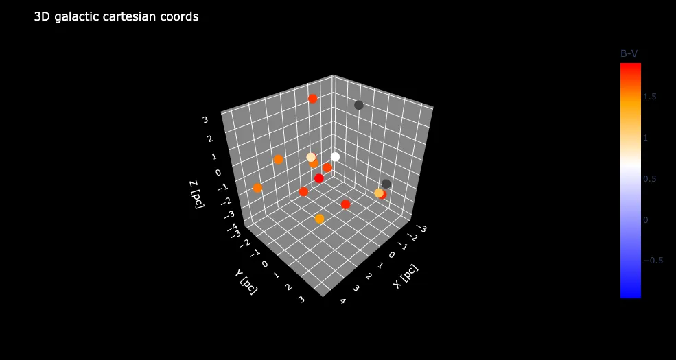
datap是我试图应用颜色调色板的pandas数据框。我正在绘制星体的位置,并希望它们的颜色代表温度。逻辑如下:
星体B-V颜色指数列(datap[B-V]) -> 计算温度 -> 从温度计算RGB -> 应用该颜色
我收到的错误:
Invalid value of type 'builtins.dict' received for the 'colorscale' property of make_figure
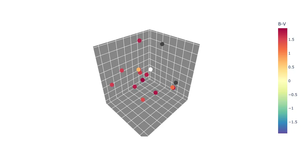
在Plotly中使用标准调色板的示例图表可以正常工作,但无法表示我试图实现的颜色温度相关性:
fig = px.scatter_3d(datap,x = x, y = y, z = z, color=datap['B-V'],
                     color_continuous_scale=px.colors.diverging.Spectral_r,
                     color_continuous_midpoint= 0,
                     hover_data=(['Name','magV']))
fig.show()
我希望B-V颜色板与第一个png中的示例相同