Matplotlib图表相同数据不重叠

3

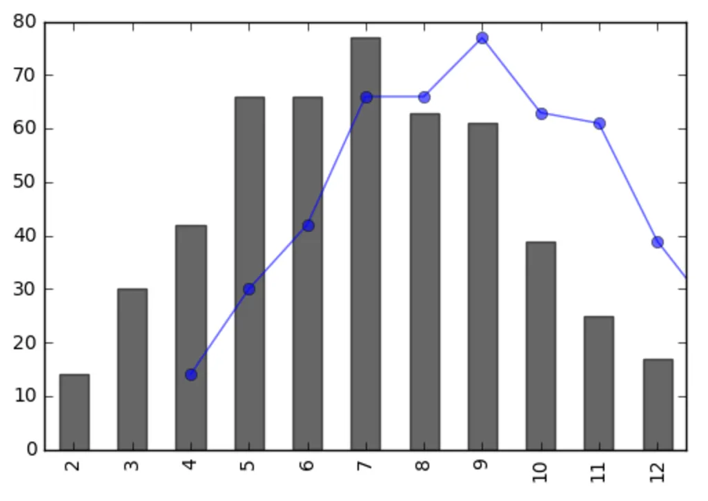
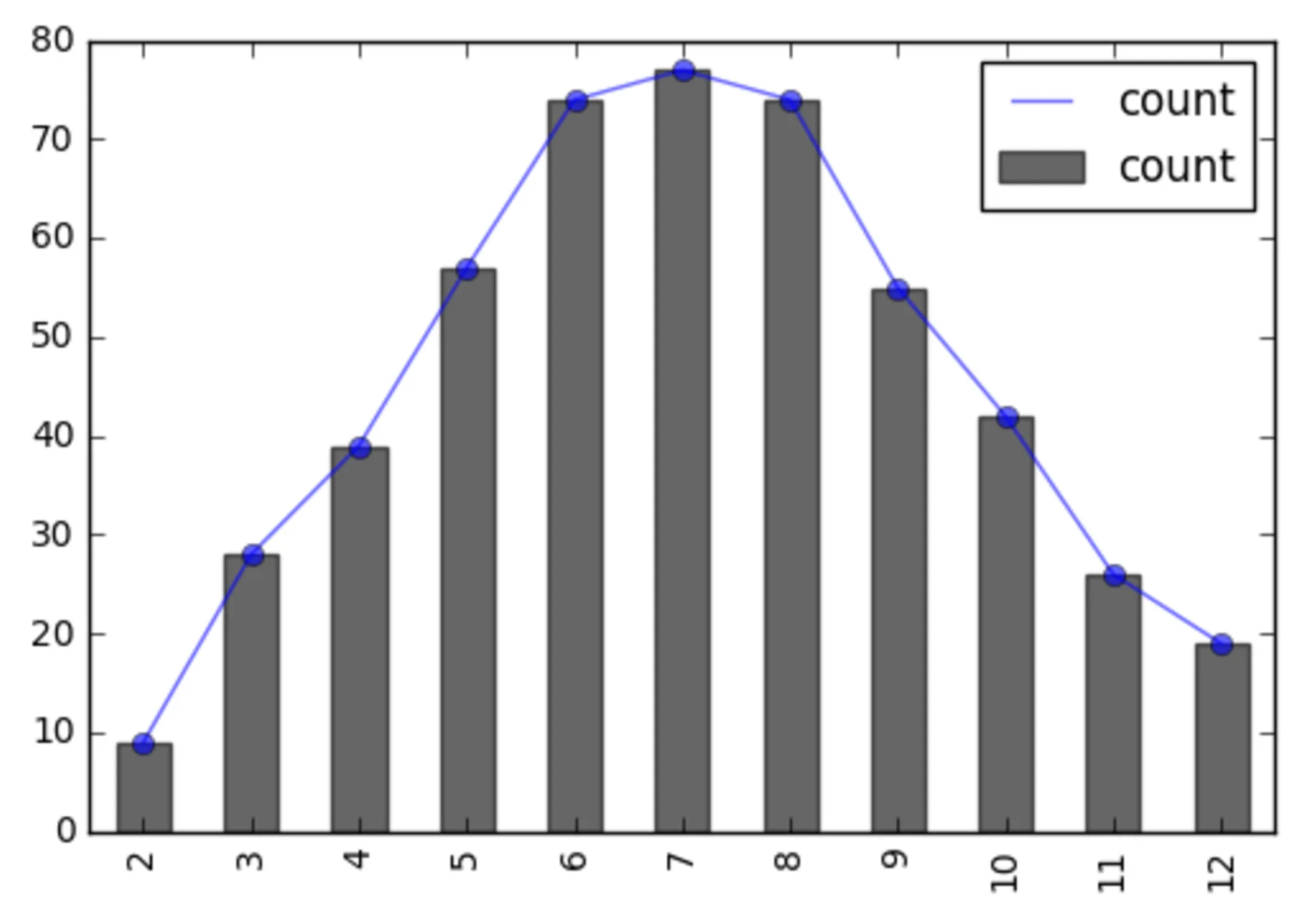
我生成了一些数据,尝试将它们可视化为同一图中的两个图表。一个是条形图,另一个是折线图。

但是由于某种原因,这些图似乎没有重叠。

以下是我的代码:

# roll two 6-sided dices 500 times
dice_1 = pd.Series(np.random.randint(1, 7, 500))
dice_2 = pd.Series(np.random.randint(1, 7, 500))

dices = dice_1 + dice_2

# plotting the requency of a 2 times 6 sided dice role
fc = collections.Counter(dices)
freq = pd.Series(fc)
freq.plot(kind='line', alpha=0.6, linestyle='-', marker='o')
freq.plot(kind='bar', color='k', alpha=0.6)

这里是图表。

enter image description here

数据集相同,但折线图向右移动两个数据点(从4开始而不是2)。如果我分别绘制它们,它们会正确显示(都从2开始)。那么如果我在同一张图中绘制它们有什么不同?如何解决这个问题?

问题在于,我认为它在Joe Kington的答案这里中有所描述。然而,那已经是5年前的事了,由于我怀疑这不是期望的行为,我想知道是否有一个好的解决方法。还在寻找中。 - roganjosh
2个回答

1
我没有找到比重新提供x轴数据更简单的方法来实现这一点。如果这代表了你所使用的更大的方法,那么也许你需要从pd.Series()绘制这些数据,而不是使用列表,但是这段代码至少会给你想要的图形。如果你正在使用Python 3,请将iteritems()更改为items()。
似乎在线性图之后发生了一些自动缩放x轴的情况,这使得两个图之间相差两个点(最低值)。可能可以在两个图绘制之前禁用x轴的自动缩放,但这似乎更加困难。
import collections
import pandas as pd
import numpy as np
import matplotlib.pyplot as plt

# roll two 6-sided dices 500 times
dice_1 = pd.Series(np.random.randint(1, 7, 500))
dice_2 = pd.Series(np.random.randint(1, 7, 500))

dices = dice_1 + dice_2

# plotting the requency of a 2 times 6 sided dice role
fc = collections.Counter(dices)

x_axis = [key for key, value in fc.iteritems()]
y_axis = [value for key, value in fc.iteritems()]

plt.plot(x_axis, y_axis, alpha=0.6, linestyle='-', marker='o')
plt.bar(x_axis, y_axis, color='k', alpha=0.6, align='center')
plt.show()

1
这是因为系列图使用索引,将use_index设置为False可以解决问题,我建议使用groupbylen来计算每个组合的频率。
import pandas as pd
import numpy as np
import matplotlib.pyplot as plt

# roll two 6-sided dices 500 times
dice_1 = pd.Series(np.random.randint(1, 7, 500))
dice_2 = pd.Series(np.random.randint(1, 7, 500))
dices = dice_1 + dice_2

# returns the corresponding value of each index from dices
func = lambda x: dices.loc[x]

fc = dices.groupby(func).agg({'count': len})

ax = fc.plot(kind='line', alpha=0.6, linestyle='-',
             marker='o', use_index=False)
fc.plot(ax=ax, kind='bar', alpha=0.6, color='k')

plt.show()

结果如下所示: plot


网页内容由stack overflow 提供, 点击上面的
可以查看英文原文,
原文链接