Python绘图和幂律拟合

10

我有以下列表:

[6, 4, 0, 0, 0, 0, 0, 1, 3, 1, 0, 3, 3, 0, 0, 0, 0, 1, 1, 0, 0, 0, 3, 2, 3, 3, 2, 5, 0, 0, 0, 0, 0, 0, 1, 0, 0, 0, 0, 0, 1, 2, 1, 0, 1, 0, 0, 0, 0, 1, 0, 1, 2, 0, 0, 0, 2, 1, 1, 0, 0, 0, 1, 0, 1, 0, 0, 1, 1, 1, 1, 0, 1, 1, 1, 3, 1, 1, 0, 1, 1, 0, 0, 0, 1, 0, 0, 1, 0, 1, 2, 2, 3, 2, 1, 0, 0, 0, 1, 2]

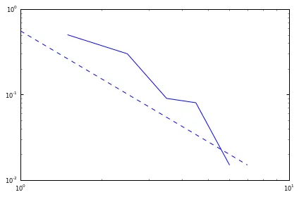
我想使用Python绘制每个实体的频率并对其进行幂律分析。
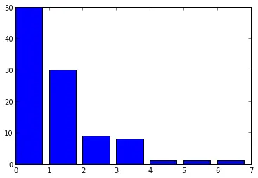
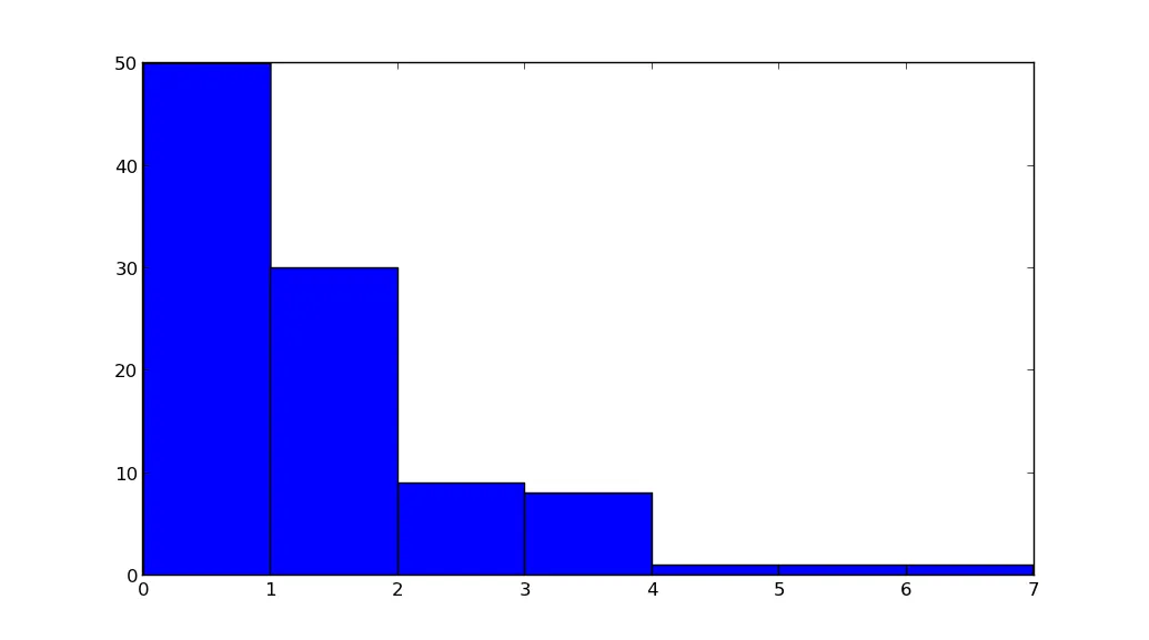
但我不知道如何绘制具有纵轴为频率和横轴为列表数字的图表。
我想创建一个包含频率的字典,并绘制字典的值,但是这样无法将列表中的数字放在x轴上。
你有什么建议吗?
4个回答

13

使用powerlaw包:

import powerlaw
d=[6, 4, 0, 0, 0, 0, 0, 1, 3, 1, 0, 3, 3, 0, 0, 0, 0, 1, 1, 0, 0, 0, 3,2,  3, 3, 2, 5, 0, 0, 0, 0, 0, 0, 1, 0, 0, 0, 0, 0, 1, 2, 1, 0, 1, 0, 0, 0, 0, 1,0, 1, 2, 0, 0, 0, 2, 1, 1, 0, 0, 0, 1, 0, 1, 0, 0, 1, 1, 1, 1, 0, 1, 1, 1,3, 1, 1, 0, 1, 1, 0, 0, 0, 1, 0, 0, 1, 0, 1, 2, 2, 3, 2, 1, 0, 0, 0, 1, 2]
fit = powerlaw.Fit(numpy.array(d)+1,xmin=1,discrete=True)
fit.power_law.plot_pdf( color= 'b',linestyle='--',label='fit ccdf')
fit.plot_pdf( color= 'b')

print('alpha= ',fit.power_law.alpha,'  sigma= ',fit.power_law.sigma)

alpha= 1.85885487521 sigma= 0.0858854875209

enter image description here

该工具可以正确绘制、拟合并分析数据,还有一种特殊的方法用于拟合具有离散数据的幂律分布。

使用以下命令可安装:pip install powerlaw


你知道怎么获取缩放因子C吗? - sdgaw erzswer

4

我认为你对字典的理解是正确的:

>>> import matplotlib.pyplot as plt
>>> from collections import Counter
>>> c = Counter([6, 4, 0, 0, 0, 0, 0, 1, 3, 1, 0, 3, 3, 0, 0, 0, 0, 1, 1, 0, 0, 0, 3, 2, 3, 3, 2, 5, 0, 0, 0, 0, 0, 0, 1, 0, 0, 0, 0, 0, 1, 2, 1, 0, 1, 0, 0, 0, 0, 1, 0, 1, 2, 0, 0, 0, 2, 1, 1, 0, 0, 0, 1, 0, 1, 0, 0, 1, 1, 1, 1, 0, 1, 1, 1, 3, 1, 1, 0, 1, 1, 0, 0, 0, 1, 0, 0, 1, 0, 1, 2, 2, 3, 2, 1, 0, 0, 0, 1, 2])
>>> sorted(c.items())
[(0, 50), (1, 30), (2, 9), (3, 8), (4, 1), (5, 1), (6, 1)]
>>> plt.plot(*zip(*sorted(c.items()))
... )
[<matplotlib.lines.Line2D object at 0x36a9990>]
>>> plt.show()

有几点需要注意。 zip(*sorted(c.items()))会返回类似于[(0,1,2,3,4,5,6),(50,30,9,8,1,1,1)]的内容。我们可以使用*运算符解包它,以便plt.plot看作是两个参数--(0,1,2,3,4,5,6)(50,30,9,8,1,1,1)。分别用于绘图的xy值。

至于拟合数据,scipy可能会有所帮助。具体来说,请查看以下示例。 (其中一个示例甚至使用了幂律)。


我刚刚看到了你的编辑。谢谢。这可能会解决我的问题。 - Tasos

4
y = np.bincount([6, 4, 0, 0, 0, 0, 0, 1, 3, 1, 0, 3, 3, 0, 0, 0, 0, 1, 1, 0, 0, 0, 3, 2, 3, 3, 2, 5, 0, 0, 0, 0, 0, 0, 1, 0, 0, 0, 0, 0, 1, 2, 1, 0, 1, 0, 0, 0, 0, 1, 0, 1, 2, 0, 0, 0, 2, 1, 1, 0, 0, 0, 1, 0, 1, 0, 0, 1, 1, 1, 1, 0, 1, 1, 1, 3, 1, 1, 0, 1, 1, 0, 0, 0, 1, 0, 0, 1, 0, 1, 2, 2, 3, 2, 1, 0, 0, 0, 1, 2])
x = np.nonzero(y)[0]
plt.bar(x,y)

enter image description here


-1
import matplotlib.pyplot as plt
data = [6, 4, 0, 0, 0, 0, 0, 1, 3, 1, 0, 3, 3, 0, 0, 0, 0, 1, 1, 0, 0, 0, 3, 2, 3, 3, 2, 5, 0, 0, 0, 0, 0, 0, 1, 0, 0, 0, 0, 0, 1, 2, 1, 0, 1, 0, 0, 0, 0, 1, 0, 1, 2, 0, 0, 0, 2, 1, 1, 0, 0, 0, 1, 0, 1, 0, 0, 1, 1, 1, 1, 0, 1, 1, 1, 3, 1, 1, 0, 1, 1, 0, 0, 0, 1, 0, 0, 1, 0, 1, 2, 2, 3, 2, 1, 0, 0, 0, 1, 2]

plt.hist(data, bins=range(max(data)+2))
plt.show()

enter image description here


网页内容由stack overflow 提供, 点击上面的
可以查看英文原文,
原文链接