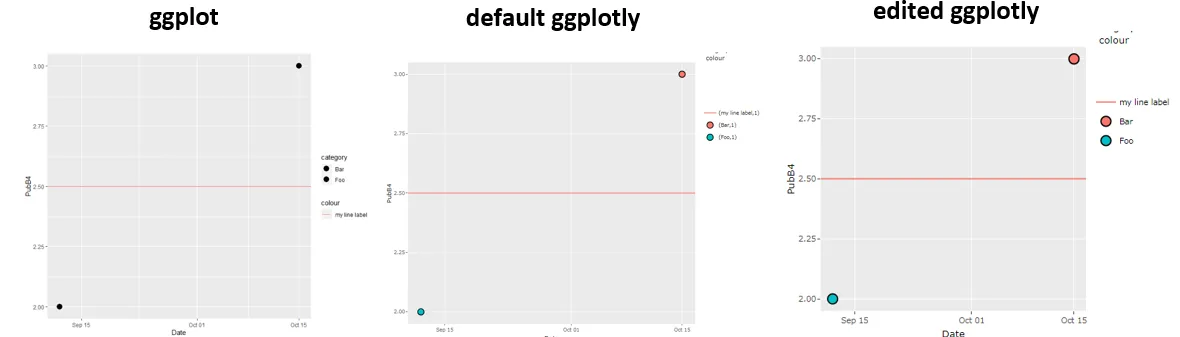
我想把一个ggplot转换成plotly。ggplot渲染正常,但是当我将它通过ggplotly处理后,图例的标签后面会增加括号和",1"。
这是一个样本假数据:
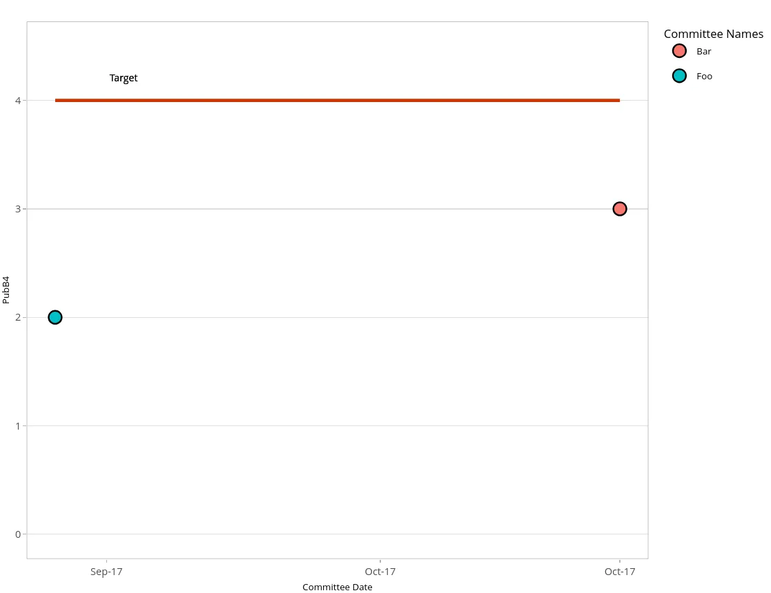
sorted1<-data.frame(CommDate=c(as.Date("2017-09-12"), as.Date("2017-10-15")), CommName=c("Foo", "Bar"), PubB4=c(2,3))
以下是我试图在上面运行的代码:
ggplotly(ggplot(sorted1, aes(x=as.Date(CommDate), y=PubB4))+
           geom_smooth(level=0.0, aes(colour="Moving average"), se=FALSE)+
           geom_point(aes(fill=CommName), size=4)+
           expand_limits(y=c(0,4.5))+
           geom_line(mapping=aes(y=4),colour="orangered3",size=1)+
           geom_text(mapping=aes(y=4.2, x=min(sorted1$CommDate)+4), label="Target", size=3)+
           xlab("Committee Date")+
           guides(fill=guide_legend(title="Committee Names"), colour=guide_legend(title.theme=element_blank(),title=NULL))+
           scale_x_date(labels = date_format("%b-%y"))+
           theme_light()+
           theme(plot.title=element_text(hjust=0.5, size=12),panel.grid.major.x = (element_blank()),
                 panel.grid.minor.x = (element_blank()),
                 axis.title = element_text(size=8), legend.title = element_text(size=10),
                 legend.text = element_text(size=8), legend.box = 'vertical', legend.spacing.y = unit(-2,"mm"))+
           scale_colour_manual(name="",values="#0072B2"))
(geom_smooth在这里没有渲染,但在完整数据中会渲染。)
我从中得到了以下信息:
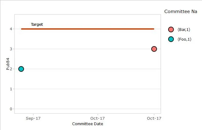
为什么图例显示为“(foo,1)”?
我尝试删除geom_smooth,它实际上解决了问题,但我需要它在那里-如何保留它并修复图例?
谢谢!
更新:好的,我开始注释一些东西看看会发生什么。如果我从geom_smooth中删掉()这个,也可以解决问题,只要我把scale_colour_manual也注释掉就可以了。但是我真的希望对geom_smooth的美学有所控制,并将其包括在图例中。所以我正在取得进展,但还不够...