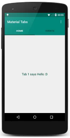
我一直在学习使用 Material Design 的滑动选项卡,参考了这篇文章。我已经成功实现了下方带有Toolbar的滑动选项卡,就像这样:
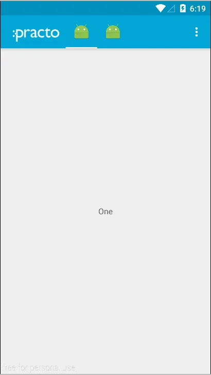
但现在我想创建 ActionBar/ToolBar Fragment Tabs ...
我一直在学习使用 Material Design 的滑动选项卡,参考了这篇文章。我已经成功实现了下方带有Toolbar的滑动选项卡,就像这样:
但现在我想创建 ActionBar/ToolBar Fragment Tabs ...
 通过依赖项导入库或手动下载项目并导入。
compile 'com.jpardogo.materialtabstrip:library:1.0.9'
styles.xml
<resources>

    <style name="AppTheme" parent="Theme.AppCompat.Light.NoActionBar">
        <item name="colorPrimary">@color/primary</item>
        <item name="colorPrimaryDark">@color/primary_dark</item>
    </style>
</resources>
MainActivity & Adapter
public class MainActivity extends ActionBarActivity {
    Toolbar toolbar;
    ViewPager viewPager;
    ContactPagerAdapter pagerAdapter;
    PagerSlidingTabStrip pagerSlidingTabStrip;

    @Override
    protected void onCreate(Bundle savedInstanceState) {
        super.onCreate(savedInstanceState);
        setContentView(R.layout.activity_main);
        toolbar = (Toolbar) findViewById(R.id.toolbar);
        toolbar.setLogo(R.mipmap.logo_two);
        toolbar.inflateMenu(R.menu.menu_main);
        viewPager = (ViewPager) findViewById(R.id.pager);
        pagerAdapter = new ContactPagerAdapter(this, getSupportFragmentManager());
        pagerSlidingTabStrip = (PagerSlidingTabStrip) findViewById(R.id.tabs);
        viewPager.setAdapter(pagerAdapter);
        pagerSlidingTabStrip.setViewPager(viewPager);
    }

    public static class ContactPagerAdapter extends FragmentPagerAdapter implements PagerSlidingTabStrip.CustomTabProvider {

        private final int[] ICONS = {R.mipmap.ic_launcher, R.mipmap.ic_launcher};
        Context mContext;
        private Fragment f = null;

        public ContactPagerAdapter(Context ctx, FragmentManager fm) {
            super(fm);
            mContext = ctx;
        }

        @Override
        public int getCount() {
            return ICONS.length;
        }

        @Override
        public Fragment getItem(int position) { // Returns Fragment based on position
            switch (position) {
                case 0:
                    f = new FragmentPageOne();
                    break;
                case 1:
                    f = new FragmentPageTwo();
                    break;
            }
            return f;
        }

        @Override
        public View getCustomTabView(ViewGroup parent, int position) {
            LinearLayout customLayout = (LinearLayout) LayoutInflater.from(mContext).inflate(R.layout.custom_tab, parent, false);
            ImageView imageView = (ImageView) customLayout.findViewById(R.id.image);
            imageView.setImageResource(ICONS[position]);
            return customLayout;
        }
    }
}
activity_main.xml
<RelativeLayout
    xmlns:android="http://schemas.android.com/apk/res/android"
    xmlns:app="http://schemas.android.com/apk/res-auto"
    android:layout_width="match_parent"
    android:layout_height="match_parent">

    <android.support.v7.widget.Toolbar
        android:id="@+id/toolbar"
        android:layout_width="match_parent"
        android:layout_height="wrap_content"
        android:background="#02a6d8"
        android:minHeight="56dp"
        app:theme="@style/ThemeOverlay.AppCompat.Dark.ActionBar">

        <com.astuetz.PagerSlidingTabStrip
            android:id="@+id/tabs"
            android:layout_width="wrap_content"
            android:layout_height="56dp"
            android:layout_alignParentRight="true"
            android:layout_marginLeft="8dp"
            android:background="#02a6d8"
            app:pstsDividerColor="#02a6d8"
            app:pstsIndicatorColor="#fff"
            app:pstsIndicatorHeight="2dp"
            app:pstsShouldExpand="false"
            app:pstsUnderlineHeight="0dp"/>
    </android.support.v7.widget.Toolbar>


    <android.support.v4.view.ViewPager
        android:id="@+id/pager"
        android:layout_width="match_parent"
        android:layout_height="match_parent"
        android:layout_below="@+id/toolbar"/>

    <!-- Shadow below toolbar-->
    <LinearLayout
        android:layout_width="match_parent"
        android:layout_height="5dp"
        android:layout_below="@+id/toolbar"
        android:background="@drawable/toolbar_shadow"/>
</RelativeLayout>
custom_tab.xml
<?xml version="1.0" encoding="utf-8"?>
<LinearLayout
    xmlns:android="http://schemas.android.com/apk/res/android"
    android:layout_width="30dp"
    android:layout_height="wrap_content">

    <ImageView
        android:id="@+id/image"
        android:layout_width="30dp"
        android:layout_height="wrap_content"
        android:layout_gravity="center_vertical"
        android:paddingBottom="8dp"
        android:paddingTop="8dp"/>
</LinearLayout>
Drawrable toolbar_shadow.xml
<?xml version="1.0" encoding="utf-8"?>
<shape xmlns:android="http://schemas.android.com/apk/res/android">
    <gradient
        android:angle="270"
        android:endColor="@android:color/transparent"
        android:startColor="@color/semi_transparent"/>
</shape>
正如我之前所写的,你可以在这里找到一个例子: http://www.android4devs.com/2015/01/how-to-make-material-design-sliding-tabs.html
顺便提一下,你需要在你的项目中包含这段代码: https://developer.android.com/samples/SlidingTabsColors/src/com.example.android.common/view/SlidingTabLayout.html。然后创建一个类,在其中粘贴整个代码。
接着创建一个继承 ActionBarActivity 的活动,比如这样一个:
public class MainActivity extends ActionBarActivity {

static final String LOG_TAG = "SlidingTabsBasicFragment";
private SlidingTabLayout mSlidingTabLayout;
private ViewPager mViewPager;

@Override
protected void onCreate(Bundle savedInstanceState) {
    super.onCreate(savedInstanceState);
    setContentView(R.layout.fragment_sample);
    Toolbar toolbar = (Toolbar) findViewById(R.id.my_awesome_toolbar);

    mViewPager = (ViewPager) findViewById(R.id.viewpager);
    mViewPager.setAdapter(new SamplePagerAdapter());
    mSlidingTabLayout = (SlidingTabLayout) findViewById(R.id.sliding_tabs);
    mSlidingTabLayout.setViewPager(mViewPager);

    /*
     * FragmentTransaction transaction =
     * getSupportFragmentManager().beginTransaction();
     * SlidingTabsBasicFragment fragment = new SlidingTabsBasicFragment();
     * transaction.replace(R.id.sample_content_fragment, fragment);
     * transaction.commit();
     */

}

@Override
public boolean onCreateOptionsMenu(Menu menu) {
    // Inflate the menu; this adds items to the action bar if it is present.
    getMenuInflater().inflate(R.menu.main, menu);
    return true;
}

@Override
public boolean onOptionsItemSelected(MenuItem item) {
    // Handle action bar item clicks here. The action bar will
    // automatically handle clicks on the Home/Up button, so long
    // as you specify a parent activity in AndroidManifest.xml.
    int id = item.getItemId();
    if (id == R.id.action_settings) {
        return true;
    }
    return super.onOptionsItemSelected(item);
}

class SamplePagerAdapter extends PagerAdapter {

    /**
     * @return the number of pages to display
     */
    @Override
    public int getCount() {
        return 5;
    }

    /**
     * @return true if the value returned from
     *         {@link #instantiateItem(ViewGroup, int)} is the same object
     *         as the {@link View} added to the {@link ViewPager}.
     */
    @Override
    public boolean isViewFromObject(View view, Object o) {
        return o == view;
    }

    // BEGIN_INCLUDE (pageradapter_getpagetitle)
    /**
     * Return the title of the item at {@code position}. This is important
     * as what this method returns is what is displayed in the
     * {@link SlidingTabLayout}.
     * <p>
     * Here we construct one using the position value, but for real
     * application the title should refer to the item's contents.
     */
    @Override
    public CharSequence getPageTitle(int position) {
        return "Item " + (position + 1);
    }

    // END_INCLUDE (pageradapter_getpagetitle)

    /**
     * Instantiate the {@link View} which should be displayed at
     * {@code position}. Here we inflate a layout from the apps resources
     * and then change the text view to signify the position.
     */
    @Override
    public Object instantiateItem(ViewGroup container, int position) {
        // Inflate a new layout from our resources

        View view = getLayoutInflater().inflate(R.layout.pager_item,
                container, false);
        // Add the newly created View to the ViewPager
        container.addView(view);

        // Retrieve a TextView from the inflated View, and update it's text
        TextView title = (TextView) view.findViewById(R.id.item_title);
        title.setText(String.valueOf(position + 1));

        Log.i(LOG_TAG, "instantiateItem() [position: " + position + "]");

        // Return the View
        return view;
    }

    /**
     * Destroy the item from the {@link ViewPager}. In our case this is
     * simply removing the {@link View}.
     */
    @Override
    public void destroyItem(ViewGroup container, int position, Object object) {
        container.removeView((View) object);
        Log.i(LOG_TAG, "destroyItem() [position: " + position + "]");
    }

}
<?xml version="1.0" encoding="utf-8"?>
<LinearLayout xmlns:android="http://schemas.android.com/apk/res/android"
    android:layout_width="match_parent"
    android:layout_height="match_parent"
    android:orientation="vertical" >

    <android.support.v7.widget.Toolbar
        xmlns:app="http://schemas.android.com/apk/res-auto"
        android:id="@+id/my_awesome_toolbar"
        android:layout_width="match_parent"
        android:layout_height="wrap_content"
        android:minHeight="?attr/actionBarSize"

        app:theme="@style/ThemeOverlay.AppCompat.ActionBar">

        <LinearLayout
            android:layout_width="match_parent"
            android:layout_height="wrap_content" >

            <com.example.android.common.view.SlidingTabLayout
                android:id="@+id/sliding_tabs"
                android:layout_width="match_parent"
                android:layout_height="wrap_content" />
        </LinearLayout>
    </android.support.v7.widget.Toolbar>

    <android.support.v4.view.ViewPager
        android:id="@+id/viewpager"
        android:layout_width="match_parent"
        android:layout_height="0px"
        android:layout_weight="1"
        android:background="@android:color/white" />

</LinearLayout>
和 pager_item.xml 相关。
<?xml version="1.0" encoding="utf-8"?>

<LinearLayout xmlns:android="http://schemas.android.com/apk/res/android"
      android:layout_width="match_parent"
      android:layout_height="match_parent"
      android:orientation="vertical"
      android:gravity="center">

    <TextView
          android:id="@+id/item_subtitle"
          android:layout_width="wrap_content"
          android:layout_height="wrap_content"
          android:textAppearance="?android:attr/textAppearanceLarge"
          android:text="Page:"/>

    <TextView
          android:id="@+id/item_title"
          android:layout_width="wrap_content"
          android:layout_height="wrap_content"
          android:textSize="80sp" />

</LinearLayout>
getSupportActionBar().hide()来隐藏工具栏,工具栏将消失。 由此导致的是选项卡位于屏幕顶部。