Python:如何在Plotly中更改多线图线条的颜色?

3

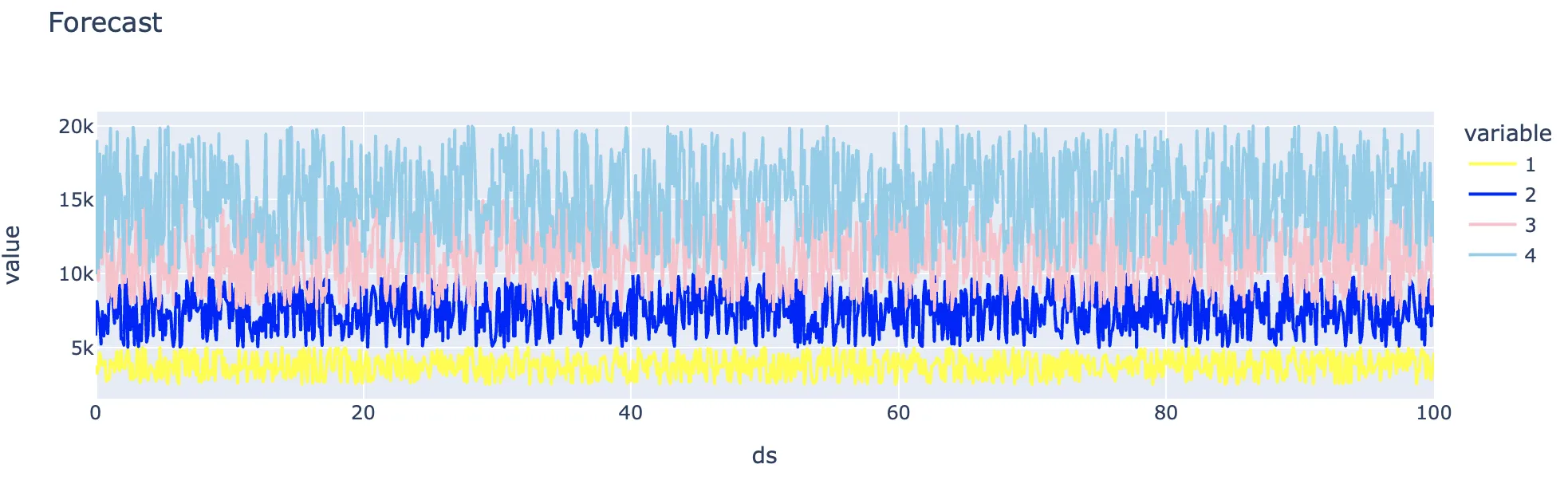
如何更改下面 Plotly 图表中线的颜色?谢谢

import plotly.express as px

# forecast_eval is a dataframe with an actual number, a forecast 
# number, and upper and lower forecast bounds

# Draw a line chart using 4 columns forecast_eval.columns[2:6]
eval_line = px.line(forecast_eval, x='ds', y=forecast_eval.columns[2:6], 
title='Forecast')

eval_line

折线图

1个回答

4
  • 你没有提供示例数据,我通过模拟与示例代码相同结构的数据框架来说明。
  • 使用color_discrete_sequence的简单案例。
import plotly.express as px
import numpy as np
import pandas as pd

# forecast_eval is a dataframe with an actual number, a forecast
# number, and upper and lower forecast bounds

forecast_eval = pd.concat(
    [
        pd.DataFrame({"ds": np.linspace(0, 100, 1000)}),
        pd.DataFrame(
            np.random.uniform(np.linspace(0, 10**4, 5), np.linspace(1, 2*10**4, 5), [1000, 5])
        ),
    ],
    axis=1,
)

# Draw a line chart using 4 columns forecast_eval.columns[2:6]
eval_line = px.line(
    forecast_eval,
    x="ds",
    y=forecast_eval.columns[2:6],
    title="Forecast",
    color_discrete_sequence=["yellow", "blue", "pink", "skyblue"],
)

eval_line

enter image description here


网页内容由stack overflow 提供, 点击上面的
可以查看英文原文,
原文链接