我知道如何制作具有填充颜色的Material Design按钮:
style="@style/Widget.AppCompat.Button.Colored"
无边框透明按钮:
style="@style/Widget.AppCompat.Button.Borderless.Colored"
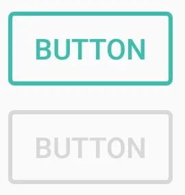
但是,有没有办法制作出材料设计的带边框(内部透明)按钮?类似下面这样:

我知道如何制作具有填充颜色的Material Design按钮:
style="@style/Widget.AppCompat.Button.Colored"
无边框透明按钮:
style="@style/Widget.AppCompat.Button.Borderless.Colored"
但是,有没有办法制作出材料设计的带边框(内部透明)按钮?类似下面这样:
你也可以使用Material Components for Android。
将依赖项添加到你的build.gradle文件中:
dependencies { implementation 'com.google.android.material:material:1.3.0' }
在这种情况下,您可以在布局文件中使用MaterialButton:
<com.google.android.material.button.MaterialButton
   ....
   style="@style/Widget.MaterialComponents.Button.OutlinedButton"
   app:cornerRadius=".."
   app:strokeColor="@color/colorPrimary"/>
应用样式@style/Widget.MaterialComponents.Button.OutlinedButton。
在您的情况下,使用app:cornerRadius属性来更改角半径的大小。这将按指定尺寸使角变圆。
使用app:strokeColor和app:strokeWidth属性来更改边框的颜色和宽度。

您还可以使用ShapeApperance自定义角(需要版本1.1.0)。
<style name="MyButton" parent="Widget.MaterialComponents.Button.OutlinedButton">
    <item name="shapeAppearanceOverlay">@style/MyShapeAppearance</item>
</style>
<style name="MyShapeAppearance" parent="">
    <item name="cornerFamilyTopLeft">rounded</item>
    <item name="cornerFamilyBottomLeft">rounded</item>
    <item name="cornerFamilyTopRight">cut</item>
    <item name="cornerFamilyBottomRight">cut</item>
    <item name="cornerSize">8dp</item>
</style>
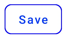
使用 Jetpack Compose,您可以使用OutlinedButton和border属性:
    OutlinedButton(
        onClick = { },
        border = BorderStroke(1.dp, Color.Blue),
        shape = RoundedCornerShape(8.dp)
    ) {
        Text(text = "Save")
    }
OLD (支持库)
使用新的Support Library 28.0.0 版本,Design Library 包含了 Material Button。
您可以在布局文件中添加此按钮:
<android.support.design.button.MaterialButton
    android:layout_width="wrap_content"
    android:layout_height="wrap_content"
    android:text="XXXX"
    android:textSize="18sp"
    app:icon="@drawable/ic_android_white_24dp" />
您可以使用以下属性自定义按钮:
app:backgroundTint:用于对按钮背景应用着色。如果您想更改按钮的背景颜色,请改用此属性而不是background。
app:strokeColor:用于按钮描边的颜色
app:strokeWidth:用于按钮描边的宽度
另外
以下是正确的操作步骤:
需要做的事情是:
1 - 创建带描边的形状drawable
2 - 创建水波纹drawable
3 - 为低于v21版本创建选择器drawable
4 - 为带边框的按钮创建新样式
5 - 在按钮上应用该样式
1 - 创建带描边的形状
btn_outline.xml
<?xml version="1.0" encoding="utf-8"?>
<shape
    xmlns:android="http://schemas.android.com/apk/res/android"
    android:shape="rectangle">

    <stroke
        android:width="2dp"
        android:color="@color/colorAccent">
    </stroke>
    <solid android:color="@color/colorTransparent"/>
    <corners
        android:radius="5dp">
    </corners>

</shape>
2 - 创建涟漪可绘制物
drawable-v21/bg_btn_outline.xml
<?xml version="1.0" encoding="utf-8"?>
<ripple xmlns:android="http://schemas.android.com/apk/res/android"
        android:color="@color/colorOverlay">
    <item>
        <shape>
            <stroke
                android:width="2dp"
                android:color="@color/colorAccent"/>
            <corners android:radius="5dp"/>
        </shape>
    </item>
    <item android:id="@android:id/mask">
        <shape>
            <stroke
                android:width="2dp"
                android:color="@color/colorAccent"/>
            <solid android:color="@android:color/white"/>
            <corners android:radius="5dp"/>
        </shape>
    </item>

</ripple>
android:id="@android:id/mask"是必需的,以便在按钮上具有涟漪触摸反馈。标记为遮罩的图层在屏幕上不可见,仅用于触摸反馈。
3-创建小于v21版本的选择器可绘制对象
drawable/bg_btn_outline.xml
<?xml version="1.0" encoding="utf-8"?>
<selector xmlns:android="http://schemas.android.com/apk/res/android">
    <item android:drawable="@drawable/btn_outline" android:state_pressed="true">
        <shape android:shape="rectangle">
            <solid android:color="@color/colorOverlay"/>
        </shape>
    </item>
    <item android:drawable="@drawable/btn_outline" android:state_focused="true">
        <shape android:shape="rectangle">
            <solid android:color="@color/colorOverlay"/>
        </shape>
    </item>

    <item android:drawable="@drawable/btn_outline"/>

</selector>
4 - 创建具有边框的按钮的新样式 给出了创建该样式所需的所有资源,您的样式应如下所示。
<style name="ButtonBorder" parent="Widget.AppCompat.Button.Colored"/>

<style name="ButtonBorder.Accent">
        <item name="android:background">@drawable/bg_btn_outline</item>
        <item name="android:textColor">@color/colorAccent</item>
        <item name="android:textAllCaps">false</item>
        <item name="android:textSize">16sp</item>
        <item name="android:singleLine">true</item>
    </style>
4 - 给按钮应用样式
<Button
   style="@style/ButtonBorder.Accent"
   android:layout_width="wrap_content"
   android:layout_height="wrap_content"/>
就是这样。以下是按钮现在的样子示例。
您可以通过将Material Design按钮的样式属性设置为@style/Widget.MaterialComponents.Button.OutlinedButton并将app:strokeColor属性值设置为首选颜色来轻松实现此操作。
示例:
<com.google.android.material.button.MaterialButton
                android:text="Rounded outlined button"
                android:layout_height="wrap_content"
                android:layout_width="wrap_content"
                android:id="@+id/btnRound"
                style="@style/Widget.MaterialComponents.Button.OutlinedButton"
                app:strokeColor="@color/colorPrimaryDark"/>
References:
<inset xmlns:android="http://schemas.android.com/apk/res/android"
       android:insetLeft="@dimen/abc_button_inset_horizontal_material"
       android:insetTop="@dimen/abc_button_inset_vertical_material"
       android:insetRight="@dimen/abc_button_inset_horizontal_material"
       android:insetBottom="@dimen/abc_button_inset_vertical_material">
    <ripple xmlns:android="http://schemas.android.com/apk/res/android"
            android:color="?attr/colorControlHighlight">
        <item>
            <shape>
                <stroke
                    android:width="2dp"
                    android:color="@color/abc_btn_colored_borderless_text_material"/>
                <corners android:radius="@dimen/abc_control_corner_material"/>
                <padding
                    android:bottom="@dimen/abc_button_padding_vertical_material"
                    android:left="@dimen/abc_button_padding_horizontal_material"
                    android:right="@dimen/abc_button_padding_horizontal_material"
                    android:top="@dimen/abc_button_padding_vertical_material"/>
            </shape>
        </item>
        <item android:id="@android:id/mask">
            <shape>
                <stroke
                    android:width="2dp"
                    android:color="@color/abc_btn_colored_borderless_text_material"/>
                <solid android:color="@android:color/white"/>
                <corners android:radius="@dimen/abc_control_corner_material"/>
            </shape>
        </item>
    </ripple>
</inset>
styles.xml
<style name="Button.Outlined" parent="Widget.AppCompat.Button.Borderless.Colored">
    <item name="android:background">@drawable/bg_btn_outlined</item>
</style>
enabled="false"状态,并且与默认的Widget.AppCompat.Button具有相同的高度:
@color/abc_btn_colored_borderless_text_material 颜色选择器。 <com.google.android.material.button.MaterialButton
android:layout_width="wrap_content"
android:layout_height="wrap_content"
android:text="Its a button"
android:textColor="@android:color/white"
android:textSize="@dimen/_12ssp"
app:backgroundTint="@android:color/transparent"
app:strokeColor="@android:color/white"
app:strokeWidth="@dimen/_1sdp" />
其中
以下是我如何在Lollipop及以上版本中只使用边框和涟漪效果来创建按钮的方法。就像AppCompat按钮一样,这些按钮在低版本API上有一个回退的按下效果(如果您需要在低版本API上实现涟漪效果,则需要使用外部库)。我使用FrameLayout因为它很便宜。文本和边框的颜色是黑色,但您可以通过自定义来更改它:
<FrameLayout
    android:layout_width="match_parent"
    android:layout_height="wrap_content"
    android:layout_margin="20dp"
    android:background="@drawable/background_button_ghost">

    <TextView
        android:layout_width="match_parent"
        android:layout_height="wrap_content"
        android:background="?android:selectableItemBackground"
        android:gravity="center"
        android:padding="14dp"
        android:textSize="16sp"
        android:textAllCaps="true"
        android:textStyle="bold"
        android:textColor="@android:color/black"
        android:text="Text"/>
</FrameLayout>
drawable/background_button_ghost.xml
<?xml version="1.0" encoding="utf-8"?>
<shape xmlns:android="http://schemas.android.com/apk/res/android">
    <stroke
        android:width="2dp"
        android:color="@android:color/black"/>
    <solid android:color="@color/transparent"/>
</shape>
MaterialButton。<com.google.android.material.button.MaterialButton
...
style="@style/Widget.MaterialComponents.Button.OutlinedButton"
android:text="Delete Mentor Manager"
app:strokeColor="@color/...."
app:strokeWidth="1dp" />
你也可以使用Jetpack Compose来完成这个操作。只需要创建一个包含OutlinedButton的组合函数,并将所需的边框作为参数传递:
@Composable
fun OutlineButton() {
    OutlinedButton(
        onClick = { //TODO - implement click here },
        border = BorderStroke(1.dp, Color.Blue), // <-- border property
        shape = RoundedCornerShape(corner = CornerSize(20.dp)),
        colors = ButtonDefaults.outlinedButtonColors(contentColor = Color.Blue)
    ){
        Text(text = "CONFIRM")
    }
}
简单地,您可以使用这段代码。它看起来非常不错。
           <LinearLayout
                android:layout_width="match_parent"
                android:layout_height="wrap_content"
                android:background="#ffffff"
                android:orientation="vertical">

                <android.support.v7.widget.AppCompatButton
                    android:layout_width="match_parent"
                    android:layout_height="wrap_content"
                    android:backgroundTint="#F48025"
                    android:text="login"
                    android:textColor="@color/colorWhite" />

            </LinearLayout>
这里的边框颜色是:
android:background="#ffffff"
背景颜色为:
android:backgroundTint="#F48025"
<Button
    android:id="@+id/btn_add_discussion"
    android:layout_width="match_parent"
    android:layout_height="wrap_content"
    android:layout_marginHorizontal="15dp"
    android:padding="8dp"
    android:layout_marginTop="10dp"
    android:layout_marginBottom="5dp"
    android:backgroundTint="#80ffffff"
    android:textColor="@color/colorPrimaryDark"
    style="@style/btn_start_new_discussion"
    android:text="Start new discussion" />
<style name="btn_start_new_discussion">
    <item name="android:layout_marginTop">15dp</item>
    <item name="strokeWidth">2dp</item>
    <item name="strokeColor">@color/colorPrimary</item>
    <item name="cornerRadius">10dp</item>
</style>
btn_outline.xml文件的? - AG-Developer