我尝试了一个新的包ggthemr,但是遇到了两个问题。
数据集如下:
代码如下:
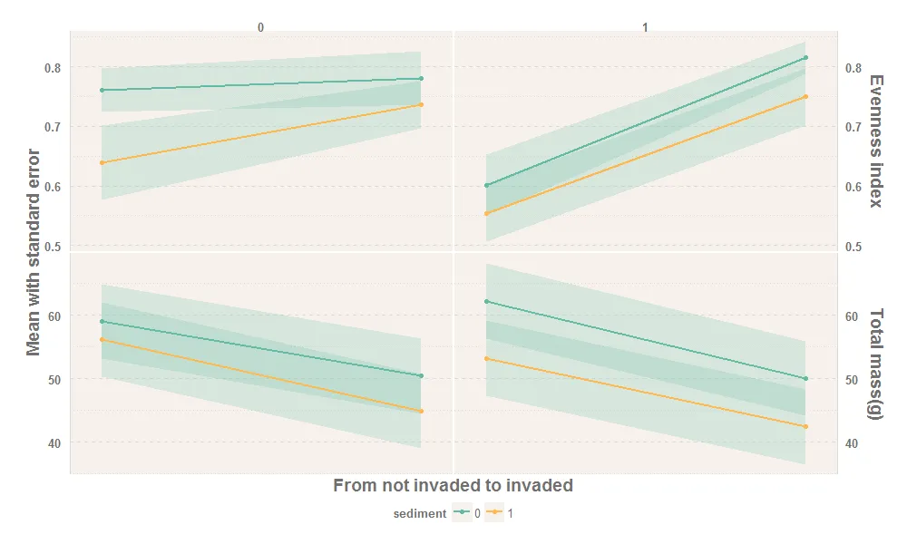
输出结果如下:
数据集如下:
tma<-data.frame(
invasion=c(0, 0, 1, 1, 0, 0, 1, 1, 0, 0, 1, 1, 0, 0, 1, 1),
sediment=c(0, 1, 0, 1, 0, 1, 0, 1, 0, 1, 0, 1, 0, 1, 0, 1),
nitrogen=c( 0, 0, 0, 0, 0, 0, 0, 0, 1, 1, 1, 1, 1, 1, 1, 1),
type=c("Evenness index",
"Evenness index",
"Evenness index",
"Evenness index",
"Total mass(g)",
"Total mass(g)",
"Total mass(g)",
"Total mass(g)",
"Evenness index",
"Evenness index",
"Evenness index",
"Evenness index",
"Total mass(g)",
"Total mass(g)",
"Total mass(g)",
"Total mass(g)"),
mean=c(0.76109,
0.63923,
0.78138,
0.73626,
59.0425,
56.15383,
50.39167,
44.9215,
0.60109,
0.55402,
0.81587,
0.74957,
62.207,
53.21033,
49.99517,
42.38767),
standard.error=c(0.03638,
0.06232,
0.045,
0.03912,
5.87524,
5.87524,
5.87524,
5.87524,
0.05093,
0.04807,
0.02694,
0.04843,
5.87524,
5.87524,
5.87524,
5.87524)
)

tma$nitrogen <- as.factor(tma$nitrogen)
tma$sediment <- as.factor(tma$sediment)
代码如下:
library(tidyverse)
library(ggthemr)

ggthemr('light', layout = 'scientific',
    spacing = 1, type = 'inner', line_weight = 0.6,
    )

ggplot(tma, aes(invasion, mean, color = sediment)) +
geom_ribbon(
    aes(ymin = mean - standard.error, ymax = mean + standard.error,group=sediment),
    alpha = 0.2,
    color = NA
    ) +
geom_line(size = 1) +
geom_point(show.legend = TRUE) +
facet_grid(type ~ nitrogen, scales = "free_y") +
scale_x_discrete(breaks = NULL, expand = c(0, 0.10)) +
scale_y_continuous(sec.axis = dup_axis(name=NULL))+
theme(legend.position = "bottom") +
theme(panel.spacing.x = unit(0.1, "lines"), panel.spacing.y = unit(0.1, "lines")) +
theme(strip.text.x = element_text(size = 10),
    strip.text.y = element_text(size = 14),
    axis.title.y = element_text(size = 14),
    axis.title.x = element_text(size = 14),
    ) +
xlab("From not invaded to invaded") +
ylab("Mean with standard error")
输出结果如下:
输出结果如下:
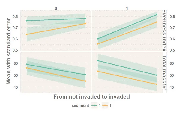
我希望重复的y轴在图形的右侧,在facet strip的左侧,但实际上它在facet strip的右侧。
另一个问题是facet strip无法完全显示,例如Total mass (g)的标题。
出了什么问题?我不知道应该调整哪些参数。非常感谢。