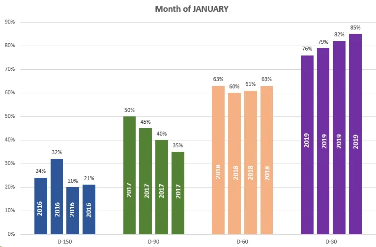
这个图表能否使用ggplot2在R中创建?

3
假设我在R中有以下数据框:
```r ```
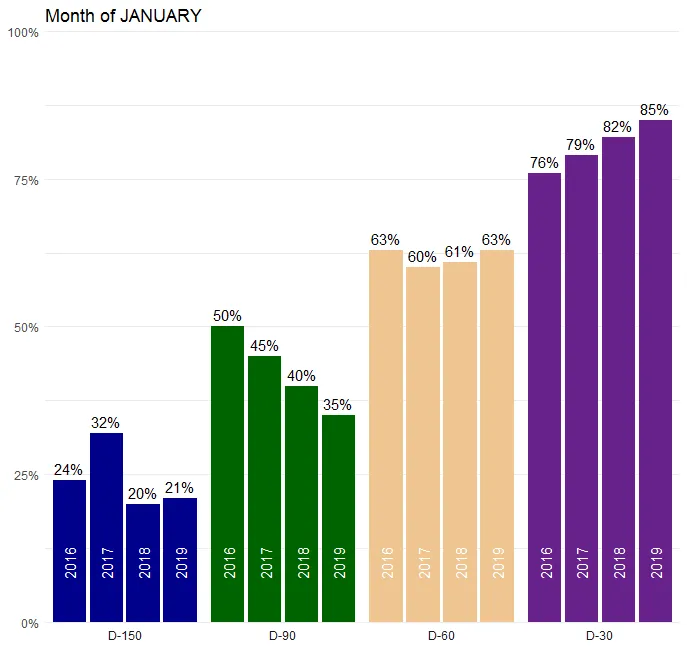
df1 <- read.csv("jan.csv", stringsAsFactors = FALSE, header = TRUE)
str(df1)

'data.frame':   4 obs. of  5 variables:
 $ JANUARY: chr  "D-150" "D-90" "D-60" "D-30"
 $ X2016  : num   0.24    0.5    0.63   0.76
 $ X2017  : num   0.32    0.45   0.6    0.79
 $ X2018  : num   0.2     0.4    0.61   0.82
 $ X2019  : num   0.21    0.35   0.63   0.85

我该如何使用ggplot2输出下面这个图表(在Excel中制作):

JANUARY

我已经可以使用ggplot2制作简单的柱状图,但是我无法像上面那样分组柱形和放置相关标签。此外,我需要重新整理数据来实现这一点吗?
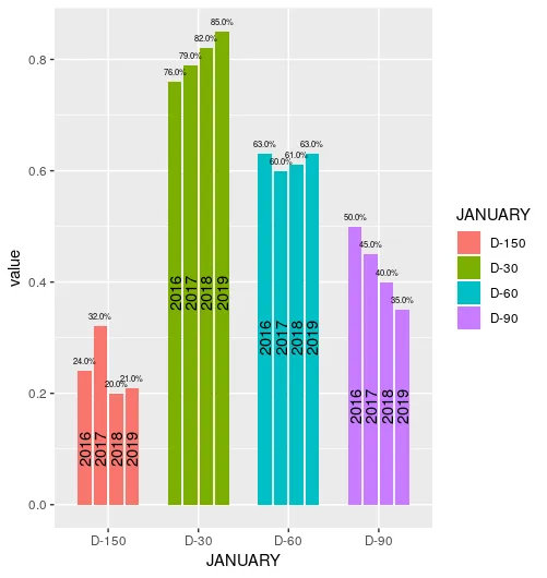
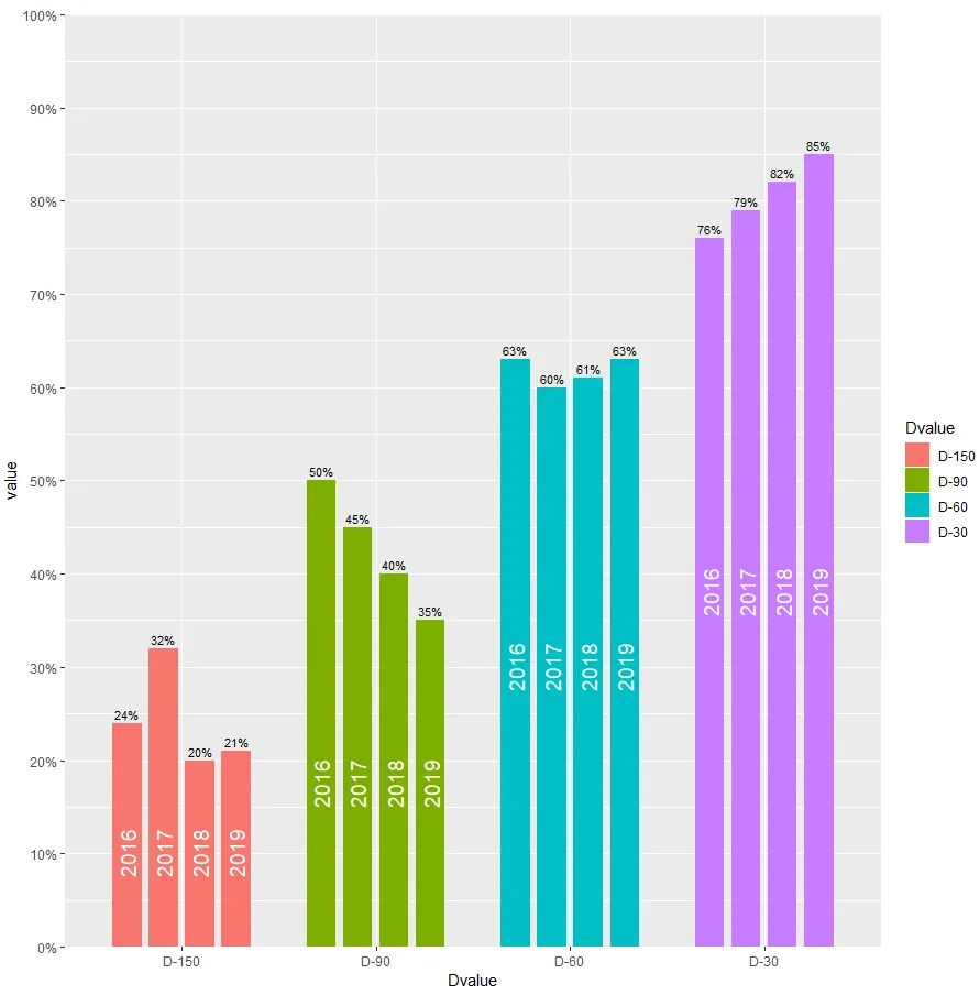

3
您可能可以使用gplot2geom_col()facet_wrap()geom_text实现接近这个效果。您尝试过什么了吗? - Wimpel
3
这些年份标签是否有误放在了柱状图上?每个x轴上的“D”标签是否应该分别对应2016年、2017年、2018年和2019年? - Mike H.
@MikeH。是的,你说得对!我会纠正它。 - user3115933
5个回答

5

可以的。我认为你的年份标签不正确。看一下我的图表:

enter image description here

这是生成图表的代码:

library(tidyverse)

df1 %>%
  gather(year, value, X2016:X2019) %>%
  mutate(JANUARY = JANUARY %>% fct_rev() %>% fct_relevel('D-150')) %>%
  group_by(JANUARY) %>%
  mutate(y_pos = min(value) / 2) %>%
  ggplot(aes(
    x = JANUARY,
    y = value,
    fill = JANUARY,
    group = year
  )) +
  geom_col(
    position = position_dodge(.65),
    width = .5
  ) +
  geom_text(aes(
      y = value + max(value) * .03,
      label = round(value * 100) %>% str_c('%')
    ),
    position = position_dodge(.65)
  ) +
  geom_text(aes(
      y = y_pos,
      label = str_remove(year, 'X')
    ),
    color = 'white',
    angle = 90,
    fontface = 'bold',
    position = position_dodge(.65)
  ) +
  scale_y_continuous(
    breaks = seq(0, .9, .1),
    labels = function(x) round(x * 100) %>% str_c('%')
  ) +
  scale_fill_manual(values = c(
    rgb(47, 85, 151, maxColorValue = 255),
    rgb(84, 130, 53, maxColorValue = 255),
    rgb(244, 177, 131, maxColorValue = 255),
    rgb(112, 48, 160, maxColorValue = 255)
  )) +
  theme(
    plot.title = element_text(hjust = .5),
    panel.background = element_blank(),
    panel.grid.major.y = element_line(color = rgb(.9, .9, .9)),
    axis.ticks = element_blank(),
    legend.position = 'none'
  ) +
  xlab('') +
  ylab('') +
  ggtitle('Month of JANUARY')

谢谢。你是否使用了特定的库来转换数据,因为我得到了这个特定的错误信息:"Error in mutate_impl(.data, dots) : Evaluation error: could not find function "fct_rev"。 - user3115933
加载 tidyverse 包。 - Paweł Chabros
很奇怪,tidyverse 加载了 forcats 包… 尝试独立加载 forcats - Paweł Chabros
我会尝试更新我的tidyverse库,看看效果如何。 - user3115933

3

我认为通过更多的数据处理,您可以实现您想要的目标。我们首先将数据融合成长格式,这是ggplot绘制此类型图表所需的格式。然后,我们创建一个单独的标签数据集,其中包含y值(似乎是每个“D”组内的最小值):

df_m <- melt(df, id.vars = "JANUARY")
df_m$above_text <- scales::percent(df_m$value)
labels <- df_m
labels$value <- ave(labels$value, labels$JANUARY, FUN = function(x) min(x/2))
labels$variable <- sub("X", "", labels$variable)
pos_d <- position_dodge(width = 0.7)

ggplot(df_m, aes(x = JANUARY, y = value, group = variable, fill = JANUARY)) + 
  geom_col(width = 0.6, position = pos_d) +
  geom_text(aes(label = above_text), position = pos_d, size = 2, hjust = 0.5, vjust = -1) + 
  geom_text(data = labels, aes(x = JANUARY, y = value, group = variable, label = variable), angle = 90, position = pos_d, hjust = 0.5)

在这里输入图片描述

请注意,您可以调整%标签大小。适合您图像文件实际尺寸的外观取决于您自己的审美。对于我来说看起来不错的大小大约为2.75,但是将其作为图像复制到此处时感觉有点拥挤。

数据:

df <- data.frame(JANUARY = c("D-150", "D-90", "D-60", "D-30"),
                 X2016   = c(0.24, 0.5, 0.63, 0.76),
                 X2017   = c(0.32, 0.45, 0.6, 0.79),
                 X2018   = c(0.2, 0.4, 0.61, 0.82),
                 X2019   = c(0.21, 0.35, 0.63, 0.85), stringsAsFactors = FALSE)

2

my approach

sample data

library( data.table )

dt <- fread('year  "D-150" "D-90" "D-60" "D-30"
2016   0.24    0.5    0.63   0.76
2017   0.32    0.45   0.6    0.79
2018   0.2     0.4    0.61   0.82
2019   0.21    0.35   0.63   0.85', header = TRUE)

code

#first, melt
dt.melt <- melt( dt, id.vars = "year", variable.name = "Dvalue", value.name = "value" )
#create values (=positions in the chart) for the year-text within the bars.
dt.melt[, yearTextPos := min( value / 2 ), by = "Dvalue"]

#then build chart
library( ggplot2 )
library( scales)
ggplot( dt.melt, aes( x = Dvalue, y = value, group = year, fill = Dvalue ) ) + 
  #build the bars, dodged position
  geom_col( width = 0.6, position = position_dodge(width = 0.75) ) +
  #set up the y-scale
  scale_y_continuous( limits = c(0,1), breaks = seq(0,1,0.1), 
                      labels = scales::percent, expand = c(0,0) ) +
  #insert year-text in bars, at the previuously calculated positions
  geom_text( aes( x = Dvalue, y = yearTextPos, group = year, label = year ), 
             color = "white", position = position_dodge( width = 0.75  ), 
             hjust = 0.5, angle = 90, size = 5 ) +
  #wite value on top as percentage
  geom_text( aes( x = Dvalue, y = value + 0.01, group = year, 
                  label = paste0( round( value * 100), "%" ) ), 
             color = "black", position = position_dodge( width = 0.75  ), 
             hjust = 0.5, angle = 0, size = 3 )

输出 在此输入图片描述

最初的回答

2
是的,这是可行的。但是,首先我们需要将您的数据以真实的表格格式呈现(就像您要导出到SQL一样)。
所以,这是您的数据:
January = c("D-150","D-90","D-60")
x2016 = c(0.24 ,   0.5,    0.63)
x2017 = c(0.32  ,  0.45,   0.6)
x2018 = c(0.2   ,  0.4  ,  0.61)
df1 <- data.frame(January,x2016,x2017,x2018)

为了让它可以绘制出来,我们需要将您的年份列合并成两列,如下所示:

最初的回答:

library(tidyr)
nuevoDf1<-gather(data = df1, losAnhos,valores,-January)

结果将如下所示:

  January losAnhos valores 
1   D-150    x2016    0.24 
2    D-90    x2016    0.50 
3    D-60    x2016    0.63 
4   D-150    x2017    0.32 
5    D-90    x2017    0.45

最初的回答:最后,使用ggplot2,您可以从以下内容开始制作图表:
ggplot(nuevoDf1,aes(losAnhos,valores)) + 
  facet_wrap(~January)+
  geom_bar(stat="sum",na.rm=TRUE)

结果将类似于图片中的结果。我不是色彩的狂热者,但是ggplot2允许在绘图构建后进行自定义。希望这能为您找到正确的路径,以了解图表的瞬息和短暂之美。

1

首先,我使用 gather 将数据从宽格式转换为长格式,然后使用 parse_number 将原始列名(X2016X2017等)转换为数字变量。我使用 fct_inorder 按照它们出现的顺序对 JANUARY 的级别进行排序。

library(tidyverse)

df1_long <- df1 %>% 
  gather(year, percentage, -JANUARY) %>% 
  mutate(year = parse_number(year), 
         JANUARY = fct_inorder(JANUARY)) 

df1_long

#    JANUARY year percentage
# 1    D-150 2016       0.24
# 2     D-90 2016       0.50
# 3     D-60 2016       0.63
# 4     D-30 2016       0.76
# 5    D-150 2017       0.32
# 6     D-90 2017       0.45
# 7     D-60 2017       0.60
# 8     D-30 2017       0.79
# 9    D-150 2018       0.20
# 10    D-90 2018       0.40
# 11    D-60 2018       0.61
# 12    D-30 2018       0.82
# 13   D-150 2019       0.21
# 14    D-90 2019       0.35
# 15    D-60 2019       0.63
# 16    D-30 2019       0.85

这些数据可以用于绘图。

ggplot(df1_long, aes(year, percentage, fill = JANUARY)) +
  geom_col() +
  scale_y_continuous(labels = scales::percent, expand = c(0, 0), limits = c(0, 1)) +
  facet_wrap(~ JANUARY, nrow = 1, strip.position = "bottom") +
  geom_text(aes(label = year), y = 0.1, angle = 90, color = "white")  +
  geom_text(aes(label = str_c(percentage*100, "%")), vjust = -0.5) +
  ggtitle("Month of JANUARY") +
  scale_fill_manual(values = c("darkblue", "darkgreen", "burlywood2", "darkorchid4")) +
  theme_minimal() +
  theme(axis.text.x = element_blank(), 
        axis.ticks.x = element_blank(), 
        axis.title = element_blank(),
        panel.spacing = unit(0, "cm"),
        panel.grid.major.x = element_blank(),
        panel.grid.minor.x = element_blank(),
        legend.position = "none")

enter image description here

数据

df1 <- data.frame(JANUARY = c("D-150", "D-90", "D-60", "D-30"),
                  X2016   = c(0.24, 0.5, 0.63, 0.76),
                  X2017   = c(0.32, 0.45, 0.6, 0.79),
                  X2018   = c(0.2, 0.4, 0.61, 0.82),
                  X2019   = c(0.21, 0.35, 0.63, 0.85))

网页内容由stack overflow 提供, 点击上面的
可以查看英文原文,
原文链接