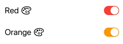
在SwiftUI中设置切换颜色

78

在按照Apple的用户输入教程后,我已经实现了一个切换开关。目前,它看起来是这样的:

这是生成此UI的代码:

NavigationView {
    List {
        Toggle(isOn: $showFavoritesOnly) {
            Text("Show Favorites only")
        }
    }
}

现在,我希望Toggleon颜色变为蓝色而不是绿色。
我尝试过:

Toggle(isOn: $showFavoritesOnly) {
    Text("Show Favorites only")
}
.accentColor(.blue)
.foregroundColor(.blue)
.background(Color.blue)

这些方法都无法奏效,我也找不到其他的修改器,例如tintColor

我该如何改变一个Toggle的颜色?


1
https://developer.apple.com/documentation/swiftui/toggle。在SwiftUI中,它似乎是最接近UIKit的tintColor的选项,这就是为什么我说它似乎应该改变Toggle的颜色。如果您对此提出错误报告,那么希望回复的人会确认它是一个错误还是有另一种SwiftUI的方法来解决它。 - RPatel99
1
我觉得这是一个 bug。它应该用 .accentColor 修改。我已经提交了 FB6158727,如果 Apple 有回应的话我会告诉你的。 :) - Clifton Labrum
1
@CliftonLabrum,你收到苹果的消息了吗? - Karen Karapetyan
@KarenKarapetyan 苹果告诉我这个问题已经在 Xcode 11 beta 4 中得到修复,但我还没有确认。 - Clifton Labrum
1
我正在使用11.3版本,但是我一直无法使 .accentColor 生效。 - Spencer Connaughton
显示剩余2条评论
12个回答

176

SwiftUI 3.0

使用tint

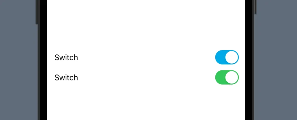
引入了一个新的修饰符,可以改变开关的颜色:

Toggle(isOn: $isToggleOn) {
    Text("Red")
    Image(systemName: "paintpalette")
}
.tint(.red)

Toggle(isOn: $isToggleOn) {
    Text("Orange")
    Image(systemName: "paintpalette")
}
.tint(.orange)

开关按钮着色切换

SwiftUI 2.0

使用 SwitchToggleStyle

在 SwiftUI 2.0 中,你现在可以为打开的状态设置一个着色,而不影响关闭的状态:

Toggle(isOn: $isToggleOn) {
    Text("Red")
    Image(systemName: "paintpalette")
}
.toggleStyle(SwitchToggleStyle(tint: Color.red))

Toggle(isOn: $isToggleOn) {
    Text("Orange")
    Image(systemName: "paintpalette")
}
.toggleStyle(SwitchToggleStyle(tint: Color.orange))

切换色调颜色

SwiftUI 1.0

使用ToggleStyle

我创建了一个新的ToggleStyle,来改变Toggle的三种颜色(开启状态的颜色,关闭状态的颜色和拇指的颜色)。

struct ColoredToggleStyle: ToggleStyle {
    var label = ""
    var onColor = Color(UIColor.green)
    var offColor = Color(UIColor.systemGray5)
    var thumbColor = Color.white
    
    func makeBody(configuration: Self.Configuration) -> some View {
        HStack {
            Text(label)
            Spacer()
            Button(action: { configuration.isOn.toggle() } )
            {
                RoundedRectangle(cornerRadius: 16, style: .circular)
                    .fill(configuration.isOn ? onColor : offColor)
                    .frame(width: 50, height: 29)
                    .overlay(
                        Circle()
                            .fill(thumbColor)
                            .shadow(radius: 1, x: 0, y: 1)
                            .padding(1.5)
                            .offset(x: configuration.isOn ? 10 : -10))
                    .animation(Animation.easeInOut(duration: 0.1))
            }
        }
        .font(.title)
        .padding(.horizontal)
    }
}

应用实例

Toggle("", isOn: $toggleState)
    .toggleStyle(
        ColoredToggleStyle(label: "My Colored Toggle",
                           onColor: .green,
                           offColor: .red,
                           thumbColor: Color(UIColor.systemTeal)))

Toggle("", isOn: $toggleState2)
    .toggleStyle(
        ColoredToggleStyle(label: "My Colored Toggle",
                           onColor: .purple))

来自 SwiftUI 书籍

Toggle Example


5
这份工作真的很出色,看起来目前是唯一可行的解决方案。谢谢! - codewithfeeling
1
你在这里做了足够的工作,因此最好创建一个独特的切换而不是使用样式修饰符实例化他们损坏的切换。使用会更清晰。 - Adama
1
@EverUribe,感谢您的提醒。已更新答案。 - Mark Moeykens
2
@MarkMoeykens 绝对是出色的工作。我不知道在 ToggleStyleConfiguration 中是否有任何更改,但在 HStack 中,您可以直接使用 configuration.label 而不是使用 Text(label)。 - Saurabh Prajapati
1
还有适用于 macOS 的版本。 - Frederic Adda
显示剩余4条评论

18

只需使用UIAppearanceAPI:

UISwitch.appearance().onTintColor = UIColor.blue

根据UIAppearance文档,它当然会默认更改所有UISwitch的实例外观。

注意:在Xcode 11 beta 5中测试通过。


14
在iOS 14/Xcode 12 Beta 3中似乎出现了问题。 - harrisg
一开始它似乎可以工作,但如果你关闭然后重新打开,颜色会被重置为默认值。 - Iker Solozabal

13

SwiftUI 2.0(WWDC-2020 后)

使用新的 SwiftUI 增强功能,您可以使用 .toggleStyle 修改器。

// Switch tinting

Toggle(isOn: $order.notifyWhenReady) {
    Text("Send notification when ready")
}
.toggleStyle(SwitchToggleStyle(tint: .accentColor))

注意:此功能仅适用于 iOS14/iPadOS14/macOS11 及以上版本。


9

我还没有找到直接更改Toggle颜色的方法,但实现一个蓝色开关或是其他自定义视图的替代方法是创建你自己的自定义视图。简单来说,要创建一个自定义的蓝色开关:

struct BlueToggle : UIViewRepresentable {
  func makeUIView(context: Context) -> UISwitch {
    UISwitch()
  }

  func updateUIView(_ uiView: UISwitch, context: Context) {
    uiView.onTintColor = UIColor.blue
  }
}

struct ContentView : View {
    var body: some View {
      BlueToggle()
    }
}

结果:

输入图像描述


翻译完毕,如有需要请继续提问。

谢谢您。我会等待其他答案的出现再进行接受。 - LinusGeffarth
我该如何使用这个自定义开关,和Toggle有相同的初始化方式init(isOn: Binding<Bool>, label: () -> Label) - LinusGeffarth
@LinusGeffarth 为了实现这一点,我认为还需要使用 UIViewControllerRepresentable,但不确定。查看此示例:https://developer.apple.com/tutorials/swiftui/interfacing-with-uikit ,虽然它不完全是您所要求的,但这是处理自定义视图的更复杂的方式! - M Reza

7
你可以在init()函数中修改所有UISwitch对象的全局onTintColor。
@State var enable_dhcp = true

init()
{
    UISwitch.appearance().onTintColor = .red
}

var body: some View
{
    Toggle("DHCP", isOn: $enable_dhcp)
}

Toggle demo UIColor(red: 226.3/255.0, green: 37.6/255.0, blue: 40.7/255.0, alpha: 1.0)


6

在@mohammad-reza-farahani的解决方案基础上,这里提供了一种完全不妥协的方法,可以在SwiftUI中使用实现协议来获得UISwitch的可配置性。

首先,在UIViewRepresentable中包装一个UISwitch ,并根据需要设置颜色:

final class CustomToggleWrapper: UIViewRepresentable {
    var isOn: Binding<Bool>

    init(isOn: Binding<Bool>) {
        self.isOn = isOn
    }

    func makeUIView(context: Context) -> UISwitch {
        UISwitch()
    }

    func updateUIView(_ uiView: UISwitch, context: Context) {
        // On color
        uiView.onTintColor = UIColor.blue
        // Off color
        uiView.tintColor = UIColor.red
        uiView.layer.cornerRadius = uiView.frame.height / 2
        uiView.backgroundColor = UIColor.red
        uiView.isOn = isOn.wrappedValue

        // Update bound boolean
        uiView.addTarget(self, action: #selector(switchIsChanged(_:)), for: .valueChanged)
    }

    @objc
    func switchIsChanged(_ sender: UISwitch) {
        isOn.wrappedValue = sender.isOn
    }
}

第二步,使用包装的UISwitch创建一个自定义切换样式
struct CustomToggleStyle: ToggleStyle {
    func makeBody(configuration: Self.Configuration) -> some View {
        let toggle = CustomToggleWrapper(isOn: configuration.$isOn)

        return HStack {
            configuration.label
            Spacer()
            toggle
        }
    }
}

按照您通常的方式实现一个 Toggle,并应用您的 CustomToggleStyle

struct TestView: View {
    @State private var isOn: Bool = true

    var body: some View {
        Toggle(
            isOn: $isOn
        ) {
            Text("Test: \(String(isOn))")
        }.toggleStyle(CustomToggleStyle()).padding()
    }
}

这个很好用。你可以在updateUIView函数中使用uiView.setOn(isOn.wrappedValue, animated: context.transaction.animation != nil && !context.transaction.disablesAnimations)来实现动画效果。 - Matthew
FYI,这种方法一开始很好,但最近在最新的XCode 14(我的是14.2)中失败了。XCode 14要求在struct上使用UIViewRepresentable而不是class,崩溃将发生在运行时。 - L N

4
Karol Kulesza和George Valkov提供了一个非常易于实现的解决方案。我只想补充一点,您也可以将下面的代码放置在应用程序委托的didFinishLaunching方法中。
UISwitch.appearance().onTintColor = .blue

您还可以使用

CSS

创建更具体的外观配置。

appearance(whenContainedInInstancesOf:)

请查看https://www.hackingwithswift.com/example-code/uikit/what-is-the-uiappearance-proxy

3
您可以使用色调修饰符在IOS 15.0中更改切换颜色。
Toggle(isOn: $isToggleOn) {
       Text("Toggle")
    }.tint(.red)

在iOS 15.0以下版本中,您可以使用toggleStyle修饰符来更改切换颜色,但这种方法将在未来被弃用。

 Toggle(isOn: $isToggleOn) {
    Text("Toggle")
 }.toggleStyle(SwitchToggleStyle(tint: .red))

2
  1. 最简单的方法是在使用切换之前设置UISwitch.appearance().onTintColor = UIColor.red,然后像下面这样使用SwiftUI Toggle。
UISwitch.appearance().onTintColor = UIColor.red
...

let toggle = Toggle(isOn: $vm.dataUsePermission, label: {
    Text(I18N.permit_data_usage)
        .font(SwiftUI.Font.system(size: 16, weight: .regular))
})

if #available(iOS 14.0, *) {
    toggle.toggleStyle(
        SwitchToggleStyle(tint: Color(UIColor.m.blue500))
    )
} else {
    toggle.toggleStyle(SwitchToggleStyle())
}

...
  1. 您也可以在SwiftUI中使用相同的Toggle界面,但名称不同,并更改色调颜色。

enter image description here


TintableSwitch(isOn: .constant(true), label: {
    Text("Switch")
})

Toggle(isOn: .constant(true), label: {
    Text("Switch")
})

如果只需要开关而无需标签,则

TintableUISwitch(isOn: .constant(true))

使用以下代码。

import SwiftUI

public struct TintableSwitch<Label>: View where Label: View {

    @Binding var isOn: Bool

    var label: Label

    public init(isOn: Binding<Bool>, @ViewBuilder label: () -> Label) {
        self._isOn = isOn
        self.label = label()
    }

    public var body: some View {
        HStack {
            label
            Spacer()
            TintableUISwitch(isOn: $isOn, onTintColor: .red) //  CHANGE HERE
        }
    }
}

public struct TintableUISwitch: UIViewRepresentable {

    @Binding var isOn: Bool
    private var onTintColor: UIColor

    public init(isOn: Binding<Bool>, onTintColor: UIColor = UIColor.m.blue500) {
        self._isOn = isOn
        self.onTintColor = onTintColor
    }

    public func makeUIView(context: Context) -> UISwitch {
        let uiSwitch = UISwitch()
        uiSwitch.addTarget(
            context.coordinator,
            action: #selector(Coordinator.valueChanged(_:)),
            for: .valueChanged
        )
        uiSwitch.onTintColor = onTintColor
        uiSwitch.isOn = isOn
        return uiSwitch
    }

    public func updateUIView(_ uiView: UISwitch, context: Context) {
        uiView.isOn = isOn
    }

    public func makeCoordinator() -> Coordinator {
        Coordinator(self)
    }

    public class Coordinator: NSObject {

        var tintableSwitch: TintableUISwitch

        init(_ tintableSwitch: TintableUISwitch) {
            self.tintableSwitch = tintableSwitch
        }

        @objc
        func valueChanged(_ sender: UISwitch) {
            tintableSwitch.isOn = sender.isOn
        }
    }
}

struct TintableSwitch_Previews: PreviewProvider {
    static var previews: some View {
        VStack {
            TintableSwitch(isOn: .constant(true), label: {
                Text("Switch")
            })

            Toggle(isOn: .constant(true), label: {
                Text("Switch")
            })
        }
    }
}

struct TintableUISwitch_Previews: PreviewProvider {
    static var previews: some View {
        TintableUISwitch(isOn: .constant(true))
    }
}


2

由于原始问题仅涉及更改切换开关的颜色,而不是完全自定义 Toggle 外观,因此我认为以下内容可以解决:

import SwiftUI

struct CustomToggle: UIViewRepresentable {
  @Binding var isOn: Bool

  func makeCoordinator() -> CustomToggle.Coordinator {
    Coordinator(isOn: $isOn)
  }

  func makeUIView(context: Context) -> UISwitch {
    let view = UISwitch()
    view.onTintColor = UIColor.red
    view.addTarget(context.coordinator, action: #selector(Coordinator.switchIsChanged(_:)), for: .valueChanged)

    return view
  }

  func updateUIView(_ uiView: UISwitch, context: Context) {
    uiView.isOn = isOn
  }

  class Coordinator: NSObject {
    @Binding private var isOn: Bool

    init(isOn: Binding<Bool>) {
      _isOn = isOn
    }

    @objc func switchIsChanged(_ sender: UISwitch) {
      _isOn.wrappedValue = sender.isOn
    }
  }
}

// MARK: - Previews

struct CustomToggle_Previews: PreviewProvider {
  static var previews: some View {
    ViewWrapper()
  }

  struct ViewWrapper: View {
    @State(initialValue: false) var isOn: Bool

    var body: some View {
      CustomToggle(isOn: $isOn)
        .previewLayout(.fixed(width: 100, height: 100))
    }
  }
}

网页内容由stack overflow 提供, 点击上面的
可以查看英文原文,
原文链接