为什么iframe在其元素下添加额外空间?看看这种奇怪的行为:
.border {
    background: red;
    width: 300px;
    height: 200px;
    border: 1px solid green;
    overflow: visible;
    margin: 0;
    padding: 0;
}

.border iframe {
    border: none;
    width: 300px;
    height: 100px;
    margin: 0;
    padding: 0;
    opacity: 0.8;
}

.border .lower {
    height: 100px;
    margin: 0;
    padding: 0;
    background: blue;
    opacity: 0.8;
}<div class="border">
<iframe src="https://example.com"></iframe>
<div class="lower"></div>
</div>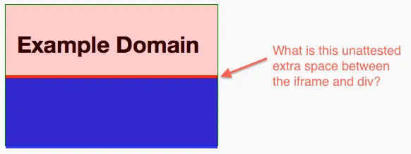
如何解决?
width: 100%无法关闭iFrame和<body>之间的间隙。 - Brandon Franklin