CSS/SVG 创建螺旋形图形

4

我正在寻找一种在CSS中创建“螺旋”的方法。

这里有一张图片,更清楚地说明了我的目标:
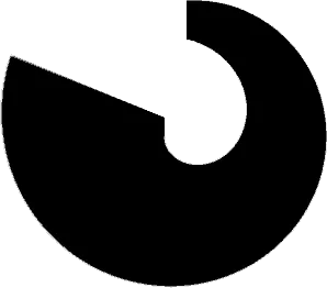
Spiral

所以是一个带有逐渐变大轮廓的部分圆形。

  • 理想情况下,我想能够设置螺旋的长度。(从(0)到360°)
  • 同时,在末端放置一个圆圈会很好看(就像我的样本一样)

这是我目前想出来的代码片段。

* {margin: 0; padding: 0;}
div {
  box-sizing: border-box;
  width: 200px; height: 200px;
  margin: 0 auto;
  background: #fff;
  
  border-top: 30px solid #fd0;
  border-right: 40px solid #fa0;
  border-bottom: 60px solid #f50;
  border-left: 0 solid blue;

  border-radius: 50%;
  
  position: relative;
}
div::after { /* kreis */
  content: "";
  position: absolute; top: 80%; left: 8%;
  width: 90px; height: 90px;
  background: red;
  border-radius: inherit;
}
div::before { /* hide the stuff that is too much. */
  content: "";
  position: absolute; top: 50%; left: 0;
  width: 50px; height: 100%;
  background-color: inherit;
}
<div></div>

我也可以接受使用 SVG 方法来完成这个操作。

你是不是指“0到360之间的任意角度”? - Paul LeBeau
1个回答

3

我通过一些调整CSS和HTML得出了这个结果,我想它类似于这张图片 演示 没有在IE上测试过,不确定是否响应式。

.spiral{
  background-color:black;
  width: 100px;
  height:100px;
  border-radius:50%;
}
.spiral:before{
    content: '';
    width: 27px;
    height: 43px;
    background-color: white;
    position: absolute;
    border-top-right-radius: 144px;
    border-bottom-left-radius: 61px;
    border-bottom-right-radius: 88px;
    left: 53px;
    top: 25px;
}
.spiral:after{
    content: '';
    width: 68px;
    height: 52px;
    background-color: white;
    position: absolute;
    left: 4px;
    top: -11px;
    transform: rotateZ(200deg);
}
<div class="spiral"></div>


还不错。 - Type-Style

网页内容由stack overflow 提供, 点击上面的
可以查看英文原文,
原文链接