我有带圆角的div块和box-shadow
.itemapplication {
    position:relative;
    overflow:hidden;
    border-radius: 10px;
    width: 180px;
    height: 225px;
    float: left;
    box-shadow: 0px 5px 1px 0px #bfc4c8;
}
我想要制作一个角折叠效果。这是我目前的代码:
.itemapplication:before {
   content:"";
   position:absolute;
   top:-1px;
   right:-1px;
   border-style:solid;
   border-width:20px;
   border-color:#eceff4 #eceff4 red red;
   -webkit-border-bottom-left-radius:10px;
   -moz-border-radius:0 0 0 10px;
   border-radius:0 0 0 10px;
   -webkit-box-shadow:0 1px 1px rgba(0,0,0,0.3), -1px 1px 1px rgba(0,0,0,0.2);
   -moz-box-shadow:0 1px 1px rgba(0,0,0,0.3), -1px 1px 1px rgba(0,0,0,0.2);
   box-shadow:0 1px 1px rgba(0,0,0,0.3), -1px 1px 1px rgba(0,0,0,0.2);
}
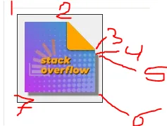
这是我得到的结果:
这是我得到的:

如您所见,div 右侧有一条细线,我无法将其移开。您有什么建议吗?