在圆形上添加一个渐变背景线

3
我在页面上有一个区块,其中有一条背景线,线上有一个圆圈,随着主滚动条一起滚动。
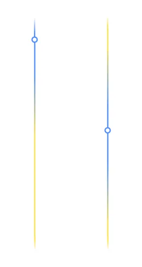
问题是,如何使得另一条与圆圈颜色相同的线随着圆圈一起沿着这条线滚动,整体效果看起来像这样:

enter image description here

我之前尝试过添加样式,但结果并不如我所预期的那样。
left: 50%;
transform: translate(-50%, -50%);
width: 3px;
height: 40vh;
background: #4f8eff;
box-shadow: inset 0 20vh 10vh -10vh #f6e75e, inset 0 -20vh 10vh -10vh #f6e75e;
z-index: 2;

一切都应该像我上传的图片那样,圆圈里面应该是白色,当我们滚动到最顶部时,蓝色应该完全覆盖黄色,从底部也是一样。而在方块的中心,蓝色应该同时在圆圈上方和下方,保持渐变效果。
在我的例子中,几乎与我想要的一样,但不完全一样,我希望当蓝线达到方块的末尾或开头时,蓝色完全覆盖黄色。现在的情况是,当圆圈处于顶部的最大位置时,黄色仍然在上面。

const circle = document.querySelector(".circle");
const cases = document.querySelectorAll(".case");

circle.style.transition = ""

const handleScroll = () => {
  const {
    height: blockHeight
  } = document.querySelector(".block2").getBoundingClientRect()

  const maxTop = cases[cases.length - 1].offsetTop + cases[cases.length - 1].offsetHeight - 200
  const minTop = cases[0].offsetTop

  let {
    height: startTop
  } = cases[0].getBoundingClientRect()

  const scrollDist = Math.min(maxTop, Math.max(startTop / 2 + window.scrollY, minTop))

  circle.style.top = `${scrollDist}px`
  circle.style.backgroundSize = `17px ${blockHeight}px`
  circle.style.backgroundPosition = `0 ${-scrollDist}px`
}

const handleWindowSizeAndScroll = () => {
  window.removeEventListener("scroll", handleScroll)
  window.removeEventListener("resize", handleScroll)
  window.addEventListener("scroll", handleScroll)
  window.addEventListener("resize", handleScroll)
}

handleScroll()
handleWindowSizeAndScroll()
window.addEventListener("resize", handleWindowSizeAndScroll)
.block1 {
  height: 200px;
  background-color: gray;
}

.block3 {
  height: 600px;
  background-color: gray;
}

.block2 {
  height: 100%;
  position: relative;
}

.block2,
.block2 .circle {
  background: linear-gradient(214deg, rgba(79, 142, 255, 0) 0%, #f5e550 10%, #f5e550 90%, rgba(79, 142, 255, 0) 100%) center/3px calc(100% - 100px) no-repeat;
}

.block2 .circle {
  background: #4f8eff;
  width: 17px;
  height: 17px;
  left: 50%;
  transform: translate(-50%, -50%);
}

.block2 .circle,
.block2 .circle::before {
  position: absolute;
  border-radius: 50%;
}

.block2 .circle::before {
  content: "";
  inset: 3px;
  background-color: white;
}

.block2 .circle::before {
  left: 50%;
  transform: translate(-50%, -50%);
  width: 3px;
  height: 40vh;
  background: #4f8eff;
  box-shadow: inset 0 20vh 10vh -10vh #f6e75e, inset 0 -20vh 10vh -10vh #f6e75e;
  z-index: 2;
}

.text {
  text-align: center;
  padding: 200px 50px;
}
<link rel="stylesheet" href="https://cdnjs.cloudflare.com/ajax/libs/bootstrap/5.3.0/css/bootstrap.min.css" integrity="sha512-t4GWSVZO1eC8BM339Xd7Uphw5s17a86tIZIj8qRxhnKub6WoyhnrxeCIMeAqBPgdZGlCcG2PrZjMc+Wr78+5Xg==" crossorigin="anonymous" referrerpolicy="no-referrer"
/>
<div class="block1"></div>
<div class="block2">
  <div class="circle"></div>
  <div class="case">
    <div class="row">
      <div class="col-5 text">Text 1</div>
      <div class="col-2"></div>
      <div class="col-5 text">Text 1</div>
    </div>
  </div>
  <div class="case">
    <div class="row">
      <div class="col-5 text">Text 2</div>
      <div class="col-2"></div>
      <div class="col-5 text">Text 2</div>
    </div>
  </div>
  <div class="case">
    <div class="row">
      <div class="col-5 text">Text 3</div>
      <div class="col-2"></div>
      <div class="col-5 text">Text 3</div>
    </div>
  </div>
</div>
<div class="block3"></div>


3
你的示例代码几乎完全符合你所要求的。唯一的区别是圆的颜色与它们重叠的线的颜色不完全匹配(线是绿色的,但圆是蓝色的)。这是问题吗?你希望重叠部分的线条是蓝色的吗? - kmoser
3
你的示例代码几乎完全符合你所要求的。唯一的区别是圆的颜色与它们重叠的线的颜色不完全匹配(线是绿色的,但圆是蓝色的)。这是问题吗?你希望重叠部分的线条是蓝色的吗? - kmoser
3
你的示例代码几乎完全符合你所要求的。唯一的区别是圆的颜色与它们重叠的线的颜色不完全匹配(线是绿色的,但圆是蓝色的)。这是问题吗?你希望线在与圆重叠的地方也是蓝色的吗? - undefined
你的示例代码几乎完全符合你所要求的。唯一的区别是圆的颜色与它们重叠的线的颜色不完全匹配。 - Mobin Salehi
https://stackoverflow.com/questions/76660526/stop-scrolling-when-the-element-reaches-the-end-of-the-block - Roko C. Buljan
显示剩余6条评论
3个回答

1
这是您的自定义滚动条。请注意,如果您想要能够拖动滑块并进行滚动,您需要添加额外的事件监听器。尝试使用鼠标滚轮进行滚动以查看效果。

const scrollBarEl = document.getElementsByClassName('scroll')[0];
const scrollEl = document.getElementsByClassName('outer-container')[0];
scrollEl.addEventListener('scroll', e => {
  const scrollSpan = scrollEl.scrollHeight - scrollEl.clientHeight;
  if (scrollSpan !== 0)
    scrollBarEl.style.setProperty('--scroll', `${scrollEl.scrollTop / scrollSpan * 100}%`)
})
.outer-container {
  max-height: 90vh;
  overflow: auto;
}

.container {
  min-height: 400vh;
}

.scroll {
  --scroll: 0%;
  position: fixed;
  right: 10px;
  top: 10px;
  bottom: 10px;
  width: 5px;
  background: linear-gradient(to bottom, #ff00, #ff0, #00f var(--scroll), #ff0, #ff00);
}

.thumb {
  height: 10px;
  width: 10px;
  border: 2px solid #00f;
  border-radius: 50%;
  background: #fff;
  position: absolute;
  top: calc(var(--scroll) - 6px);
  left: -4px;
}
<div class='outer-container'>
  <div class='container'>
    <div class='scroll'>
      <div class='thumb'></div>
    </div>
  </div>
</div>


我不太明白如何使它看起来像我的设计。 - Hector
我不太明白怎么让它看起来像我的设计。 - undefined

1
根据您对评论的回复,我相信您希望随着各个部分滚动圆圈。请在全屏模式下检查解决方案。

const circle = document.querySelector(".circle");
const cases = document.querySelectorAll(".case");
const text1 = document.querySelector(".text1");
const block3 = document.querySelector(".block3");

const handleScroll = () => {
  const {
    height: blockHeight
  } = document.querySelector(".block2").getBoundingClientRect();

  const maxTop = cases[cases.length - 1].offsetTop + cases[cases.length - 1].offsetHeight - 200;
  const minTop = cases[0].offsetTop;
  const block3Top = block3.offsetTop - 700;

  let {
    height: startTop
  } = cases[0].getBoundingClientRect();

  let scrollDist = Math.min(maxTop, Math.max(startTop / 2 + window.scrollY, minTop));

  if (scrollDist <= minTop || scrollDist >= maxTop || scrollDist >= block3Top) {
    scrollDist = scrollDist <= minTop ? minTop : (scrollDist >= block3Top ? block3Top : maxTop);
    circle.style.backgroundSize = `17px 100%`;
    circle.classList.remove('active');
  } else {
    circle.style.backgroundSize = `17px ${blockHeight}px`;
    if (scrollDist >= 250) {
      circle.classList.add('active');
    } else {
      circle.classList.remove('active');
    }
  }

  circle.style.top = `${scrollDist}px`;
  circle.style.backgroundPosition = `0 ${-scrollDist}px`;
};

const handleWindowSizeAndScroll = () => {
  handleScroll();
};

handleScroll();
handleWindowSizeAndScroll();
window.addEventListener("resize", handleWindowSizeAndScroll);
window.addEventListener("scroll", handleScroll);
.block1 {
  height: 200px;
  background-color: gray;
  position: relative;
  z-index: 1;
}

.block3 {
  height: 600px;
  background-color: gray;
}

.block2 {
  height: 100%;
  position: relative;
}

.block2,
.block2 .circle {
  background: linear-gradient(214deg, rgba(79, 142, 255, 0) 0%, #f5e550 10%, #f5e550 90%, rgba(79, 142, 255, 0) 100%) center/3px calc(100% - 100px) no-repeat;
}

.block2 .circle {
  width: 17px;
  height: 17px;
  left: 50%;
  top: 50%;
  transform: translate(-50%, -50%);
  position: fixed;
  border: 2px solid #4f8eff;
  border-radius: 50%;
  background: white;
  transition: visibility 0.3s ease-out, opacity 0.3s ease-out;
}

.block2 .circle::before,
.block2 .circle::after {
  content: "";
  inset: 3px;
}

.block2 .circle::after {
  left: 50%;
  width: 3px;
  height: 100px;
  background: #4f8eff;
  box-shadow: inset 0 50vh 25vh -25vh #4f8eff, inset 0 -50vh 25vh -25vh #4f8eff;
  z-index: 1;
  position: fixed;
  top: 65px;
  transform: translate(-50%, -50%);
}

.block2 .circle::before {
  left: 50%;
  width: 3px;
  height: 100px;
  background: #4f8eff;
  box-shadow: inset 0 50vh 25vh -25vh #4f8eff, inset 0 -50vh 25vh -25vh #4f8eff;
  z-index: 1;
  position: fixed;
  top: -50px;
  transform: translate(-50%, -50%);
}

.text {
  text-align: center;
  padding: 200px 50px;
}

.text1 .circle.active,
.text1 .circle.active::before,
.text1 .circle.active::after {
  visibility: visible;
  opacity: 1;
}

.circle,
.circle::before,
.circle::after {
  visibility: hidden;
  opacity: 0;
}

.circle.active,
.circle.active::before,
.circle.active::after {
  visibility: visible;
  opacity: 1;
}

.block3 .circle,
.block3 .circle::before,
.block3 .circle::after {
  transition: visibility 0.3s ease-out, opacity 0.3s ease-out;
}

.block3 .circle,
.block3 .circle::before,
.block3 .circle::after {
  visibility: hidden;
  opacity: 0;
}
<!DOCTYPE html>
<html>

<head>
  <link rel="stylesheet" href="https://cdnjs.cloudflare.com/ajax/libs/bootstrap/5.3.0/css/bootstrap.min.css" integrity="sha512-t4GWSVZO1eC8BM339Xd7Uphw5s17a86tIZIj8qRxhnKub6WoyhnrxeCIMeAqBPgdZGlCcG2PrZjMc+Wr78+5Xg==" crossorigin="anonymous" referrerpolicy="no-referrer">

</head>

<body>
  <div class="block1"></div>
  <div class="container">
    <div class="block2">
      <div class="circle"></div>
      <div class="case">
        <div class="row">
          <div class="col-5 text">Text 1</div>
          <div class="col-2"></div>
          <div class="col-5 text">Text 1</div>
        </div>
      </div>
      <div class="case">
        <div class="row">
          <div class="col-5 text">Text 2</div>
          <div class="col-2"></div>
          <div class="col-5 text">Text 2</div>
        </div>
      </div>
      <div class="case">
        <div class="row">
          <div class="col-5 text text3">Text 3</div>
          <div class="col-2"></div>
          <div class="col-5 text text3">Text 3</div>
        </div>
      </div>
    </div>
    <div class="block3"></div>
  </div>

</body>

</html>


在你的例子中,如果你在这个下面和上面添加块,那么滚动条也会经过它们。 - Hector
@Hector 请检查更新的答案。现在滚动不会进入上方和下方的区块,而是以过渡效果开始和结束。 - Sai Manoj
只有在块结束时才停止,而不是隐藏,这样做才可能吗? - Hector
@Hector 你说的停止是什么意思?你提到当蓝色达到方块的顶部或底部时,它必须吸收所有的黄色。所以当滚动到特定的方块时,圆圈和其后面的线条会使用ease-out效果。当你向后滚动时,会使用ease-in效果。如果这个解决方案符合你的要求,请接受答案。 - Sai Manoj
是的,当蓝线达到末端时,它应该只需接住黄色点,而圆形本身应停止而不会消失。也许我犯了个错误,给你传达了错误的信息,对误导你表示抱歉。 - Hector
显示剩余9条评论

1
这应该接近你想要实现的内容:

const circle = document.querySelector(".circle");
const cases = document.querySelectorAll(".case");

circle.style.transition = ""

const handleScroll = () => {
  const {
    height: blockHeight
  } = document.querySelector(".block2").getBoundingClientRect()

  const maxTop = cases[cases.length - 1].offsetTop + cases[cases.length - 1].offsetHeight - 200
  const minTop = cases[0].offsetTop

  let {
    height: startTop
  } = cases[0].getBoundingClientRect()

  const scrollDist = Math.min(maxTop, Math.max(startTop / 2 + window.scrollY, minTop))

  circle.style.top = `${scrollDist}px`
  circle.style.backgroundSize = `17px ${blockHeight}px`
  circle.style.backgroundPosition = `0 ${-scrollDist}px`
}

const handleWindowSizeAndScroll = () => {
  window.removeEventListener("scroll", handleScroll)
  window.removeEventListener("resize", handleScroll)
  window.addEventListener("scroll", handleScroll)
  window.addEventListener("resize", handleScroll)
}

handleScroll()
handleWindowSizeAndScroll()
window.addEventListener("resize", handleWindowSizeAndScroll)
.block1 {
  height: 200px;
  background-color: gray;
}

.block3 {
  height: 600px;
  background-color: gray;
}

.block2 {
  height: 100%;
  position: relative;
}

.block2 {
  background: linear-gradient(180deg, rgba(79, 142, 255, 0) 0%, #f5e550 140px, #f5e550 calc(100% - 140px), rgba(79, 142, 255, 0) 100%) center/3px calc(100% - 100px) no-repeat;
}

.block2 .circle {
  width: 17px;
  height: 17px;
  left: 50%;
  transform: translate(-50%, -50%);
}

.block2 .circle,
.block2 .circle::before {
  position: absolute;
  border-radius: 50%;
}

.block2 .circle .gradient-container::before {
  content: "";
  inset: 3px;
  background-color: white;
  position: absolute;
  background: #4f8eff;
  width: 27px;
  height: 60%;
  left: 50%;
  transform: translate(-50%, 32%);
  box-shadow: 0 0 40px 30px #4f8eff;
}

.block2 .circle .gradient-container {
  left: 50%;
  transform: translate(-50%, -50%);
  width: 3px;
  height: 40vh;
  z-index: 2;
  position: absolute;
  overflow: hidden;
}

.block2 .circle::after {
content: "";
    position: absolute;
    border-radius: 50%;
    background: white;
    width: 17px;
    height: 17px;
    left: 50%;
    transform: translate(-50%, 2px);
    z-index: 5;
    border: 4px solid #4f8eff;
}

.text {
  text-align: center;
  padding: 200px 50px;
}
<link rel="stylesheet" href="https://cdnjs.cloudflare.com/ajax/libs/bootstrap/5.3.0/css/bootstrap.min.css" integrity="sha512-t4GWSVZO1eC8BM339Xd7Uphw5s17a86tIZIj8qRxhnKub6WoyhnrxeCIMeAqBPgdZGlCcG2PrZjMc+Wr78+5Xg==" crossorigin="anonymous" referrerpolicy="no-referrer"
/>
<div class="block1"></div>
<div class="block2">
  <div class="circle">
    <div class="gradient-container"></div>
  </div>
  <div class="case">
    <div class="row">
      <div class="col-5 text">Text 1</div>
      <div class="col-2"></div>
      <div class="col-5 text">Text 1</div>
    </div>
  </div>
  <div class="case">
    <div class="row">
      <div class="col-5 text">Text 2</div>
      <div class="col-2"></div>
      <div class="col-5 text">Text 2</div>
    </div>
  </div>
  <div class="case">
    <div class="row">
      <div class="col-5 text">Text 3</div>
      <div class="col-2"></div>
      <div class="col-5 text">Text 3</div>
    </div>
  </div>
</div>
<div class="block3"></div>


网页内容由stack overflow 提供, 点击上面的
可以查看英文原文,
原文链接