CSS 形状和内部文本

10

我需要在下面的图像中创建这种包含文本的形状。
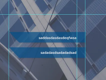
enter image description here

这是我的尝试:

HTML

        <div class="header-bottom">

            <div class="blue-rectangle">
                <p>sadasdasdasd</p>
            </div>

            <div class="blue-rectangle">
                <p>dsasdasdasda</p>
            </div>

        </div>

CSS

.header-bottom{
position: absolute;
right:13%;
bottom:5%;
}

.blue-rectangle {
background-color: rgba(3,78,136,0.7);
padding: 10px 20px 10px 200px;
margin-bottom: 20px;
}

.blue-rectangle p{
color:white;
text-transform: uppercase;
font-size:18px;
}

我尝试添加 transform:skew,但它会使右侧、左侧和文本本身都倾斜。


可能是 使用 CSS 剪角 的重复问题。 - Shrinivas Shukla
5个回答

12

.shape{
  text-align:center;
  background-color:rgba(3,78,136,0.7);
  width:200px;
  height:60px;
  line-height:60px;
  color:white;
  margin:20px auto;
  position:relative;
}
.shape:before{
  content:"";
  width:0px;
  height:0px;
  border-top:60px solid rgba(3,78,136,0.7);
  border-left:60px solid transparent;
  position:absolute;
  right:100%;
  top:0px;
}
<div class="shape">
  something something
</div>
<div class="shape">
  something else
</div>


6
我喜欢使用:before伪类来实现这个效果:

.blue-rectangle {
  color:white;
  text-transform: uppercase;
  font-size:18px;
  padding: 10px 20px 10px 200px;
  background-color: rgba(3,78,136,0.7);
  width: 200px;
  position: relative;
  margin-left: 50px;
}
.blue-rectangle:before {
  content: "";
  position: absolute;
  border: 21px solid transparent;
  border-top-color: rgba(3,78,136,0.7);
  border-right-color: rgba(3,78,136,0.7);
  right: 100%;
  top: 0;
  width: 0;
  height: 0
}
<p class="blue-rectangle">sadasdasdasd</p>


(减1),因为OP要求小写字母 - musefan
4
我复制了他的CSS代码...其中包含了大写字母转换。他的问题中没有要求小写字母... - GreyRoofPigeon

3
请尝试以下代码。

.header-bottom {
  position: absolute;
  right: 13%;
  bottom: 5%;
}
.blue-rectangle {
  height: 60px;
  background-color: rgba(3, 78, 136, 0.7);
  padding: 10px 20px 10px 200px;
  margin-bottom: 20px;
  position: relative;
}
.blue-rectangle p {
  color: white;
  text-transform: uppercase;
  font-size: 18px;
  position: relative;
}
.blue-rectangle:before {
  content: '';
  width: 0;
  height: 0;
  border-top: 80px solid rgba(3, 78, 136, 0.7);
  border-left: 80px solid transparent;
  position: absolute;
  top: 0;
  right: 100%;
}
<div class="header-bottom">

  <div class="blue-rectangle">
    <p>sadasdasdasd</p>
  </div>

  <div class="blue-rectangle">
    <p>dsasdasdasda</p>
  </div>

</div>


2

有关信息:

背景渐变和背景大小也可以使用:)

.shape{
  text-align:center;
  background:
    linear-gradient(65deg , transparent 50%,rgba(3,78,136,0.7) 50%) left no-repeat, 
    linear-gradient(0deg , rgba(3,78,136,0.7),rgba(3,78,136,0.7)) 30px 0 no-repeat;
  
  background-size:30px 100%, 100% 100%;
  width:200px;
  height:60px;
  line-height:60px;
  padding:0 20px;
  color:white;
  margin:20px auto;
  position:relative;
}
body {
  background:url(http://lorempixel.com/640/480);
  background-size:cover;
  }
<div class="shape">
  sometext
</div>
<div class="shape">
  something else
</div><div class="shape">
  some more text 
</div>
<div class="shape">
  and so on  n on 
</div>


0
在您的情况下,您不能使用 skew。相反,您应该在左侧添加一个旋转的三角形。
尝试添加:
.blue-rectangle:before {
    content: "";
    border-left: 78px solid transparent;
    border-top: 78px solid rgba(3,78,136, 0.7);
    position: absolute;
    top: 0;
    left: -78px;
    opacity: 0.7;
}

你可以自己完成剩余的调整。


网页内容由stack overflow 提供, 点击上面的
可以查看英文原文,
原文链接