将 div 放置于文本右侧。

3

我有一个固定宽度的div。 它有两个子元素:

  1. 第一个包含文本,
  2. 第二个是类似“徽章”的东西(只是一个带有固定宽度和高度的div)。

所以我想实现类似这样的效果:

enter image description here

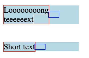
我想要第二个子元素紧贴着第一个子元素的文本位置

我尝试通过将display: flex添加到父元素来解决此问题,但问题是第一个子元素的宽度超过其内容(在下面的代码段示例中)

我尝试将flex-basis: 0添加到第一个子元素,但然后每个单词都会从新的一行开始,即使有足够的空间在一行中显示整个文本。

也许还有另一种解决方法? 我曾尝试使用绝对定位的子元素解决问题,但也失败了。

.parent {
  width: 150px;
  background: lightblue;
  display: flex;
  align-items: center;
}

.first-child {
  outline: 1px solid red;
}

.first-child span {
  outline: 1px solid white;
}


.second-child {
  outline: 1px solid blue;
  width: 20px;
  height: 10px;
  flex-shrink: 0;
}
<div class="parent">
  <div class="first-child">
    <span>Loooooooong teeeeeext</span>
  </div>
  <div class="second-child">
  </div>
</div>
<br /><br />
<div class="parent">
  <div class="first-child">
    <span>Short text</span>
  </div>
  <div class="second-child">
  </div>
</div>


也许这个问题可以帮到你。https://dev59.com/8VoU5IYBdhLWcg3we2-6 - Saeed Shamloo
6个回答

1
也许你可以在文档加载完成后尝试使用js代码来解决这个问题!
document.querySelectorAll('.first-child').forEach(t => {t.style.width=t.querySelector('span').offsetWidth+'px'})

document.querySelectorAll('.first-child').forEach(t => {t.style.width=t.querySelector('span').offsetWidth+'px'})
.parent {
  width: 150px;
  background: lightblue;
  display: flex;
  align-items: center;
}

.first-child {
  outline: 1px solid red;
}

.first-child span {
  outline: 1px solid white;
}


.second-child {
  outline: 1px solid blue;
  width: 20px;
  height: 10px;
  flex-shrink: 0;
}
<div class="parent">
  <div class="first-child">
    <span>Loooooooong teeeeeext</span>
  </div>
  <div class="second-child">
  </div>
</div>
<br /><br />
<div class="parent">
  <div class="first-child">
    <span>Short text</span>
  </div>
  <div class="second-child">
  </div>
</div>


1

你只能将width属性设置为min-content;,用于文本元素。

例如:

width: min-content;

在这种情况下,所有单词都将被移动到下一行,即使文本很短并且可以放在同一行上。 - Sergey Tyupaev

0

只需在右侧文本中使用 display: inline 属性,并在父级 div 中使用 display: block 属性即可。


0
解决方案是在“.first-child”上添加“flex: 0 0 auto;”。

.parent {
  width: 150px;
  background: lightblue;
  display: flex;
  align-items: center;
}

.first-child {
  outline: 1px solid red;
flex: 0 0 auto; 
}

.first-child span {
  outline: 1px solid white;
}


.second-child {
  outline: 1px solid blue;
  width: 20px;
  height: 10px;
  flex-shrink: 0;
}
<div class="parent">
  <div class="first-child">
    <span>Loooooooong <br>teeeeeext</span>
  </div>
  <div class="second-child">
  </div>
</div>
<br /><br />
<div class="parent">
  <div class="first-child">
    <span>Short text</span>
  </div>
  <div class="second-child">
  </div>
</div>


您已将 <br /> 标签添加到第一个子元素的文本中。但它是动态的,例如它可能来自后端。 - Sergey Tyupaev
移除 <br> 标签,现在它跟随内容了,但我认为你真正需要的是在 ".first-child" 上使用一个好老式的 "width"。 - Andrei Teodorescu
或者更好的是:一个“最大宽度”。 - Andrei Teodorescu

0

这个解决方案使用了对HTML内容的添加,但对于动态内容无效,但我仍然会发布它 - 对于固定内容,它可以工作:

如果您只是在长文本中的单词之间添加一个换行符/ <br/> 标记,它就可以实现您想要的效果(不需要对您的代码进行其他更改):

.parent {
  width: 150px;
  background: lightblue;
  display: flex;
  align-items: center;
}

.first-child {
  outline: 1px solid red;
}

.first-child span {
  outline: 1px solid white;
}


.second-child {
  outline: 1px solid blue;
  width: 20px;
  height: 10px;
  flex-shrink: 0;
}
<div class="parent">
  <div class="first-child">
    <span>Loooooooong<br/>teeeeeext</span>
  </div>
  <div class="second-child">
  </div>
</div>
<br /><br />
<div class="parent">
  <div class="first-child">
    <span>Short text</span>
  </div>
  <div class="second-child">
  </div>
</div>


-1

我希望这是你要找的,为了使第二个 div 右对齐,你可以使用 justify-content: space-between;

更新:我误读了问题,我已经在代码中做出了更改,并且使用 CSS 工作正常。

.parent {
  width: 150px;
  background: lightblue;
  display: flex;
  align-items: center;
  justify-content: flex-start;
}

.first-child {
  outline: 1px solid red;
  flex: .5;
}

.first-child span {
  outline: 1px solid white;
}

.second-child {
  outline: 1px solid blue;
  width: 20px;
  height: 10px;
  flex-shrink: 0;
}
<div class="parent">
  <div class="first-child">
    <span>Loooooooong teeeeeext</span>
  </div>
  <div class="second-child">
  </div>
</div>
<br /><br />
<div class="parent">
  <div class="first-child">
    <span>Short text</span>
  </div>
  <div class="second-child">
  </div>
</div>


只有使用HTML/CSS才能得到你想要的东西。如果这个方法可行,请告诉我。 - prograk

网页内容由stack overflow 提供, 点击上面的
可以查看英文原文,
原文链接