ggplotly破坏了我的geom_smooth元素

3

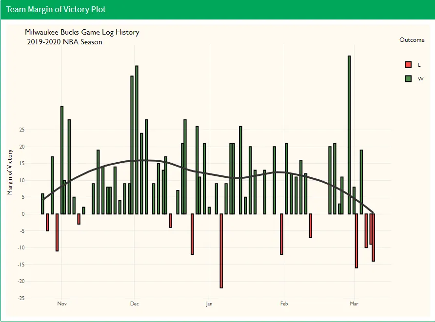
我正在构建一个NBA R Shiny应用程序,尝试制作交互式图表时遇到了一些小问题。在我提供的第一组代码中,我的Geom smooth元素可以显示所选球队胜利间隔的平滑均值,但是一旦我使用ggplotly实现自定义工具提示,Geom smooth元素就停止工作了。

mov_plot <- function(df){
  p <- df %>%
    ggplot(aes(Date, Margin_of_Victory)) +
    geom_col(color = 'black', alpha = 0.7, aes(fill = Outcome)) +
    geom_smooth(method = 'loess', se = FALSE, color = 'grey20', alpha = 0.4) +
    scale_y_continuous(breaks = c(-25, -20, -15, -10, -5, 0, 5, 10, 15, 20, 25)) +
    scale_fill_manual(values = c("red", "dark green")) +
    labs(x = NULL,
         y = 'Margin of Victory',
         title = paste0(df$FullName, ' Game Log History \n 2019-2020 NBA Season'),
         subtitle = '2019-2020 NBA Season') +
    theme_jacob()
  
  ggplotly(p)
  
}

mov_plot <- function(df){
  p <- df %>%
    ggplot(aes(Date, Margin_of_Victory, text = paste(Date, '<br>',
                                                     Outcome, ' vs', Opponent, '<br>',
                                                     'Scoreline: ', team_pts, ' - ', Opp_PTS, '<br>',
                                                     'Margin of Victory: ', Margin_of_Victory))) +
    geom_col(color = 'black', alpha = 0.7, aes(fill = Outcome)) +
    geom_smooth(method = 'loess', se = FALSE, color = 'grey20', alpha = 0.4) +
    scale_y_continuous(breaks = c(-25, -20, -15, -10, -5, 0, 5, 10, 15, 20, 25)) +
    scale_fill_manual(values = c("red", "dark green")) +
    labs(x = NULL,
         y = 'Margin of Victory',
         title = paste0(df$FullName, ' Game Log History \n 2019-2020 NBA Season'),
         subtitle = '2019-2020 NBA Season') +
    theme_jacob()
  
  ggplotly(p, tooltip = c('text'))
  
}

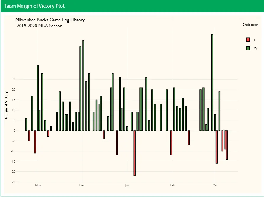
以下是两个图像,显示了当我使用第二组代码时,geom_smooth元素会消失的问题。

enter image description here

enter image description here

如果有人有 plotly 的经验并且对潜在的解决方案有任何想法,我将非常感激!

2个回答

2
geom_smooth层试图包含text美学,而在您的情况下您不需要。我建议您将text美学从ggplot()父函数移动到geom_col()函数中,以便将工具提示放置在列上。 如果有读者想要将工具提示放在geom_smooth上: text美学与geom_smooth不兼容,因为geom_smooth是一个聚合层,或者是由ggplot2生成的"汇总统计" (https://plotly-r.com/controlling-tooltips.html#tooltip-text-ggplotly)。 ggplotly对象具有多个"trace"——第二个"trace"可能是geom_smooth层。您可以通过先保存ggplotly对象来探索这些子对象。
w <- ggplotly(p)

然后查看 w$x$data。 在 geom_smooth 上,工具提示将是 “continuous”,因此水平轴变量和垂直轴变量可能分别保存在 w$x$data[[2]]$xw$x$data[[2]]$y 中。 因此,工具提示中的文本可以使用这些向量填充:

# Suppress the tooltip on the columns and supply custom text to the smooth line
w %>%
  style(hoverinfo = "skip", traces = 1) %>%
  style(text = paste0(
      "Date: ", w$x$data[[2]]$x, "\nMargin of Victory: ", w$x$data[[2]]$y
    ), traces = 2)

0

在你的geom_smooth中尝试使用formula = 'y ~ x',如下所示

geom_smooth(method = 'loess', se = FALSE, formula = 'y ~ x', color = 'grey20', alpha = 0.4)

由于您没有提供样本数据框,因此很难进行验证。

很遗憾没有起作用,但我感谢您的建议。 - jyablonski
您也可以在工具提示上尝试其他几个操作。首先,您可以将“text”更改为“label”或“name”,并尝试一下。如果仍然无法正常工作,也许您可以在工具提示的定义中将“<br>”替换为“\ n”。 - YBS

网页内容由stack overflow 提供, 点击上面的
可以查看英文原文,
原文链接