解决我的问题的编辑:
html {
    width: 100%;
    height: 100%;
    overflow-x: auto;
    position: relative;
}
body {
    margin: 0;
    width: 100%;
    height: 100%;
    letter-spacing: -.2px;
    font-kerning: normal;
    position: relative;
    overflow-x: auto;
}
.wrapperAudit {
    min-height: 100%;
    width: 100%;
    position: absolute;
    background-color: #cbdcc6;
    min-width: 991px;
}
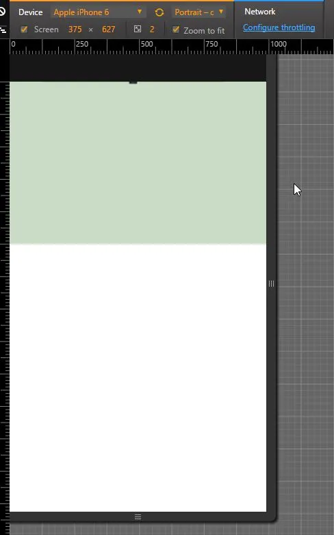
我在我的网站上使用包装器div来制作全屏背景图像,我想要固定包装器div的宽度,如下所示:
min-width:991px; 如果我在电脑上打开它,它可以很好地工作,如果我将其调整为小于991像素,它也可以很好地工作。
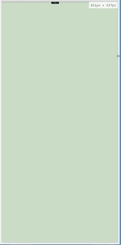
但是当我在移动设备上打开网站时,它看起来像这样:
以下是我的代码:
html {
    width: 100%;
    height: 100%;
}
body {
    margin: 0;
    width: 100%;
    height: 100%;
    letter-spacing: -.2px;
    font-kerning: normal;
}
.wrapper{
    min-height: 100%;
    width: 100%;
    position: relative;
    background-color: #cbdcc6;
    min-width: 991px;
}