一些期刊的惯例是在绘图中只显示 x 和 y 轴,而不是整个绘图区域周围的框。我该如何在 ggplot2 中实现这一点?我尝试了来自此处的
theme_minimal_cb_L,但它似乎擦除了绘图周围的整个框(没有留下 x 和 y 轴),如下所示:
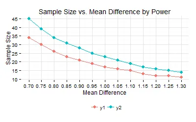
dat <- structure(list(x = c(0.7, 0.75, 0.8, 0.85, 0.9, 0.95, 1, 1.05,
    1.1, 1.15, 1.2, 1.25, 1.3), y1 = c(34, 30, 26, 23, 21, 19, 17,
    16, 15, 13, 12, 12, 11), y2 = c(45, 39, 34, 31, 28, 25, 23, 21,
    19, 17, 16, 15, 14)), .Names = c("x", "y1", "y2"), row.names = c(NA,
    -13L), class = "data.frame")


library(reshape2); library(ggplot2)
dat2 <- melt(dat, id='x')

theme_minimal_cb_L <- function (base_size = 12, base_family = "", ...){
  modifyList (theme_minimal (base_size = base_size, base_family = base_family),
              list (axis.line = element_line (colour = "black")))
}

ggplot(data=dat2, aes(x=x, y=value, color=variable)) +
    geom_point(size=3) + geom_line(size=.5) +
    theme_minimal_cb_L()
theme_minimal_cb_L相同的链接获得theme_minimal。 - Tyler Rinker