有没有可能制作出一条波浪线?

25

如果我想要制作一条水平线,我会这样做:

<style>
#line{
    width:100px;
    height:1px;
    background-color:#000;
}
</style>
<body>
<div id="line"></div>

如果我想要画一条竖线,我会这样做:

#line{
    width:1px;
    height:100px;
    background-color:#000;
}
</style>
<body>
<div id="line"></div>

曲线比较棘手,但是可以使用border-radius并将元素包装起来实现:

<style>
.curve{
    width:100px;
    height:500px;
    border:1px #000 solid;
    border-radius:100%;
}
#wrapper{
    overflow:hidden;
    width:40px;
    height:200px;
}
</style>
<body>
<div id="wrapper">
    <div class="curve"></div>
</div>
</body>

但我甚至无法想象如何生成波浪线!只使用CSS(以及JavaScript,因为似乎需要更轻松地生成它们)是否有可能实现。

注意:

正如所预期的那样,根据您的答案,单独使用CSS无法做到这一点... JavaScript和jQuery对于您的答案都可以使用...不能使用任何图像


几个 .curve 元素粘在一起了吗? - Chad
2
使用CSS3边框图像怎么样? - elclanrs
你可以使用多个相邻设置非常高的边框半径的div来实现类似这样的效果。此外,您还需要根据元素是奇数还是偶数隐藏其顶部/底部的一半,这可以通过CSS完成。 - AlbertEngelB
为什么没有图片?甚至没有SVG吗? - david
@david 因为我正在使用的应用程序将要求用户创建 squiggle。 - Ryan Saxe
请注意技术是会变化的——当前所选答案可能已经不再有效。对于像我一样偶然发现这篇文章的人,请参考 MDN text-decoration-style:wavy > https://developer.mozilla.org/en-US/docs/Web/CSS/text-decoration-style。 - qodeninja
12个回答

36
这个问题相当老了,但我找到了一种方法来解决它,而不需要使用Javascript、重复的CSS或图片。
你可以使用background-size来定义大小,然后用linear-gradient来重复它。
我在这里放了一堆例子:http://jsbin.com/hotugu/edit?html,css,output

example

基本意思是:

.holder {
  /* Clip edges, as some of the lines don't terminate nicely. */
  overflow: hidden;
  position: relative;
  width: 200px;
  height: 50px;
}

.ellipse {
  position: absolute;
  background: radial-gradient(ellipse, transparent, transparent 7px, black 7px, black 10px, transparent 11px);
  background-size: 36px 40px;
  width: 200px;
  height: 20px;
}

.ellipse2 {
  top: 20px;
  left: 18px;
  background-position: 0px -20px;
}
<div class="holder">
  <div class="ellipse"></div>
  <div class="ellipse ellipse2"></div>
</div>

你可以通过一些修改来产生波浪线:

.holder {
    position: relative;
    width: 200px;
    height: 50px;
    top: 25px;
}
.tinyLine {
    position: absolute;
    /* Cuts off the bottom half of the pattern */
    height: 20px;
    /* For better cross browser consistency, make it larger with width.  */
    width: 1000%;
    /* And then scale it back down with scale, recentering with translateX. */
    transform: translateX(-45%) scale(0.1);
}

.tinyLine1 {
    background: linear-gradient(45deg, transparent, transparent 49%, red 49%, transparent 51%);
}
.tinyLine2 {
    background: linear-gradient(-45deg, transparent, transparent 49%, red 49%, transparent 51%);
}
.tinyLine {
    /* Must be after background definition. */
    background-size: 40px 40px;
}
<div class="holder">
    <div class="tinyLine tinyLine1"></div>
    <div class="tinyLine tinyLine2"></div>
</div>

浏览器的支持还算合理(http://caniuse.com/#feat=css-gradients),IE 10可能可以工作,但在不同的浏览器中在小尺度下会出现问题。如果你希望它在非常小的尺度上保持一致性,你可能希望将线条放大,然后使用transform: scale(x);进行缩小。
此外,由于所有主要浏览器都在GPU上渲染线性渐变,所以它应该非常快速。

这太巧妙了!我需要一种模拟跨浏览器的 text-decoration: underline wavy red; 的方法,成功地借鉴了这个答案并使用 :before:after 伪元素来获得可行的替代方案。谢谢! - Michael Bromley
现在只需使用 decoration:wavy => https://developer.mozilla.org/zh-CN/docs/Web/CSS/text-decoration-style - qodeninja
对于第一个演示,您是如何确定背景大小宽度为36像素的? - bytrangle

10
编辑:鉴于不使用图像/数据URI的要求,您还可以将一堆border-radius元素挤在一起,交替使用禁用的上/下边缘或左/右边缘。我已将此通用化为一个函数,将其附加到元素中。Javascript中,squigglecount是“squiggles”的数量。如果您愿意,您可以将其推广到实际宽度。http://jsfiddle.net/V7QEJ/1/

function makeLine(id, squiggleCount) {
  var curve;
  var lineEl = $(id);

  for (var i = 0; i < squiggleCount; i++) {
    curve = document.createElement('div');
    curve.className = 'curve-1';
    lineEl.append(curve);

    curve = document.createElement('div');
    curve.className = 'curve-2';
    lineEl.append(curve);
  }
}
$(document).ready(function(){
    makeLine('#line', 16);
});
.curve-1,
.curve-2 {
  display: inline-block;
  border: solid 1px #f00;
  border-radius: 50px;
  height: 20px;
  width: 20px;
}

.curve-1 {
  border-bottom: none;
  border-left: none;
  border-right: none;
}

.curve-2 {
  border-top: none;
  border-left: none;
  border-right: none;
}
<script src="https://cdnjs.cloudflare.com/ajax/libs/jquery/3.3.1/jquery.min.js"></script>
<div id="line">
</div>

New (without images):

If you want to create a vertical squiggly line on a webpage, you can use a background-image and a data-uri of a squiggly line. This can be done by using various data uri generators available online. However, it's not recommended for practical use but can be considered as an interesting exercise. Check out this link for an example: http://jsfiddle.net/zadP7/

.aux{
    display: inline-block;
    vertical-align: top;
}
.line{
    display: inline-block;
    
    height: 400px;
    width: 10px;
    
    background-image:       url(data:image/png;base64,iVBORw0KGgoAAAANSUhEUgAAAAoAAAAoCAYAAADHVmuAAAAABmJLR0QA/wD/AP+gvaeTAAAACXBIWXMAAAsTAAALEwEAmpwYAAAAB3RJTUUH3QYYFSs0NbBHxgAAAB1pVFh0Q29tbWVudAAAAAAAQ3JlYXRlZCB3aXRoIEdJTVBkLmUHAAAGc0lEQVQ4EQFoBpf5AQAAAP8AAAAAAAAAAAAAAAEAAAAAAAAAAAAAAAAAAAAAAAAAAAAAAAACAAAAAAAAAAAAAAAAAAAAAAAAAAAAAAAAAAAAAAAAAAAAAAAAAAAAAAIAAAAAAAAAAAAAAAAAAAAAAAAAAAAAAAAAAAAAAAAAAAAAAAAAAAAAAgAAAAAAAAAAAAAAAAAAAAAAAAAAAAAAAAAAAAAAAAAAAAAAAAAAAAACAAAAAAAAAAAAAAAAAAAAAAAAAAAAAAAAAAAAAAAAAAAAAAAAAAAAAAIAAAAAAAAAAAAAAAAAAAAAAAAAAAAAAAAAAAAAAAAAAAAAAAAAAAAAAgAAAAAAAAAAAAAAAAAAAAAAAAAAAAAAAAAAAAAAAAAAAAAAAAAAAAACAAAAAAAAAAAAAAAAAAAA/wAAAAAAAAAAAAAAAAAAAAAAAAAAAAAAAAIAAAABAAAAAAAAAAAAAAAAAAAAAAAAAAAAAAAAAAAAAAAAAAAAAAAAAgAAAAAAAAAAAAAAAAAAAAAAAAD/AAAAAAAAAAAAAAAAAAAAAAAAAAABAAAAAAAAAAAAAAD/AAAAAAAAAAAAAAAAAAAAAQAAAAAAAAAAAAAAAAEAAAAAAAAAAAAAAAAAAAAAAAAA/wAAAAAAAAAAAAAAAAAAAAEAAAAAAQAAAAAAAAAAAAAAAAAAAAAAAAAAAAAA/wAAAAAAAAAAAAAAAAAAAAEBAAAAAAAAAAAAAAAAAAAAAAAAAAAAAAD/AAAAAAAAAAAAAAAAAAAAAAEAAAAAAAAAAAAAAAAAAAAAAAAAAAAAAAAAAAD/AAAAAAAAAAAAAAAAAQAAAAAAAAAAAAAAAAAAAAAAAAAAAAAAAAAAAAAAAAD/AAAAAAAAAAACAAAAAAAAAAAAAAAAAAAAAAAAAAAAAAAAAAAAAAAAAAAAAAAAAAAAAAIAAAAAAAAAAAAAAAAAAAAAAAAAAAAAAAAAAAAAAAAAAAAAAAAAAAAAAgAAAAAAAAAAAAAAAAAAAAAAAAAAAAAAAAAAAAAAAAAAAAAAAAAAAAACAAAAAAAAAAAAAAAAAAAAAAAAAAAAAAAAAAAAAAAAAAAAAAAAAAAAAAIAAAAAAAAAAAAAAAAAAAAAAAAAAAAAAAAAAAAAAAAAAAAAAAAAAAAAAgAAAAAAAAAAAAAAAAAAAAAAAAAAAAAAAAAAAAAAAAAAAAAAAAAAAAACAAAAAAAAAAAAAAAAAAAAAAAAAAAAAAAAAAAAAAAAAAAAAAAAAAAAAAIAAAAAAAAAAAAAAAAAAAAAAAAAAAAAAAAAAAAAAAAAAAAAAAAAAAAAAgAAAAAAAAAAAAAAAAAAAAAAAAAAAAAAAAAAAAAAAAAAAAAAAAAAAAACAAAAAAAAAAAAAAAAAAAAAAAAAAAAAAAAAAAAAAAAAAAAAAAAAAAAAAIAAAAAAAAAAAAAAAAAAAAAAAAAAAAAAAAAAAAAAAAAAAAAAAAAAAAAAgAAAAAAAAAAAAAAAAAAAAAAAAAAAAAAAAAAAAAAAAAAAAAAAAAAAAACAAAAAAAAAAAAAAAAAAAAAAAAAAAAAAAAAAAAAAAAAAAAAAAAAAAAAAIAAAAAAAAAAAAAAAAAAAAAAAAAAAAAAAAAAAAAAAAAAAAAAAAAAAAAAQAAAAAAAAAAAAAAAAAAAAAAAAAAAAAAAAAAAP8AAAAAAAAAAAAAAAABAAAAAAAAAAAAAAAAAAAAAAAAAAAAAAD/AAAAAAAAAAAAAAAAAAAAAQEAAAAAAAAAAAAAAAAAAAAAAAAA/wAAAAAAAAAAAAAAAAAAAAEAAAAAAgAAAAAAAAAAAAAAAAAAAP8AAAAAAAAAAAAAAAAAAAAAAAAAAAAAAAABAAAAAAAAAAAAAAD/AAAAAAAAAAAAAAAAAAAAAQAAAAAAAAAAAAAAAAEAAAAAAAAA/wAAAAAAAAAAAAAAAAAAAAEAAAAAAAAAAAAAAAAAAAAAAQAAAP8AAAAAAAAAAAAAAAAAAAABAAAAAAAAAAAAAAAAAAAAAAAAAAACAAAAAAAAAAAAAAAAAAAAAQAAAAAAAAAAAAAAAAAAAAAAAAAAAAAAAAIAAAAAAAAAAAAAAAAAAAAAAAAAAAAAAAAAAAAAAAAAAAAAAAAAAAAAAgAAAAAAAAAAAAAAAAAAAAAAAAAAAAAAAAAAAAAAAAAAAAAAAAAAAACelxA/rjIgrgAAAABJRU5ErkJggg==);   
}
<div class="aux">Stuff</div>
<div class="line"></div>
<div class="aux">More Stuff</div>


我添加了一种替代方案,如果对您有任何额外的帮助,它不使用图像。 - bfuoco
那个答案是迄今为止最好的,虽然只能重复地工作,但它给了很大的空间!既然看到这些答案后,一个复杂的、不重复的波浪线显然只能用图像来完成,我会接受它。 - Ryan Saxe

9

如果您想要某些文本的下划线是波浪线,可以使用以下CSS:

span {
  text-decoration-line: underline;
  text-decoration-style: wavy;
  text-decoration-color: red;
}
<span>Example text here</span>

来源:https://developer.mozilla.org/zh-CN/docs/Web/CSS/text-decoration-line#example

这是一个关于CSS文本装饰属性的例子。text-decoration-line属性用于设置文本的装饰线,可以使用以下值之一:none、underline、overline、line-through和blink。在此示例中,将链接元素的文本下划线去掉,并添加上划线。

8

纯CSS解决方案:

我们可以使用正弦波字符“∿”字符,然后

letter-spacing设置负值

FIDDLE

enter image description here

仅仅为了好玩,我们可以使用不同的字符来得到其他的曲线:

FIDDLE #2

div {
  font-size: 50px;
  font-family: verdana;
}
.tilde {
  letter-spacing: -19px;
}
.ohm {
  letter-spacing: -6px;
}
.ac {
  letter-spacing: -25px;
}
.acd {
  letter-spacing: -11px;
}
.curlyv {
  letter-spacing: -12px;
}
.frown {
  letter-spacing: -13px;
}
<div class="acd">∿∿∿∿∿∿∿∿∿∿∿∿∿∿∿</div>
<div class="tilde">˜˜˜˜˜˜˜˜˜˜˜˜˜˜˜˜˜˜˜˜˜˜˜˜</div>
<div class="curlyv">⋎⋎⋎⋎⋎⋎⋎⋎⋎⋎⋎⋎⋎⋎⋎⋎</div>
<div class="frown">⌢⌢⌢⌢⌢⌢⌢⌢⌢⌢⌢⌢⌢⌢⌢⌢⌢</div>
<div class="ac">∾∾∾∾∾∾∾∾∾∾∾∾∾∾∾∾∾∾∾∾∾</div>
<div class="ohm">ΩΩΩΩΩΩΩΩΩΩ</div>


1
正弦波 ∿ 曲线 v ⋎ 欧姆 Ω 皱眉 ︵ 以下在字母间距为0时有效 - ﹏(波浪低线)﹏﹏﹏﹏﹏﹏﹏﹏﹏﹏﹏﹏﹏﹏﹏﹏﹏﹏﹏﹏﹏﹏﹏﹏﹏﹏ - mathheadinclouds
我可以依赖哪些常见字体来包含这些字符?我担心不同的字体会导致字母间距不同。在我的系统上,至少对于波浪符号,Verdana被指定为使用的字体,但是对于波浪低线和正弦波字符,会使用备用字体。 - tremby
1
这真的很不错,但我不建议在现实世界中使用它,因为字体差异。 - caesay

1

﹏﹏﹏﹏﹏﹏﹏﹏﹏﹏﹏﹏﹏﹏﹏﹏﹏﹏﹏﹏﹏﹏﹏﹏﹏﹏﹏﹏﹏﹏﹏﹏﹏﹏﹏﹏

& #65103 ;(波浪线)

我希望这不会太偏离主题 - 这是如何使用那些波浪线来下划线一些文本的方法(应该是一个常见的用例)。

方法1(从Wulf回答相关问题中抓取)

<span style="border-bottom: 1px dotted #ff0000;padding:1px">
    <span style="border-bottom: 1px dotted #ff0000;">
        foobar
    </span>
</span>

方法2(灵感来自DanieldD)

使用Unicode字符&#65103;(波浪低线)和绝对/相对定位将该字符放置在一些文本下面。这是一个fiddle

这里是用于定位的“精华”部分的代码

function performUnderWavyLowLineazation(contentElt){
    var wavyFontSize = 40;
    var width = contentElt.width();
    contentElt.addClass("underWavyLowLined");
    replaceSpaceByNonBreakingSpace(contentElt);
    var sp = "<span/>";
    var wrapper = contentElt.wrap(sp).parent();
    wrapper.addClass("wavyParent");
    var underlining = jQuery(sp, {"class" : "wavyLowLine"}).prependTo(wrapper);
    var ghost;
    var invisibleGhostThatTakesUpTheSpaceThatUnderWavyLowLinedElementShouldTakeButDoesntDueToBeingAbsolute
        = ghost = jQuery(sp, {"class": "invisibleUnderWavyLowLined"}).appendTo(wrapper);
    ghost.html(contentElt.html());
    ghost.find("*").removeAttr("id");
    replaceSpaceByNonBreakingSpace(ghost);
    var numWavyChars = Math.floor(0.1 + width/wavyFontSize);
    innerUnderLine = jQuery(sp, {"class": "innerWaveLine"}).appendTo(underlining);
    innerUnderLine.html("&#65103;".repeat(numWavyChars));
    var lineLength = wavyFontSize * numWavyChars;
    var defect = width - lineLength;
    innerUnderLine.css("left", defect/2);
    var wavyGroup = jQuery(sp, {"class" : "wavyGroup"}).prependTo(wrapper);
    underlining.appendTo(wavyGroup);
    contentElt.appendTo(wavyGroup);
}

1

感谢@yeerk提供如此出色的解决方案!

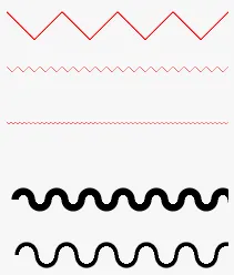
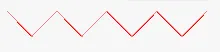
但我想对他的第一种变体提出一些建议-那些看起来更三角形的波浪。我建议使用:before:after伪元素,而不是硬编码的封闭div。

它可能看起来像这样(html):

<div class="triangly-line"></div>

这里的triangly-line是一个目标装饰元素(不是“波浪线”而是“三角形线”)。

相应的样式(使用LESS符号表示)如下:

@line-width: 300px;
@triangled-size: 6px;
@triangly-color: red;
@double-triangled-size: (@triangled-size * 2 - 1px);
.linear-gradient (@gradient) {
    background: -webkit-linear-gradient(@gradient);
    background: -o-linear-gradient(@gradient);
    background: linear-gradient(@gradient);
}
.triangly-gradient (@sign, @color) {
    .linear-gradient(~"@{sign}45deg, transparent, transparent 49%, @{color} 49%, transparent 51%");
}
.triangly-line {
    overflow: hidden;
    position: relative;
    height: @triangled-size;
    &:before {
        .triangly-gradient("", @triangly-color);
    }
    &:after {
        .triangly-gradient("-", @triangly-color);
    }
    &:before,
    &:after {
        content: "";
        display: block;
        position: absolute;
        width: @line-width;
        height: @triangled-size;
        background-size: @double-triangled-size @double-triangled-size !important;
    }
}

得到的CSS(使用上述参数):

.triangly-line {
    overflow: hidden;
    position: relative;
    height: 6px;
}
.triangly-line:before {
    background: -webkit-linear-gradient(45deg, transparent, transparent 49%, red 49%, transparent 51%);
    background: -o-linear-gradient(45deg, transparent, transparent 49%, red 49%, transparent 51%);
    background: linear-gradient(45deg, transparent, transparent 49%, red 49%, transparent 51%);
}
.triangly-line:after {
    background: -webkit-linear-gradient(-45deg, transparent, transparent 49%, red 49%, transparent 51%);
    background: -o-linear-gradient(-45deg, transparent, transparent 49%, red 49%, transparent 51%);
    background: linear-gradient(-45deg, transparent, transparent 49%, red 49%, transparent 51%);
}
.triangly-line:before,
.triangly-line:after {
    content: "";
    display: block;
    position: absolute;
    width: 300px;
    height: 6px;
    background-size: 11px 11px !important;
}

1

我发现了一种更好的方法,在CSS中实现三角形波浪线,而不需要减半高度或应用在各个浏览器上效果不佳的技巧。

result

我尝试了@yeerk's solution,但只在Chrome中运行良好。 在Safari和Firefox上出现了伪影。

Firefox

firefox artifacts

Safari

safari artifact

这个解决方案是@liliputen的解决方案的一个变体,但它在灵活性方面有所改进。

您可以轻松地通过background-size属性更改行的大小。

.squiggly {
    position: relative;
    height: 10px;
    width: 100%;
}

.squiggly::after,
.squiggly::before {
    height: inherit;
    width: inherit;
    background-size: 12px 100%; /* Change this to adjust the size of the squiggly line. */
    content: "";
    position: absolute;
}

.squiggly::before {
    top: -2px;
    background-image: linear-gradient(45deg, red 35%, transparent 0),
        linear-gradient(-45deg, red 35%, transparent 0);
}

.squiggly::after {
    top: 0px;
    background-image: linear-gradient(45deg, white 35%, transparent 0),
        linear-gradient(-45deg, white 35%, transparent 0);
}
<div class="squiggly"></div>

你也可以在JS Fiddle上找到它。


1

如果你不是在寻找非常整洁的东西,只是为了好玩,可以尝试使用多个box-shadow进行调整: http://codepen.io/gcyrillus/pen/mfGdphttp://codepen.io/gcyrillus/pen/xhqFu

.curve{
  margin:3em 0;
  width:100px;
  height:150px;
  border-radius:50%;
  box-shadow:
    0px 2px 1px -1px,
    400px 0px 0px 0px white,
    400px 2px 1px -1px ,
    300px 0px 0px 0px white,
    300px -2px 1px -1px,
    600px 0px 0px 0px white,
    600px 2px 1px -1px ,
    500px 0px 0px 0px white,
    500px -2px 1px -1px,
    800px 0px 0px 0px white,
    800px 2px 1px -1px ,
    700px 0px 0px 0px white,
    700px -2px 1px -1px,
    1000px 0px 0px 0px white,
    1000px 2px 1px -1px ,
    900px 0px 0px 0px white,
    900px -2px 1px -1px,
    1200px 0px 0px 0px white,
    1200px 2px 1px -1px ,
    1100px 0px 0px 0px white,
    1100px -2px 1px -1px,
    1400px 0px 0px 0px white,
    1400px 2px 1px -1px ,
    1300px 0px 0px 0px white,
    1300px -2px 1px -1px,
    1600px 0px 0px 0px white,
    1600px 2px 1px -1px ,
    1500px 0px 0px 0px white,
    1500px -2px 1px -1px;
  position:relative;
}
.curve:before,.curve:after {
  content:'';
  position:absolute;
  height:100%;
  width:100%;
  border-radius:100%;
  box-shadow:inherit;
}
.curve:before {
  left:100%;
  transform:rotate(180deg);
 }
.curve:after {
  left:200%;
}

0

这里有一个基于@yeerk的SASS波浪线生成器。如果你想要三角形,可以使用上面@lilliputten的生成器。

$waveHeight: 40px;
$waveLength: 70px;
$waveRadius: 13px; // adjust depending on length
$waveThickness: 8px;

@mixin waveSide() {
  position: absolute;
  background: radial-gradient(ellipse, transparent, transparent $waveRadius, black $waveRadius, black #{$waveRadius + $waveThickness}, transparent #{$waveRadius + $waveThickness});
  background-size: #{$waveLength} #{$waveHeight * 2};
  height: $waveHeight;
}

.wavy {
  width: 400px; // give the wave element a length here

  @include waveSide;

  &::before {
    $waveOffset: $waveLength / 2;
    @include waveSide;

    content: '';
    width: calc(100% - #{$waveOffset});
    top: $waveHeight;
    left: $waveOffset;
    background-position: 0px -#{$waveHeight};
  }
}

0
在 HTML5 和 Canvas 之前,有 JavaScript 矢量图形。如果你想在纯HTML中绘制圆形、椭圆等等,可以尝试一下它。

网页内容由stack overflow 提供, 点击上面的
可以查看英文原文,
原文链接