我一直在阅读关于R中的千层面图。在链接的论文附录中,作者有很多实现这些图的代码。但它是一个pdf文件,我无法复制到RStudio中(至少我还没有弄清楚如何)。是否有人将这些代码制作成软件包或以更可用的格式提供了代码?
3个回答
4
回答实际问题:代码在此pdf文档中:http://www.ncbi.nlm.nih.gov/pmc/articles/PMC2937254/bin/NIHMS225391-supplement-1.pdf。我在Adobe Reader中轻松选择了代码并将其复制粘贴到文本文档中。
- Carl Witthoft
1
当时可行了。谢谢。无论如何,现在有关Lasagna图的参考资料在这里了。但是,鉴于@TexB的评论,我不确定是否应该将其标记为已回答,因为可能有更好的代码。 - Peter Flom
2
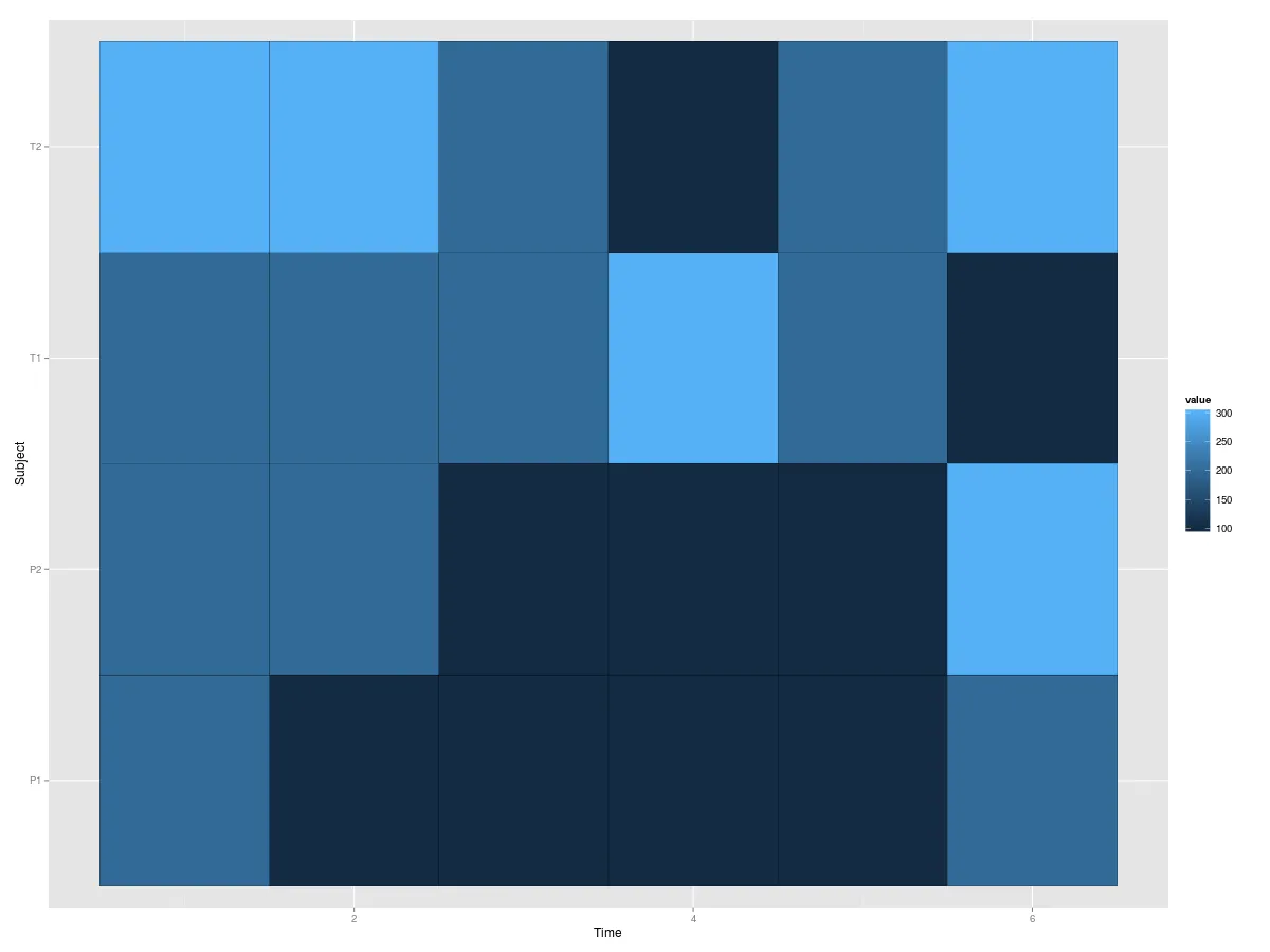
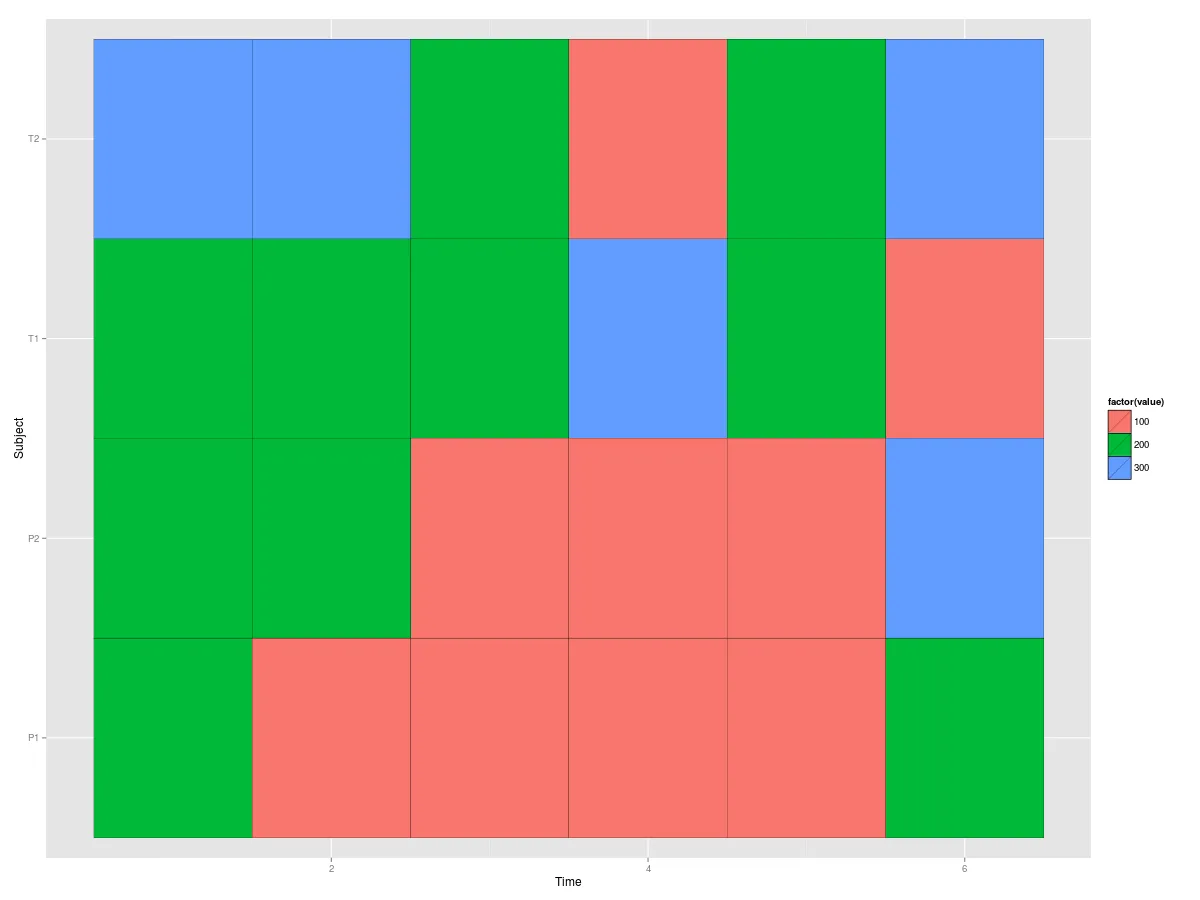
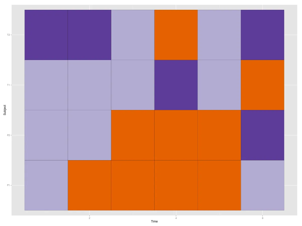
拉萨尼亚图看起来就像热力图,虽然名字很可爱。其他软件包中的热力图绘制得非常好。考虑 Carl Witthoft 指出的代码中的第一个示例图。您可以像这样在 ggplot 中复现它:
## Create the data
palette <- brewer.pal(4, "PuOr")[-2]
## the matrix containing data for Figure 02a
H.mat <- matrix(NA, nrow=4, ncol=6)
H.mat[1, 1:6] = 100*c(2, 1, 1, 1, 1, 2)
H.mat[2, 1:6] = 100*c(2, 2, 2, 3, 2, 1)
H.mat[3, 1:6] = 100*c(2, 2, 1, 1, 1, 3)
H.mat[4, 1:6] = 100*c(3, 3, 2, 1, 2, 3)

library(ggplot2)
library(reshape2)
rownames(H.mat)<-c('P1','T1','P2','T2')
colnames(H.mat)<-seq(ncol(H.mat))
names(dimnames(H.mat))<-c('Subject','Time')
H.df<-melt(H.mat)
根据您的需求,您可以获得不同类型的着色。
# For continuous values.
ggplot(H.df,aes(x=Time,y=Subject,fill=value)) + geom_tile(colour='black')
# If you consider the value to be categorical.
ggplot(H.df,aes(x=Time,y=Subject,fill=factor(value))) +
  geom_tile(colour='black')
# If you want those exact colours the author used:
col<-palette[match(ordered(H.df$value),levels(ordered(H.df$value)))]
ggplot(H.df,aes(x=Time,y=Subject,fill=col)) +
  geom_tile(colour='black') + scale_fill_identity()
- nograpes
2
2我无法弄清楚如何正确使用作者所用的确切颜色,因此我使用了一个不太正规的方法。如果有人能告诉我如何以更自然的方式向
ggplot提供自定义颜色,那么请告诉我,我会更改答案。 - nograpes1我认为你已经明白了! - Peter Flom
网页内容由stack overflow 提供, 点击上面的可以查看英文原文,
原文链接
原文链接
heatmap()使用可能会让你朝着某个方向前进... - texb