我希望创建一种形状,我想称之为“反向圆形”:
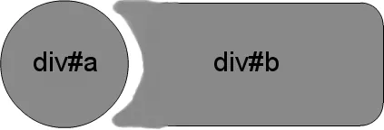
(对于支持它的浏览器-已在FF和Chrome中测试-IE10,Safari也应该可以)。
原始答案的一个“问题”是有些情况下人们没有一个实心的背景来工作。此更新创建了相同的效果,允许圆形和它的倒置切割之间存在透明的“间隙”。
CSS
.inversePair {
    border: 1px solid black;
    display: inline-block;
    position: relative;
    height: 100px;
    text-align: center;
    line-height: 100px;
    vertical-align: middle;
}

#a {
    width: 100px;
    border-radius: 50px;
    background: grey;
    z-index: 1;
}

#b {
    width: 200px;
    /* need to play with margin/padding adjustment
       based on your desired "gap" */
    padding-left: 30px;
    margin-left: -30px;
    /* real borders */
    border-left: none;
    -webkit-border-top-right-radius: 20px;
    -webkit-border-bottom-right-radius: 20px;
    -moz-border-radius-topright: 20px;
    -moz-border-radius-bottomright: 20px;
    border-top-right-radius: 20px;
    border-bottom-right-radius: 20px;
    /* the inverse circle "cut" */
    background-image: -moz-radial-gradient(
        -23px 50%, /* the -23px left position varies by your "gap" */
        circle closest-corner, /* keep radius to half height */
        transparent 0, /* transparent at center */
        transparent 55px, /*transparent at edge of gap */
        black 56px, /* start circle "border" */
        grey 57px /* end circle border and begin color of rest of background */
    );
    background-image: -webkit-radial-gradient(-23px 50%, circle closest-corner, rgba(0, 0, 0, 0) 0, rgba(0, 0, 0, 0) 55px, black 56px, grey 57px);
    background-image: -ms-radial-gradient(-23px 50%, circle closest-corner, rgba(0, 0, 0, 0) 0, rgba(0, 0, 0, 0) 55px, black 56px, grey 57px);
    background-image: -o-radial-gradient(-23px 50%, circle closest-corner, rgba(0, 0, 0, 0) 0, rgba(0, 0, 0, 0) 55px, black 56px, grey 57px);
    background-image: radial-gradient(-23px 50%, circle closest-corner, rgba(0, 0, 0, 0) 0, rgba(0, 0, 0, 0) 55px, black 56px, grey 57px);
}
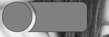
我花费了比预期更多的精力来使z-index工作(这似乎忽略了负的z-index),然而,这样看起来很干净整洁(在IE9、FF、Chrome中进行了测试):
HTML
<div id="a" class="inversePair">A</div>
<div id="b" class="inversePair">B</div>
.inversePair {
    border: 1px solid black;
    background: grey;
    display: inline-block;
    position: relative;
    height: 100px;
    text-align: center;
    line-height: 100px;
    vertical-align: middle;
}

#a {
    width: 100px;
    border-radius: 50px;
}

#a:before {
    content:' ';
    left: -6px;
    top: -6px;
    position: absolute;
    z-index: -1;
    width: 112px; /* 5px gap */
    height: 112px;
    border-radius: 56px;
    background-color: white;
}

#b {
    width: 200px;
    z-index: -2;
    padding-left: 50px;
    margin-left: -55px;
    overflow: hidden;
    -webkit-border-top-right-radius: 20px;
    -webkit-border-bottom-right-radius: 20px;
    -moz-border-radius-topright: 20px;
    -moz-border-radius-bottomright: 20px;
    border-top-right-radius: 20px;
    border-bottom-right-radius: 20px;
}

#b:before {
    content:' ';
    left: -58px;
    top: -7px;
    position: absolute;
    width: 114px; /* 5px gap, 1px border */
    height: 114px;
    border-radius: 57px;
    background-color: black;
}
从你的图纸上我无法确定你想要多弧度的点,但这里有一个可能性:http://jsfiddle.net/n9fTF/6/
如果需要更圆润的点,你需要在两端放一些圆形,以便它们与大铲子相融合。
这种方法使用CSS盒子阴影,IE9及以上版本支持(canIuse)。
输出:
HTML :
<div id="a">
    <div id="b"></div>
</div>
CSS :
#a{
    overflow:hidden;
    border-radius:20px;
    position:relative;
    display:inline-block;
}
#a:before, #a:after{
    content:'';
    width: 100px;
    border-radius: 50%;
}
#a:before {
    height: 100px;
    float:left;
    border: 1px solid black;
    background: grey;
}
#a:after {
    position:absolute;
    left:14px; top:-6px;
    height:114px;
    box-shadow: 1px 0px 0px 0px #000, 110px 0px 0px 68px #808080;
    background:none;
    z-index:-1;
}
#b {
    width: 200px;
    height: 100px;
    background:none;
    margin-left:-15px;
    border: 1px solid black;
    border-left:none;
    float:left;
    border-top-right-radius: 20px;
    border-bottom-right-radius: 20px;
}
这是一个非常有趣的问题。我最近发布了一个关于如何在CSS中制作反向边框半径(此处)的教程,我认为这可以很容易地适应您的情况。
诀窍是创建一个生成反向边框的span,使用一个非常简单的概念-非常厚的边框,并通过隐藏内部部分来使用内部部分。除了我提供的脚本之外,您还需要在左上角添加另一个border-radius,因为我只使用了右上角的border-radius。将span与要对齐的项目左对齐,通过绝对定位增加span的高度/宽度,然后您就拥有了反向边框半径。
let precision = 64;
let radius = 50;
let c = [...Array(precision)].map((_, i) => {
  let a = -i/(precision-1)*Math.PI*2;
  let x = Math.cos(a)*radius + 100;
  let y = Math.sin(a)*radius + 50;
  return `${x}% ${y}%`
})

document.querySelector('.circleContainer').style.clipPath =
`polygon(100% 50%, 100% 100%, 0 100%, 0 0, 100% 0, 100% 50%, ${c.join(',')})`;.container{
display: flex;
position: relative;
width: 200px;
}
.left{
background: blue;
width: 100px;
height: 100px;
border-top-left-radius: 50%;
border-bottom-left-radius: 50%;
}
.circleContainer {
background: blue;
width: 100px;
height: 100px;
}
.innerCircle{
width: 80px;
height: 80px;
border-radius: 50%;
background: orange;
position: absolute;
top: 10px;
right: -40px;
}<div class='container'>
<div class='left'></div>
<div class='circleContainer'></div>
<div class='innerCircle'></div>
</div>据我所知,有人已经在其他地方完成了这个...
JSFiddle: http://jsfiddle.net/ajeN7/
问题链接:CSS3 Inverted Rounded Corner
希望这能帮到你!
介绍一个绝对定位的无边框白色圆圈,它位于灰色圆圈的偏移位置。您需要设置暗圆圈的 z-index,以确保它位于白色圆圈上方:
#c {
    position: absolute;
    border: 0;
    left: 30px;
    width: 100px;
    height: 100px;
    border-radius: 50px;
    background: white;
}
演示。