我在我的应用程序中使用了名为“addButton”的自定义按钮,我想用白色边框包围它,如何使我的自定义按钮有白色边框?
13个回答
364
你可以通过访问按钮的图层属性,在CALayer上设置边框属性。
首先,添加Quartz。
首先,添加Quartz。
#import <QuartzCore/QuartzCore.h>
设置属性:
myButton.layer.borderWidth = 2.0f;
myButton.layer.borderColor = [UIColor greenColor].CGColor;
请参考以下链接:
https://developer.apple.com/documentation/quartzcore/calayer#//apple_ref/occ/cl/CALayer
上述链接中的CALayer允许您设置其他属性,例如圆角半径、maskToBounds等...
此外,这篇文章介绍了如何创建自定义UIButton:
https://web.archive.org/web/20161221132308/http://www.apptite.be/tutorial_custom_uibuttons.php
- bryanmac
3
3请确保在目标编辑器的“Build Phases”选项卡中将您的目标与QuartCore框架链接起来。 - zekel
1我需要导入Quartz吗?即使没有它,我仍然可以访问按钮的层。我提出这个问题的目的是:导入Quartz会给我们带来什么好处? - Alok C
1使用
CGColor 加 1。 - Anurag Sharma53
非常简单,只需在文件中添加quartzCore头文件(为此您需要将quartz框架添加到项目中),
然后执行以下操作:
[[button layer] setCornerRadius:8.0f];

[[button layer] setMasksToBounds:YES];

[[button layer] setBorderWidth:1.0f];
您可以根据需求更改浮点值。
祝使用愉快。
以下是一些典型的现代代码...
self.buttonTag.layer.borderWidth = 1.0f;
self.buttonCancel.layer.borderWidth = 1.0f;

self.buttonTag.layer.borderColor = [UIColor blueColor].CGColor;
self.buttonCancel.layer.borderColor = [UIColor blueColor].CGColor;

self.buttonTag.layer.cornerRadius = 4.0f;
self.buttonCancel.layer.cornerRadius = 4.0f;
那看起来与分段控件很相似。
Swift 更新:
- 无需添加 "QuartzCore"
只需要这样做:
button.layer.cornerRadius = 8.0
button.layer.borderWidth = 1.0
button.layer.borderColor = UIColor.black.cgColor
- Ajeet Pratap Maurya
25
在Swift中,您无需导入“QuartzCore/QuartzCore.h”
只需使用:
button.layer.borderWidth = 0.8
button.layer.borderColor = (UIColor( red: 0.5, green: 0.5, blue:0, alpha: 1.0 )).cgColor
button.layer.borderWidth = 0.8
button.layer.borderColor = UIColor.grayColor().cgColor
- tong
1
根据XCode 9的说法,“CGColor已被重命名为cgColor”。 - BlenderBender
22
设置
borderWidth 和 borderColor 属性存在问题,就是当你点击按钮时,边框不会有高亮效果的动画。
当然,你可以观察按钮事件并相应地更改边框颜色,但那样感觉是不必要的。
另一个选择是创建可拉伸的 UIImage 并将其设置为按钮的背景图像。您可以在 Images.xcassets 中创建一个 Image set,如下所示:
然后,将其设置为按钮的背景图像:
如果您的图像是模板图像,则可以设置按钮的 tint color,边框将会改变:
现在,当你点击按钮时,边框将会和按钮的其它部分一起高亮展示。- juanjo
3
你用什么制作图像? - Bigfoot11
1制作这张图片我使用了Sketch,但你也可以使用Gimp、Illustrator、Photoshop等软件。 - juanjo
很好的回答。比改变图层的
borderWidth 更好。 - Alexander Doloz9
这是Ben Packard的答案的更新版本(Swift 3.0.1)。
import UIKit

@IBDesignable class BorderedButton: UIButton {

    @IBInspectable var borderColor: UIColor? {
        didSet {
            if let bColor = borderColor {
                self.layer.borderColor = bColor.cgColor
            }
        }
    }

    @IBInspectable var borderWidth: CGFloat = 0 {
        didSet {
            self.layer.borderWidth = borderWidth
        }
    }

    override var isHighlighted: Bool {
        didSet {
            guard let currentBorderColor = borderColor else {
                return
            }

            let fadedColor = currentBorderColor.withAlphaComponent(0.2).cgColor

            if isHighlighted {
                layer.borderColor = fadedColor
            } else {

                self.layer.borderColor = currentBorderColor.cgColor

                let animation = CABasicAnimation(keyPath: "borderColor")
                animation.fromValue = fadedColor
                animation.toValue = currentBorderColor.cgColor
                animation.duration = 0.4
                self.layer.add(animation, forKey: "")
            }
        }
    }
}
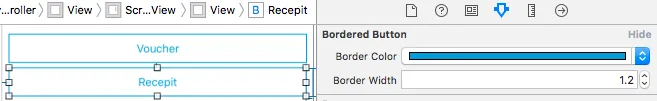
生成的按钮可以在StoryBoard中使用,这要归功于
@IBDesignable和@IBInspectable标签。

- LaloLoop
2
我在Swift 4的约束方面遇到了问题。我创建了一个全尺寸按钮(宽度从一侧到另一侧),在Xcode中,我可以很好地看到边框预览,但是在模拟器或设备上,我看到边框缩小到按钮内部文本的大小。我添加的唯一自动布局约束是水平居中,如何解决?谢谢! - Cristian
@CristianChaparroA。原因是
prepareForInterfaceBuilder只在IB中调用,而不是在运行应用程序时调用。因此,在awakeFromNib中也设置UIEdgeInsets,这样它在运行应用程序时也会显示。 - Samuël8
要更改按钮的半径、颜色和宽度,我设置如下:
self.myBtn.layer.cornerRadius = 10;
self.myBtn.layer.borderWidth = 1;
self.myBtn.layer.borderColor =[UIColor colorWithRed:189.0/255.0f green:189.0/255.0f blue:189.0/255.0f alpha:1.0].CGColor;
- Alex
8
这可以通过多种方法在Swift 3.0中实现。最新版本为2017年8月。
选项1:直接为UI按钮分配borderWidth属性值:
选项1:直接为UI按钮分配borderWidth属性值:
btnUserButtonName.layer.borderWidth = 1.0
为UI按钮设置默认颜色值的标题:
btnUserButtonName.setTitleColor(UIColor.darkGray, for: .normal)
为UI按钮设置默认颜色的边框属性值:
btnUserButtonName.layer.borderColor = UIColor.red
为UI按钮的边框属性值设置自定义颜色:
   let myGrayColor = UIColor(red: 0.889415, green: 0.889436, blue:0.889424, alpha: 1.0 )
   btnUserButtonName.layer.borderColor = myGrayColor.cgColor
选项2:[推荐]
使用扩展方法,这样整个应用程序中的按钮将保持一致的外观,并且无需在各处重复多行代码。
//Create an extension class in any of the swift file

extension UIButton {
func setBordersSettings() {
        let c1GreenColor = (UIColor(red: -0.108958, green: 0.714926, blue: 0.758113, alpha: 1.0))
        self.layer.borderWidth = 1.0
        self.layer.cornerRadius = 5.0
        self.layer.borderColor = c1GreenColor.cgColor
        self.setTitleColor(c1GreenColor, for: .normal)
        self.layer.masksToBounds = true
    }
}
在代码中的用法:
//use the method and call whever the border has to be applied

btnUserButtonName.setBordersSettings()
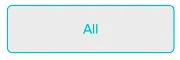
扩展方法 Button 的输出:
- BHUVANESH MOHANKUMAR
7
这是一个
UIButton的子类,支持高亮状态动画,而不需要使用图像。当视图的色调模式更改时,它还会更新边框颜色。class BorderedButton: UIButton {
override init(frame: CGRect) {
super.init(frame: frame)
layer.borderColor = tintColor.cgColor
layer.borderWidth = 1
layer.cornerRadius = 5
contentEdgeInsets = UIEdgeInsets(top: 5, left: 10, bottom: 5, right: 10)
}
required init?(coder aDecoder: NSCoder) {
fatalError("NSCoding not supported")
}
override func tintColorDidChange() {
super.tintColorDidChange()
layer.borderColor = tintColor.cgColor
}
override var isHighlighted: Bool {
didSet {
let fadedColor = tintColor.withAlphaComponent(0.2).cgColor
if isHighlighted {
layer.borderColor = fadedColor
} else {
layer.borderColor = tintColor.cgColor
let animation = CABasicAnimation(keyPath: "borderColor")
animation.fromValue = fadedColor
animation.toValue = tintColor.cgColor
animation.duration = 0.4
layer.add(animation, forKey: nil)
}
}
}
}
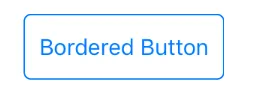
用法:
let button = BorderedButton(style: .System) //style .System 是重要的
外观:

- Ben Packard
7
现在不需要再导入QuartzCore.h了。参考iOS 8 SDK和Xcode 6.1。
直接使用:
[[myButton layer] setBorderWidth:2.0f];
[[myButton layer] setBorderColor:[UIColor greenColor].CGColor];
- Vinay Jain
5
Swift 5
button.layer.borderWidth = 2
要更改边框的颜色,请使用
button.layer.borderColor = CGColor(srgbRed: 255/255, green: 126/255, blue: 121/255, alpha: 1)
- Fahim Rahman
1
2button.layer.borderColor = UIColor.gray.cgColor 是可以接受的! - Carlos Irano
网页内容由stack overflow 提供, 点击上面的可以查看英文原文,
原文链接
原文链接